HOME | DD
 Malicious-Monkey — Deep Space Descent

Published: 2013-09-21 04:20:15 +0000 UTC; Views: 962; Favourites: 27; Downloads: 0
Redirect to original
Description
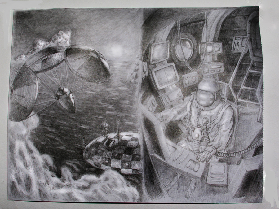
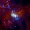
In an attempt to make the illustrations for my story somewhat consistent in style, I'm redoing a few. Media will be limited to soluble ink, ballpoint pen, diorama, and maybe watercolor. This means that digital , rollerball , and pencil illustrations will have to go (for rollerball, I'll make exceptions for diagrammatic illustrations). I'll also be applying similar restrictions to the speculative evolution portion of the project in case I ever decide to publish either of them as a book.I'm not actually sure if I like this version better than the old one. It's got more detail and a better star field, but it's also a bit cluttered. At least it doesn't clash with the rest. Pencil and pen just don't look good side by side.
Soluble ink and acrylic on bristol board
Old version:
fav.me/d53u3xq
Related content


Comments: 7


You mind if I do a critique? Im not sure if I should, considering my level as an artist compared to you
")
👍: 0 ⏩: 1

Oh, please do. Critique is always welcome in this house.
👍: 0 ⏩: 1
Well for starters the detail level is much better than in the old one, but there are several things that make, at least for me, the old one better:
-The guy's expression is brilliant in the old one, while here it doesnt seem as alive.
-I feel that the scene is too cluttered, but I dont really know what is going on but the other one felt better, the emptiness gave the feel of deep space.
But then again you have improved dramatically in the spacing of stars in this one, in fact I would say they are near perfect.
In general its just that the old one packs a dramatic punch that this one lacks due to an overcrowded image that creates an initial sense of confusion that kind of, stifles primary sense of awe.
👍: 0 ⏩: 1
I'm glad I'm not the only one who thinks that, then. I'm debating redoing it. The problem with the man's expression is a limitation of the medium. I just couldn't work it the way I wanted in pen and ink the way I could in pencil. I need to find a way to bring the old composition into a new medium without sacrificing what made the old one good.
👍: 0 ⏩: 0

The style somehow reminds me of soviet sci fi of the 60ies and 70ies... I absolutely adore the soluble ink technique!
👍: 0 ⏩: 1
I could see that, first thing I thought was that this wouldn't look out of place on the sleeve of a Stanislaw Lem novel. ")
👍: 0 ⏩: 0