HOME | DD
 malpractition — Lapis Surprise

#lapis #lazuli #persona #steven #stevenuniverse #persona5 #lapislazuli #universe #lapislazulistevenuniverse
Published: 2017-06-02 22:09:51 +0000 UTC; Views: 386; Favourites: 13; Downloads: 2
Redirect to original
Description
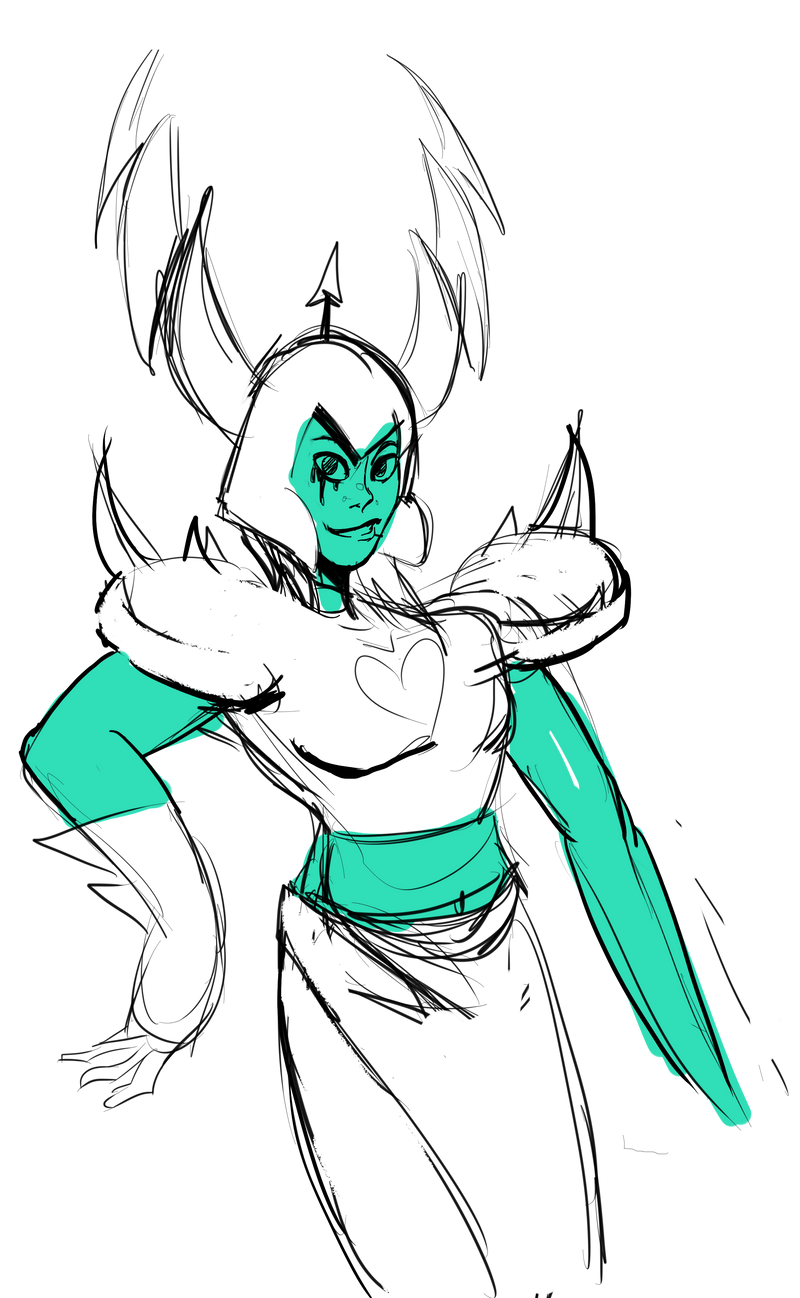
STORMY WEATHER CAUGHT YOU COLDI was compelled to draw this after listening to P5's soundtrack while I drew Padparadscha.
Related content


Comments: 18

XD
That's SO her, omigosh. So funny and love the style of the water in the background.
👍: 0 ⏩: 1

Thank you much! The water was actually quite fun to make - first time drawing water in a rough, fluid motion like that.
👍: 0 ⏩: 1
Well it looked like you've practiced many times, so good job!
")
👍: 0 ⏩: 0

Love it! but you could use some more shading on lapis
👍: 0 ⏩: 1
Happy that you enjoyed! I agree, I probably could have done better shading Lapis. Need to work on having more than one light source.
👍: 0 ⏩: 1
dont worry, I need to work on that too.
 (Smile)")
👍: 0 ⏩: 0

I could totally see Lapis doing something like this. It fits her character, and the kind of monotone theme fits the piece very well. Her expression also shows that she is partially conflicted, like she doesn't really believe what she's saying or that she feels bad about it. Idk. I like the simplistic look to it as well. All in all, pretty nice! keep it up <3
👍: 0 ⏩: 1
Thank you! I'm glad you enjoyed viewing my artwork! Even better that the expression gives implications about her. That has been something I've been working on more lately. Good to see it's paying off!
👍: 0 ⏩: 1
It is! Though it might just be me reading into it, I dunno.
👍: 0 ⏩: 0

Hi there! I'm here from ProjectComment c:
The first thing I noticed is that I really like the colours in this! They're very well chosen, and the whole the piece goes together really well. None of the colours feel out of place. The expression you've drawn is perfect for Lapis as well, and you've portrayed her character really well! The water in the background looks really great. It's simplistic, but shaded in all the right places and has really good fluidity to it! And the stylized way you made the text box works really well for this piece as well!
As far as what can be improved.. I'd say to definitely take some time and practice some hand anatomy. Hands are really hard, but if you look up some references and just try to sketch a bunch of hands you'll find it really rewarding, and that you'll be able to draw some accurate hands pretty quickly! In this piece here fingers are drawn very triangular, when in usually fingers are more of a rectangular shape with slight curves on the end. Instead of having the fingers be so pointed, fingers are usually the same width all the way to the tip. It's really helpful to use your own hand as reference as well! It's basically a real life reference that you can pose however you need!
Otherwise my only comment in regards to anatomy is that the face is probably too wide? The hair on the left side of her face (the left side in this picture), should start furthur in/closer to her eyes. I think the face in this went on a bit too long, because at the width it is her ear would have already started (if gems had ears that is). I'm nor sure if I explained that well, but hopefully that makes sense!
My only other critique is that I honestly cannot figure out what the black thing in the background is? So I would suggest to have that drawn a bit more clearly. I can't tell if it's a ship.. or..?
Either way, despite my critiques, I really like this picture! As I said, you captured Lapis' personality really well and the composition in this piece is really nice! Keep up the good work <3
👍: 0 ⏩: 1
Thanks for the critique! It's always appreciated. I've been working more on hands since this piece, though admittedly I was kind of lazy with how I made them in this one haha. I'll keep the other suggestions in mind while I'm drawing, too. I probably should have made the figure in the background larger.
👍: 0 ⏩: 1
No problem! I'm just glad I could help out, if only a little.
Your art is already looking great anyhow, keep drawing and improving and you'll do great <3
👍: 0 ⏩: 1
Aaaa, thanks! I very much appreciate it!
👍: 0 ⏩: 0

I will say I love Lapis Lazuli, she is my water waifu! She is one of the most interesting characters who suffered from a checkered past, abusive relationship, and being a prisoner from multiple people. This is a very good piece, the water looks very fluid and your drawing of lapis is remarkable. Although it is hard to depict what she is exactly she is striking down over the sea. Not to mention I see you are trying to go for the bad ass look with her, her facial expression isn't exactly giving the vibe "don't screw with me". Ultimately I would say you did a decent job on this, and work more with facial expressions.
👍: 0 ⏩: 1
Haha yeah, I'm currently working to improve my facial expressions. Thanks for the critique! I always appreciate it.
👍: 0 ⏩: 0

OHH THIS IS SO ACCURATE TO LAPIS'S IN THIS SEASON
I came from ProjectComment to comment on this beautiful and wonderful piece! But maybe I can't make a long review. So this is just a regular comment!
Overall, I think this drawing is good. I really like the water background behind Lapis. It's so good! Not everyone can draw waters like that. But! A little more colors and details will make the water more wonderful. I suggest you to look for tutorials so it's going to look more realistic. (What is wrong with me? This is a cartoon show).
If you want this picture to look more similar with the Steven Universe's style, maybe you can practice the anatomy using pencils and papers first. Then maybe you can make fanarts! Or just keep on practicing until you reach the style you wanted.
For me, her fingers don't match her hands. It's too short ad small D: They also looks like spikes and I can't see the crooked lines. (You know, those lines in the finger where they crook the fingers into a fist etc)
👍: 0 ⏩: 1
Thanks for the critique! I appreciate it!
Yeah this was my first time drawing water that wasn't just plain calm, I'm glad it came out as well as it did but I'll definitely be working to improve my depiction of water in general as I go forward. More color variation really couldn't hurt haha. I also agree with you on the hand. I thought it would be a neat stylistic choice but the more I look at it the more I feel it looks off.
I'm pretty psyched for more Steven Universe in general haha. I hope Lapis and Peridot have more to do in the main story though.
👍: 0 ⏩: 1
I haven't see Lapis and Peri lately. I'm scared they will get left behind.
Not a problem! I start my coloring with the realistic ones so my manga style will look cooler!
Thank you for the reply.
👍: 0 ⏩: 0