HOME | DD
 markerguru — TOTF Arcee page 2 study

Published: 2010-01-01 21:44:06 +0000 UTC; Views: 3566; Favourites: 60; Downloads: 121
Redirect to original
Description
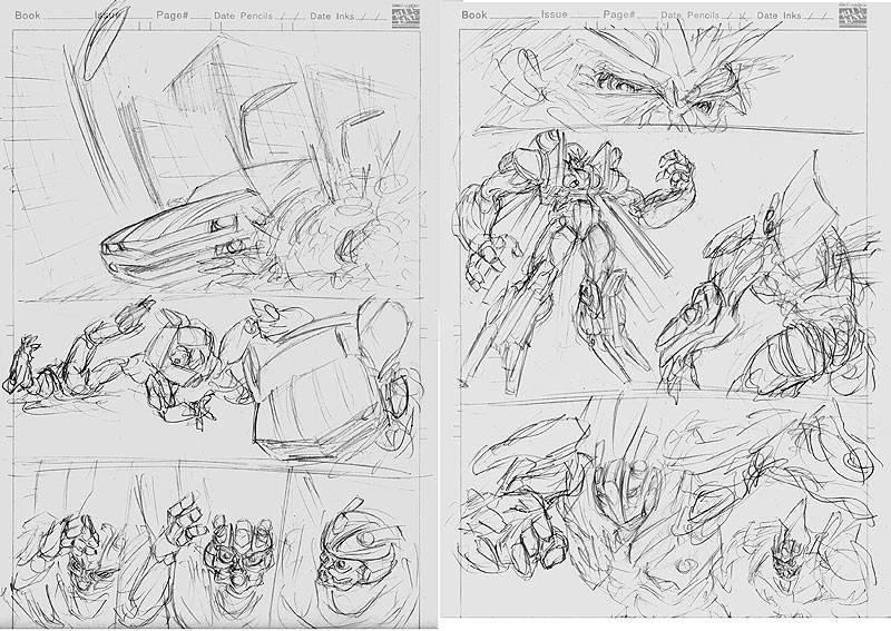
so this is the second page of the issue of tales of the fallen arcee.i was trying something different when i picked the angle i wanted to view this scene in.
version a. is the way the page is ment to be viewed. it has the start of a fish eye perspective, and the ground curves away from us to see whats going on in the background.
it was strange drawing this page.
version b. i discovered when i was drawing this page. i would random rotate the page while i was drawing it to check things, and i discovered that it looked good upside down from the way i intended it be viewed.
so i just thought i'd share that with you.
but version a is the way it's ment to be seen. it has a more uncomfortable feel to it, and that helps add to whats going on in the scene.
i won't say whats going on. for that, you'll have to read the book
")
enjoy
transformers©hasbro
Related content


Comments: 16


I like the final version better too. I agree with the "uncomfortable" thing. Arcee looks like she's in pain.
I think with the final version, we see Arcee screaming first, then our eyes sort of slide down to see her mangled body. Gives a much better effect.
👍: 0 ⏩: 0

Both angles are pretty cool! haha, oh boy, i can't even start to imagine how you has draw this page..looks really really really hard, what makes you even more awesome D:
👍: 0 ⏩: 1

funny thing is i worked on this page while i was out with friends. so while we were at a burger joint, i'm there drawing this page, and rotating it around from all sides to draw it. it was pretty fun to draw. i like that the image curves on itself, and makes part of it upside down.
👍: 0 ⏩: 0

 (Smile)")

")

I looked at the previews I guess this is why she looked weird and different from the concept designs in the movie. Cool stuff man.
👍: 0 ⏩: 0

Well I'll be! I guess we can finally see how Arcee got her new bod! In the meantime, a slight homage to Spotlight Arcee?
👍: 0 ⏩: 1
an homage to my own work
👍: 0 ⏩: 1
I knew there was quite the resemblence between this work and your Spotlight: Arcee lineart - excellent!
👍: 0 ⏩: 0

I like (A.) more.(even though they're the same) The camera angle is awkward which really adds and focuses on the drama with Arcee finding her body in front of her. It's a very powerful shot. Good job.
👍: 0 ⏩: 1
well (a) is what i intended the page to look like, but (b) i found interesting that it looked like it also could be the right way of viewing the page.
👍: 0 ⏩: 1
Yeah your right. (B.) does make the eye read the page more, but for the effect of drama going on, (A) puts you in the moment right away. Your first intention turned out best. imo Though it was good thinking of looking at your art from different sides.
👍: 0 ⏩: 0

Stunning page!
Incredible attention to detail. Love the fish eye perspective!
I found interesting how my eye read the page differently in both options. I found B reads a lot faster but in the process I did not capture everything. Option A lets me look carefully at the page and really observe what is going on.
Amazing job as always!
Glad they're explaining the Arcee thing
👍: 0 ⏩: 0