HOME | DD
 MatsuRD — Max - Freefall

Published: 2006-06-08 08:20:24 +0000 UTC; Views: 1821; Favourites: 63; Downloads: 67
Redirect to original
Description
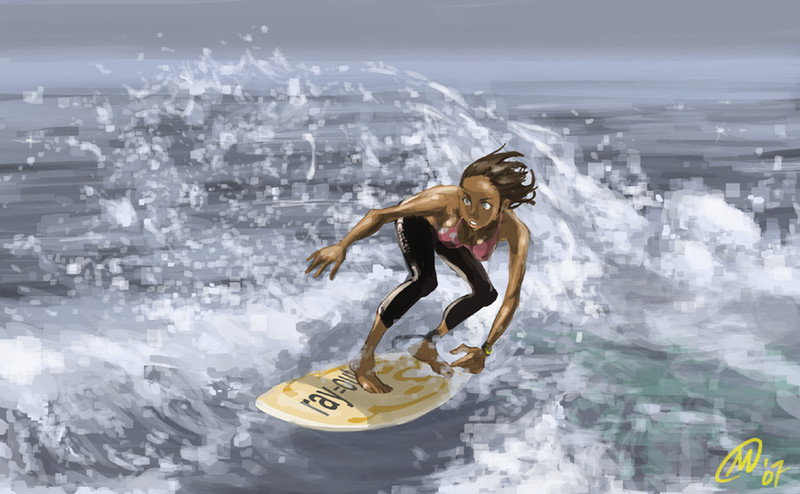
...got lazy on the background...
")
Max (c) me
supplemental (6/8): inspired by E7
Related content


Comments: 20


this is funny 
")
👍: 0 ⏩: 1
 (Smile)")


I think serene is the word I'm lookin for. And friggin wicked.
👍: 0 ⏩: 0


Great pespective and all around good pic! Very Eureka 7 influenced!
👍: 0 ⏩: 0

I love Eureka 7 its so awsome but unfortunetly for me I have the american dub only
👍: 0 ⏩: 0


From the cathedral? hmm... now that i think of it...
👍: 0 ⏩: 0

Wow that is an amazing effect.The background isn't too bad...it still looks good.
👍: 0 ⏩: 0

for gettign lazy onthe background, thats pretty amazing 0.0
nice perspective^^
👍: 0 ⏩: 1
thanks
i was actually planning to make the view higher, but somehow.... and then i got lazy

")
👍: 0 ⏩: 0

Wow, you did an amazing job with proportions in this perspective. I think your background looks nice, and it's detailed but not too detailed--it brings the attention directly to the character. Oh, and I like his expression. So impassive!
👍: 0 ⏩: 0
Thanks for the fav & comments, guys!
i am trying to do better backgrounds... been focusing on characters too much...
👍: 0 ⏩: 0

I like the perspective of this drawing.
Good proportions on the character
Even though the background was (in your words)
lazy, it was still painted well enough to give it some kind
of depth.
👍: 0 ⏩: 0

this is a great angle, freefalling seems so natural tot he guy. I really like the perspecive used, though the background of the earth below could have meen perhaps blurred , it just seems a bit sketchy to me. it's a lot of detail and good concept for the city below.
👍: 0 ⏩: 0

Hello I was browsing around dA and came across your page.
this is very well done
it deserve my admiration!
👍: 0 ⏩: 0


I think the background compared to the character is a great contrast, and the way he seems totally unconcerned about his free falling. Nice stuff!
👍: 0 ⏩: 0