HOME | DD
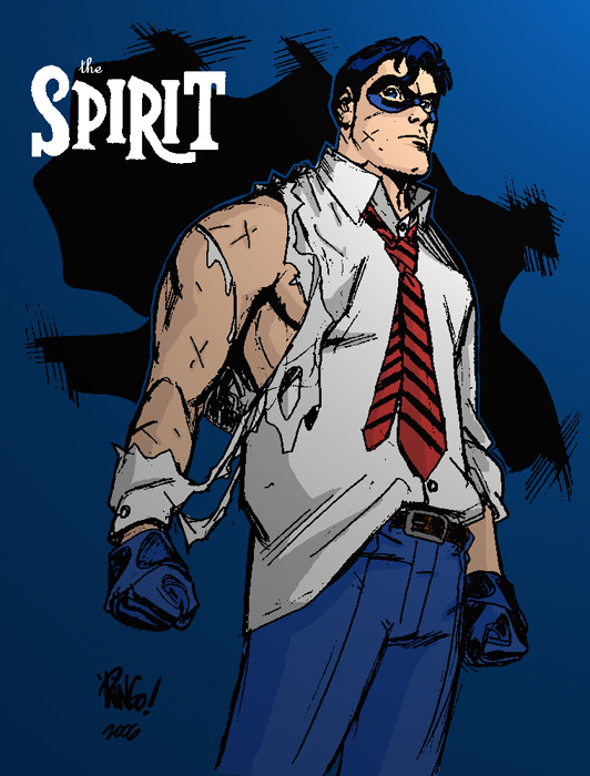
 mattcrap — the SPIRIT by MikeWeringo

Published: 2006-09-25 17:40:39 +0000 UTC; Views: 1722; Favourites: 39; Downloads: 16
Redirect to original
Description
There's a SPIRIT jam over at DB ---> [link]'Ringo did this really great sketch, so I asked him if I could color it. [link]
I regret not making the tie all red. But that wasn't really my call.
drawring by Mike Weringo
colores by mattcrap
EDIT: swithed the tie
Related content
Comments: 22

You made The Spirit actually look like a tough hombre there.
👍: 0 ⏩: 1

i just added some infantile colors to it- Ringo made him look tough
👍: 0 ⏩: 0

it's all Ringo's ....so cool.
👍: 0 ⏩: 0

The tie looks fine with the lines I think. I like it.
👍: 0 ⏩: 1

i fixed it, heh
I don't think you saw the "shitty tie version"
👍: 0 ⏩: 0

Wooooooow.... I actually like the striped tie.. *shrugs*
Very nice job...I gotta agree though with angelcrusher that the pants should have been a little different shade... or the background...
👍: 0 ⏩: 1

the blue of theSpirit's clothes are supposed to be a little brighter.
Unfortunately they gotta little washed down in the light rendering
👍: 0 ⏩: 1

Use some um... Cheer... it's good for colors.
Har har.
👍: 0 ⏩: 1

good stuff man. i agree that the tie should have been all red, or perhaps red with horizontal thin grey stripes. Maybe have made the pants a darker shade of blue than the background too.
👍: 0 ⏩: 1

yeah, I re-posted it, so it's the red/black stripe version.
👍: 0 ⏩: 1

Ah, that looks much better. Weird how such a small thing like the colouring of a tie can vastly image the look of something.
👍: 0 ⏩: 1

i totally agree.
I did 2 different versions...and I think i went with the first one beCAUSE it was different. Horrible reason. This one looks WAY better
👍: 0 ⏩: 0

Really nice one bro. Your colors have come a long way.
👍: 0 ⏩: 1

thanks, Will- you just can't beat the subject matter
👍: 0 ⏩: 0


