HOME | DD
 mattwileyart — The Enterprise Bridge

Published: 2012-12-02 01:43:19 +0000 UTC; Views: 11572; Favourites: 242; Downloads: 334
Redirect to original
Description
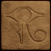
The all-new Command Collection from Enterprise. Re-imagines the famous starship in the style of a 1960s magazine ad. View others in this series!PRINT AVAILABLE NOW!
Related content


Comments: 48


The spinning tape units totally crack me up. You have totally got to add the computer console...www.columbia.edu/cu/computingh…
 (Smile)")
👍: 0 ⏩: 1

HOLY CRAP that's a lot of buttons. Saving that in my massive reference database.
👍: 0 ⏩: 1
Actually most of those are lights. Below them are lots of switches, and just a few knobs and buttons. Oh, and a few more lights.
👍: 0 ⏩: 0


Words fail me... this is so amazing it's criminal. I want to live on that Enterprise.
👍: 0 ⏩: 0

I continue to be amazed at the creative minds here on dA.
I would never have gotten the idea to do Starship Enterprise's bridge in Mid-Century. mattwileyart how did you get the idea to do this/
👍: 0 ⏩: 0

I can see old Jim Kirk lounging in the center chair sipping a clean martini, smoking a Lucky Strike, and eyeballing Uhura's derriere.
This truly evokes the time period and its media. Nice job.
👍: 0 ⏩: 0

I dig your design. I was jokingly suggesting it should be featured on Home & Garden TV.
👍: 0 ⏩: 0

Absolutely love it. Imaginative and well executed.
👍: 0 ⏩: 0


")
Nuclear-Fridge [2013-04-30 10:20:04 +0000 UTC]
"Shmaltz"... That's the one thing that's missing. The voiceover and the lounge-session soundtrack for the advertisement before the main feature...
👍: 0 ⏩: 0


I'm sorry TheAtomcDog, I'm going to have to disagree with you. The best thing about this image is Kirk hitting on the girl in the turbolift![link]
👍: 0 ⏩: 0

The best thing about this mini-series is the text. Our Host certainly studied the advertsiting language of the period to lay on he saleman's shmaltz as well as he has.
Bonus points for the Asian-inspired grille at the entrance--complete with opaque fill-- and the wonderful reel-to-reel magnetic tape readers.
The knee-length, black skirts are actually somewhat conservative.
Also, the Enterprise emblem Our Host devised is quite invocative of stuff like this:
[link]
Again, Our Host knew their shit.
👍: 0 ⏩: 1
You are right on target on each point. I also thought the black skirts were the one thing that was off in this wonderful illustration.
👍: 0 ⏩: 0

I've been sitting back looking at this piece as something seemed familiar. The it came to me... Star Trek by Irwin Allen.
👍: 0 ⏩: 1
Oh wow. I could totally see that.
👍: 0 ⏩: 1
Now I'm wondering what the Enterprise would have looked like if he were the executive producer?
👍: 0 ⏩: 1
I imagine they'd have a cardboard robot and a creepy old man stalking a child. And more sparklers! They'd still do the camera tilting when the ship got hit.
👍: 0 ⏩: 1
I agree, it's a scary thought.
👍: 0 ⏩: 0

There is nothing about this that I don't like. It is retro perfection, and my hat is off to you. This is utterly amazing.
👍: 0 ⏩: 0


ahaha this is rich! i know this type of add, this is classy sir!
👍: 0 ⏩: 0

This is brilliant! I'm buying a copy for my office at work.
👍: 0 ⏩: 0

Don Draper, captain of the groovy ship Enterprise.
👍: 0 ⏩: 0


Love this! It really is spot on. Brings me back to my very early childhood, watching Star Trek, Lost in Space and playing with my Major Matt Mason dol ... <*erm*> ... "Action Figures."
👍: 0 ⏩: 0

I LOVE this. Retro style is so cool. can't wait to see more. The captain has real retro style
👍: 0 ⏩: 0

This is not wrong! I can actually see this - strange, this reminds me of UFO, and even the Prisoner!
And lets be honest - that is a killer command chair!
👍: 0 ⏩: 0
Love the '60s deco look. The reel to reels is a nice touch.
👍: 0 ⏩: 0

One guy, three girls and one large chair - I like where this is going...
👍: 0 ⏩: 0


Missed the lava lamp
The Hi Fi
and the stack of Esquire & Playboy on Kirk's seat
👍: 0 ⏩: 0

Oh man, only five comments?? This is BRILLIANT stuff, right down to the mod "Enterprise" logo. Plus it looks a lot more like the bridges we used to try and create in friend's basements  (Wink)")
👍: 0 ⏩: 1


Love it! I especially like the attitude of the captain in the lift
👍: 0 ⏩: 0


haha! That's perfect! Done exactly in that retro style! awesome!
👍: 0 ⏩: 0