HOME | DD
 MelonLogic — A Heart's Wreath
by-nc-nd
MelonLogic — A Heart's Wreath
by-nc-nd
Published: 2007-03-07 21:23:35 +0000 UTC; Views: 2015; Favourites: 44; Downloads: 60
Redirect to original
Description
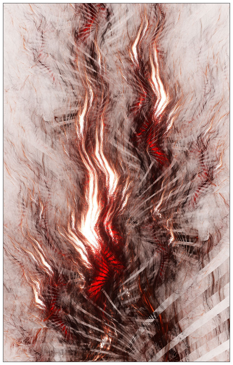
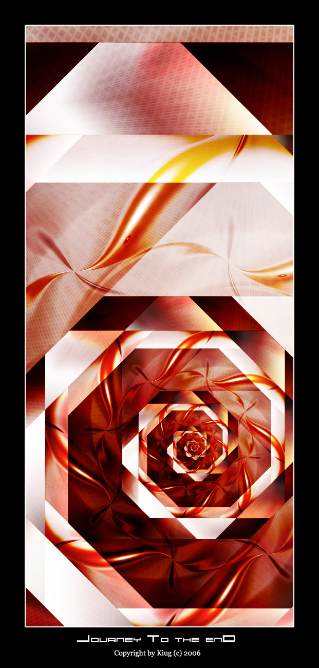
"The flame of anger, bright and brief, sharpens the barb of love."Apophysis || Full view recommended for detail
No postwork excluding the border.
Related content


Comments: 43

Your Art has been featured in Fractal Styles - ABSTRACT News article, for your viewing pleasure >> [link]
Hope you like viewing it, as much as I liked writing it  (Wink)")
👍: 0 ⏩: 0


Hello! You have been featured in my Digital Delectables article which you can find by clicking this link.
Thank you for creating your wonderful artwork.

👍: 0 ⏩: 1

Thank you kindly, great honor, great features.
👍: 0 ⏩: 0


Fan the flame

👍: 0 ⏩: 1
I wanted to get the effect of a furnace or blackened parts. I already had high density in the flames and worked for the opposite in that area.
Thanks ID for commenting.
👍: 0 ⏩: 0


 (Smile)")

Expresses the flash of fury that can make or break a emotional connection. The "clearing of the air" so to speak or a controlled burn to get rid of junk that stops growth of things planted. Quick, sharp, and shattering.
I do have a problem with the fan in the red heart of the flame. The black seems too intense and eye grabbing, kinda gets stuck there instead continuing to move on through the picture. Of course this is also one of those things that you have to "back up" and look at. It just maybe the closeness of the large view, you don't have this problem in the thumb.
As always...IHMO only.
👍: 0 ⏩: 1

You aren't expressing it well enough. Use color better; make it more vibrant, with less distraction (I don't like the bottom, but then I almost always prefer subtle use of fan versus how it affects the flame as it does at the bottom...you know this already).
👍: 0 ⏩: 1
More contrast, less fan?
I would be afraid the color would be overbearing doing so.
👍: 0 ⏩: 0


You hardly ever see fan2 used heavily anymore. ")
👍: 0 ⏩: 2
I like fan, It can be used as a great offset or texture.
👍: 0 ⏩: 0
That's because I told him fan was becoming too whored as a variation and he agreed many, many moons ago : )
👍: 0 ⏩: 1
Are you saying I was the one who whored it and since i stopped creating you dont see it as much
And for the record you want to hump fan as much as I do on a regular basis.
👍: 0 ⏩: 0

You're welcome (that was a really bad advanced critique I know, I'm sorry!)
👍: 0 ⏩: 1


This one reminds me a bit of your Electrolier. I can't say I like it though, to be honest. Don't take it bad ")
But in a way, it's a typical MelonLogic-fractal due to the nice and subtle use of the fan-variation. Well, I guess I don't like flamy fractals in general...
👍: 0 ⏩: 1
I Can't sayI see the Electrolier resemblence. I won't lie I do like working with fan and waves.
Thank you for the observation, I want to be anything but typical. My main concern was portraying emotion, but I put a high value on originality and quality as well. As a growing artist, you have to re invent yourself in order not to go stale.
I have to say it is my favorite, maybe that is why its melonlogic'esqe.
👍: 0 ⏩: 1
Well, it made me think of Electrolier because of the texture (parts of it) and the image's motion going upwards.
And I know you don't like to be typical, but you gotta admit that there are pieces in your gallery that are different from anything else around. Call it typical or call it unique, either way, I meant it as a good thing
👍: 0 ⏩: 1
Trying is the first step and I will always do that. Thank you for the honest opinion. This is what helps, it lets me know what I am not thinking about when I create.
👍: 0 ⏩: 0


It is a little bit "featehry" looking ... but still great, man!
👍: 0 ⏩: 1
Feathery as opposed to flamey? And i am assuming your talking about the flame like shapes?
👍: 0 ⏩: 1
Yes, sort of ... when I look at it I see feathers in the flame-like shapes ...
👍: 0 ⏩: 1
Understand, I thought it gave them more life/motion be adding movement. Character.
👍: 0 ⏩: 0

Woah man! I don't know what I was expecting when I read the title...but it wasn't this! This is awesome! I love it!
👍: 0 ⏩: 1

Fantastic. Love the emotion that comes from this.

👍: 0 ⏩: 1
One of the most important parts of this piece for me.
👍: 0 ⏩: 0
