HOME | DD
 mibi —
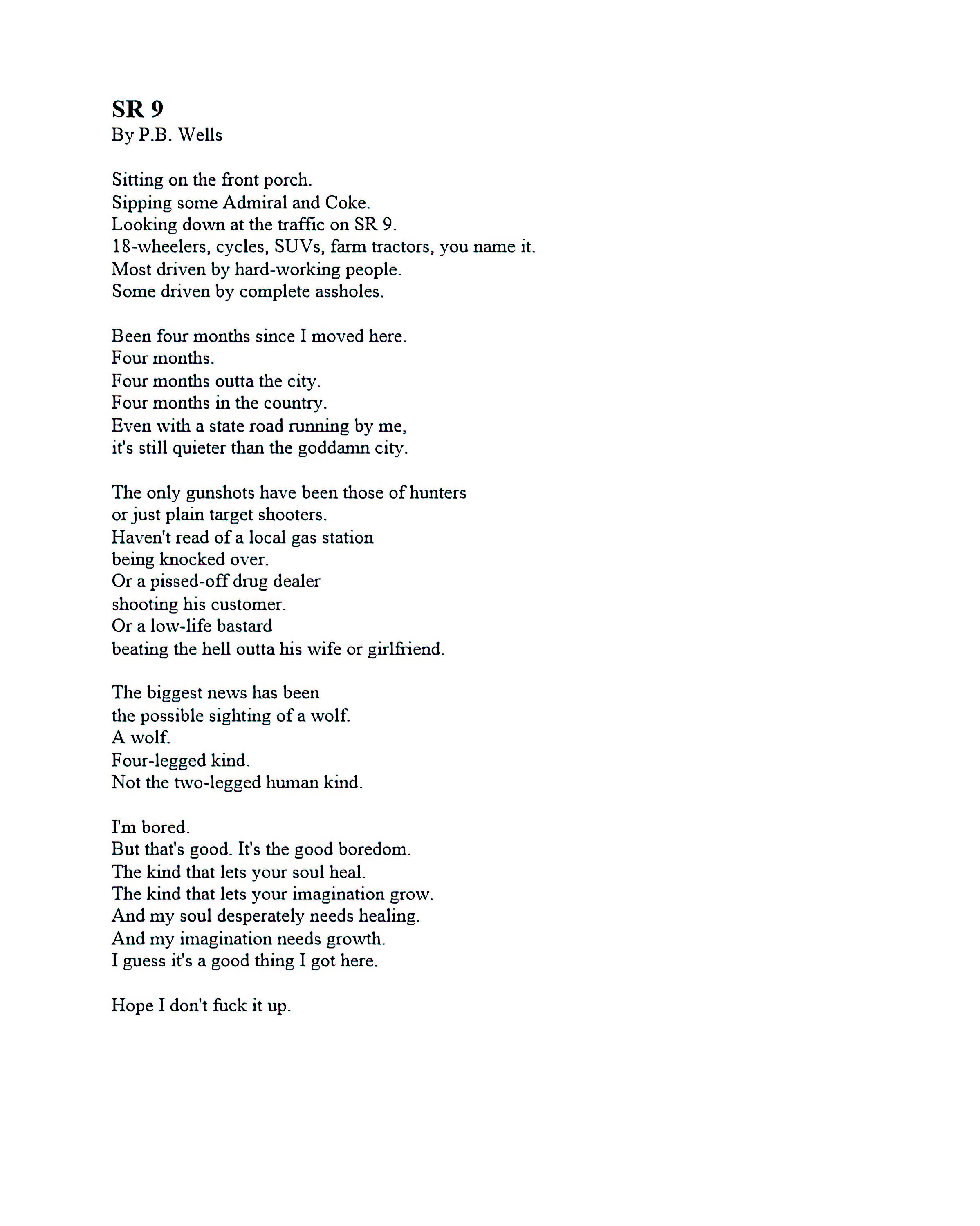
The Last Dissection
mibi —
The Last Dissection

Published: 2004-07-13 03:59:31 +0000 UTC; Views: 29043; Favourites: 511; Downloads: 8576
Redirect to original
Description
My best Dr. Frankenstien impression.A composite of engravings from Henry Gray's "Book of Human Anatomy" published in 1918.
A vein here...a couple of orifices there... and a few weeks later its finished.
parchment stock from ~temabinastock
thanks to *wicked-eve for the pointers and suggestions
thanks to !derivablezero for the drunken proofreading
Enjoy the high quality print. To view some of the actual size images, visit my journal. [link]
Related content


Comments: 291


that is eerily grotesque and yet i absolutely can not stop staring at it....absolutely amazin
👍: 0 ⏩: 0

great ar work!
the effect style and the details
just purrrfect
great jobs
👍: 0 ⏩: 0

")

Wow... Is all I have to say
I do love the analysis and notes as to what is what. Very nice. Defiantly a 

👍: 0 ⏩: 0

WOW...not only is the picture awesome, your implications of the story behind it are fascinating.
👍: 0 ⏩: 0

everything about this makes it awesome, in every sense of the word
👍: 0 ⏩: 0


Damn... this thing is so horrifying... but yeah, that's what you wanted. o_o;;;;
👍: 0 ⏩: 0


I can honestly say that of all the deviations I've ever seen here, this is definitely one of my favourites. The anatomy is stunningly detailed and the notes you've added to it create a story that enhances the amazing factor greatly (if that sentence makes any discernible sense). Brilliant work. 

👍: 0 ⏩: 0

This is magnificant. The anatomy and composition of the beast seems completely unreal in the most realistic way I've ever seen. It's just....beautieful.
👍: 0 ⏩: 0


First off, you have my huge applause for creating such a well-thought out and amazingly original concept and then carrying it out to this extent. There's a few things that bother me, though, and I'll try to point them out at least somewhat constructively.
First off, the left edge of the stock photo you used looks like it wasn't meant to be one sheet of paper, but a stack of paper with one main sheet on top. This would have been fine, save the fact that the text goes onto the other paper at one point, and the burn't edge doesn't really make sense. It's not that apperent at first glance, though. I just think it might look a little more realistic if that problem wasn't there...
Aside from that, the writing looks really mechanical and font-ish in a few places. It's a good font for the project, but a bit of custom erasing on some of the letters would have made them look less monotonous.
And you missed an 's' in the word 'dissection' somewhere in the bottom paragraph. It kind of adds a bit of spur-of-the-moment written feel to this, though, and I think that's what you were going for.
Another thing that bothers me a bit is the repeated image near the lover right hand corner. I don't know what it is, but it's goldish. There's two of them and one's just rotated a bit...if it was edited or altered in some way that wouldn't make them so identical it might have looked a bit better as well. Also, the left-hand one of these two's attaching cord-thing looks fairly un-attached to the main body, if that makes sense.
Awesome, awesome, awesome, awesome work though. Please don't take this as derogatory, because I like tearing art apart when it's worty of being torn apart. Art that fits that description, like this, I find maybe once every month and a half. I browse about two hundred pictures a day, so that's saying a lot (at least for me).
I hope you don't mind me leaving such a long comment on your work, and I apoligise if I've offended you in any way o.o...
(apoligising in advance if this is a double post, my internet screwed itself the first time I tried to submit.)
👍: 0 ⏩: 1

Thanks for the contructive criticism... its always apreciated...
i agree about the paper... when i had the orignal stock of the parchment it didnt occur to be that it could have been a stack of pages... it looks more like the binding of a book.... but now i can clearly see it can be interpreted as a stack of paper... and i also agree about the fontish look of the writing.. i too am peeved with the over use of hand writing fonts... however... handwriting (penmanship)of such uniform perfection was often the rule than the exception a hundred years ago...also you can see the full detail on this version but i used sevel brushes to break up the uniformity of the writing... you might be able to see a better version in my journal... but its a good suggestion, definetly something for next time.... and i think your talking about the "knee" of the beast... yes i should probably change on of those up a bit...
thanks for the good suggest... i will definetly put them to use if i decide to have another go at monter building
thanks again.. and i fixed the typo...
 (Wink)")
👍: 0 ⏩: 0


this is very very cool, +fav
btw... i spotted a spell error
")
👍: 0 ⏩: 0

Excellent Work Mr. Mibi 
==E-47==

👍: 0 ⏩: 0

Did you spell "disection" wrong in the last paragraph, with the last words, 6th line down?
>_> Oh well it adds realism anyway. What kind of doctor doesn't make mistakes?
👍: 0 ⏩: 1
haha.. thats very true.... but i fixed it anyways... thanks for te heads up tho
👍: 0 ⏩: 1
No problem
I thought it might've been intentional, but I had to post because I notice those small errors that normally not many people see a lot of times and I just HAVE to tell.
👍: 0 ⏩: 0


are u a doctor? medical student...
in case if u are....u just found a buddy as I am one
👍: 0 ⏩: 0

beautiful. eerie and yet fascinating. i love it. the words make it seem menacing and almost sad. i love it more. great work!
i also have Gray's Anatomy at my house... and Frankenstein.
👍: 0 ⏩: 0

Glooooomy... but what a cool idea, and what great execution! This is rather smashing...
👍: 0 ⏩: 0


awesome!!! The drawing stands out a little bit too much to really look like it has been drawn on that parchment... but just a little bit
what font did you use for that?
👍: 0 ⏩: 1
yes i agree... i upped the contrast of the beast a little before i finished... it does stand out more, but i suppose its atrade off between detail and realism.. thanks tho... ill post the font in my journal later... since everyone seems to want to know.
👍: 0 ⏩: 0

O_O OMG... theres so much detail!! O_O th...this is great!!! 
👍: 0 ⏩: 0


this is an excellent deviation and definitely deserving of the daily deviation. really well thought out and very creative. it looks amazing. especially the burn marks and stuff around the borders. great job!
👍: 0 ⏩: 0


Maybe it's short comment and I'm repeating others, but... wow... 
 (Smile)")
👍: 0 ⏩: 0

*shivers* omfg, this is awesome. Like, really. I mean, the parchment looks so real, and...gosh! i cant talk...xX;; *gulps* my art looks like CRAP now...
👍: 0 ⏩: 0

lacerating? what the heck? laceration is a term used for a cut, not for "to cut"...isn't it? i like the image, but the descriptions are stretching...a better knowledge of medical terminology woulda helped, i think...
👍: 0 ⏩: 1
lacerating is a transient verb. [link]
and i suppose more medical termology would make it more authentic. thanks for the suggestion.
👍: 0 ⏩: 1
yeah..i dunno, lacerating just sounded weird to me...but yeah, good art though
👍: 0 ⏩: 0


I've got nothing useful to say... but that's crazy. ")

👍: 0 ⏩: 0

I.....i, can't, speak. This, is, wow. Okay, talk about artwork! This is enough to send chills down my spine. Really, it's a great piece. The best i've seen so far, the observations made and stuff written down is really creative. It almost seems real. Although, a lot of things about it make me want to wish that it isn't. Haha. Excellent drawing and everything!
👍: 0 ⏩: 0


mmmmmm i ereally do like this! where did the font come from though?
👍: 0 ⏩: 0

For a long time I wanted to study forensic medicine, in particular forensic pathology. This piece certainly reminded me of all the reasons why I looked to pursue it. Thanks.
👍: 0 ⏩: 0

a-fuckin-mazing. so beautiful and complex! bravo, you should be proud.
👍: 0 ⏩: 0

Very disturbing. Not so much the diagram but the writng. very good work.
👍: 0 ⏩: 0

wow thats amazing how u drew it and tied it together with the wording...and its one of the most twisted images i have ever seen
👍: 0 ⏩: 0

<= Prev | | Next =>