HOME | DD
 MichaelFaber — The Julian Commander

Published: 2006-05-03 02:02:32 +0000 UTC; Views: 5531; Favourites: 50; Downloads: 1030
Redirect to original
Description
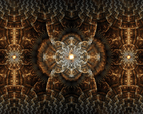
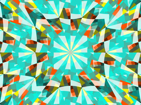
Apophysis 2.04 beta and The Gimp (lighting and title)Thanks for looking! I left a nice area for people who like their icons!
EDIT: I fixed up the title because there was too much blur.
Related content
Comments: 67

Nice and simple, yet large and impossing in it's ordered chaos; just like a Commander should be. Excellent job.
👍: 0 ⏩: 0

oh kick arse! this is so good! i want to do a fractal like this for a stock bg but i can't do it. 
👍: 0 ⏩: 0

It looks like a glass ballroom ceiling opening up into the skies...I don't know how, but your works are so inspiring that they make me imagine these strange interpretations. Doesn't happen to me often
👍: 0 ⏩: 1


👍: 0 ⏩: 0

Man you do some really great art. the detail is blinding in it's completeness.
👍: 0 ⏩: 1

Thanks for the great complement!
👍: 0 ⏩: 0

no prob .. its a pretty nice piece ..
.
👍: 0 ⏩: 0

Amazing!
The soft Apophysis is so mysterious for me and such creation is a new enigma !
👍: 0 ⏩: 0

. o wow u crazy . it looks magnificent. if only one could transfer that onto glass.
👍: 0 ⏩: 1

Yup, thats me
Thanks for the fav!
👍: 0 ⏩: 0

An astounding piece of flame art. Absolutely wonderful!
👍: 0 ⏩: 1

Thanks for the 
👍: 0 ⏩: 0

thank you! i'm really glad you like it!
👍: 0 ⏩: 0

icons suck, but you are very welcome!
👍: 0 ⏩: 0

The glow on the text is a bit much. But, it takes nothing away from that most amazing fractal. 
👍: 0 ⏩: 1

yeah, i think i will fix up the text. i hope i saved it before i added the title
👍: 0 ⏩: 1

Even if you didn't save it... shouldn't be too hard to cover it, and start a fresh font for it. 
👍: 0 ⏩: 1

i didn't save it after i did the lighting and cropping. all i have is the original png.
👍: 0 ⏩: 1

Nah, what I meant was take the jpg, and use the eyedropper tool to match the background, then just cover it and re-do the text only.
👍: 0 ⏩: 2

Ok. i fixed it! 
Thanks for taking the time to help me out!
👍: 0 ⏩: 1

Sweet. Looks perfect. Before it was kinda hard to see the definitions of each letter's edge. Now it is crisp enough for the eye to view easily.
👍: 0 ⏩: 1

i have a higher resolution png of it, but there is blue behind the text if you look carefully. i am not very good with editing. i'll have to crop and redo the post work from the original file. i'll do it some time soon
👍: 0 ⏩: 0

Damn, i fall behind on your comments and i come back to this?! XD
Super Suprb, michael. Im going to somehow get you to teach me this stuff XD
👍: 0 ⏩: 1

Thanks for the fav! I'm glad you like it!
The fun with apophysis is learning, but feel free to ask questions
👍: 0 ⏩: 0

Superb work (again! 
👍: 0 ⏩: 1

Wow!! very nice work!! (i wonder how u do the lighting so well with gimp.... can u send me a note on how u did it? pls? ^^)
👍: 0 ⏩: 1

i used the 'curves' tool. there isn't much post work on this flame though. Thanks for the
👍: 0 ⏩: 1

Ty ill try that tool out, and no problem
👍: 0 ⏩: 0


👍: 0 ⏩: 1

You welcome Michael
👍: 0 ⏩: 0
| Next =>
