HOME | DD
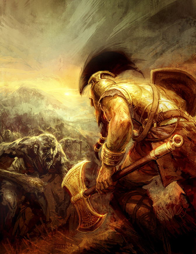
 michalivan — The Axe of Bronze
Published: 2008-06-13 22:32:13 +0000 UTC; Views: 69678; Favourites: 2204; Downloads: 2960
Redirect to original
Description
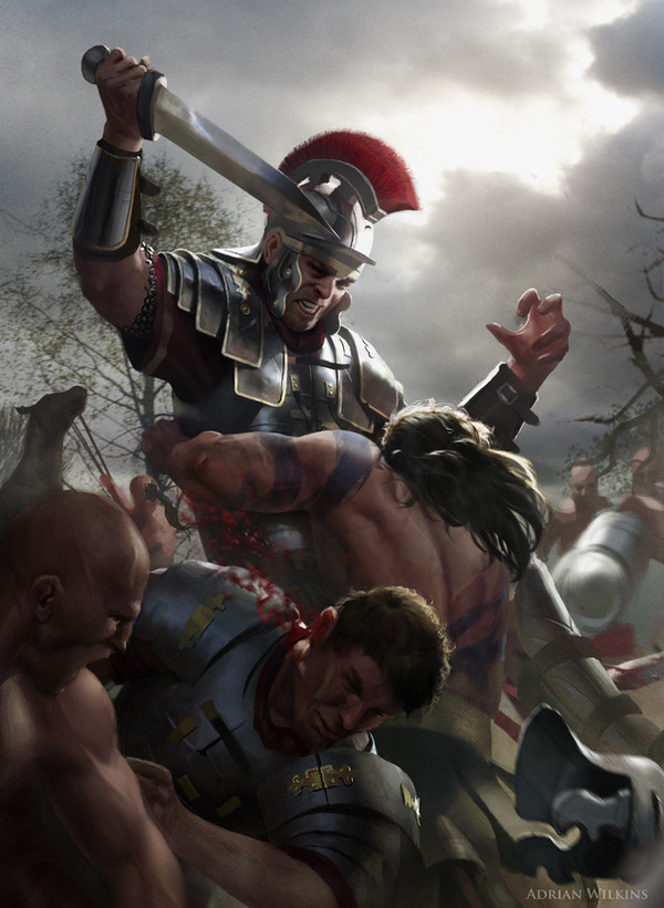
This is a color illustration for a fantasy story with characters from Greek mythology. It will be published in local sci-fi/fantasy mag. It was a faster work than my usual cover stuff.Made from scratch in Photoshop CS3
some B&W ilustrations for this story can be found here:
[link]
[link]
Related content


Comments: 152


Awesome. The light is so hot in this piece. Great tension in the characters & composition.
👍: 0 ⏩: 0

Brilliant! The colors and the textures you used are top notch!
👍: 0 ⏩: 0

very good lightening.i like the no scrupulous touch,make the pic full of motion! a little more shading and certain detail on the first goblin/is a goblin ,right?/ maybe will do good,but as a hole is impressive
👍: 0 ⏩: 0

composition, color balance, textures, dynamics...amazing...spechless...you rule
👍: 0 ⏩: 0

Can I put little remark, to not to talk trivial "Wow this is cool!" ?
So: His left hand shines at the same way as armour. That's all.
...forgotten to say: Wow this is cool work!!! ")
 (Wink)")
👍: 0 ⏩: 0

Definitely worth the waiting! Gorgeous lighting and awesome brush strokes 

👍: 0 ⏩: 0


velmi pekne...paci sa mi ten farebny rozdiel medzi "hrdinom"a tou hordou ale osobne by som bol radsej v tej horde a vlastnil kyjak nez tu bronzovu sekeru...
👍: 0 ⏩: 0

Quite stylish... Looks like oil painting.
Might be unexpected, but my favourite part is the twilight horizon, which deepens the picture a lot. I remain unsure about the lighting on the warrior, but all in all, it's fine.
👍: 0 ⏩: 0

... as always great and cool style of painting ...
Regards
👍: 0 ⏩: 0


This is a really great piece of art. Got to fav this!
👍: 0 ⏩: 0

")

your a God....a pure 👍: 0 ⏩: 0
are you registered at conceptart.org?


waw, good camera angle~
u did this one faster than usual ")
from what I see, that detail on that arm with the axe is already time-consuming, if it were me Oo
👍: 0 ⏩: 0

great! I like the shine of metal in this pic and the feeling of motion, it's awesome
overall it looks quite sketchy, do they really put it into a cover?
👍: 0 ⏩: 1

thanks! no it's not a cover it's just interior illustration for a mag, so it's ok when it's sketchy
👍: 0 ⏩: 1
ah, then I understand
well, waiting for more stuff from you
👍: 0 ⏩: 0
diky, som rad ze sa ti to paci! tablet mam intuos 2 (A4) taky uz postarsi, je hnusne fijalovy a pero sa mi uz rozpadava, ale inac stale funguje super
👍: 0 ⏩: 1

hehe ze fialovy, tyvole
👍: 0 ⏩: 0
jaky mas tablet? mne predvcerom akurat dosiel novy Intuosek 3 A5 wide special edition.....akoze je tam airbrush, ale pekna blbost to je...inac super
👍: 0 ⏩: 0

sic shit, reminds me of the band 3 inches of blood, their Advance and Vanquish cover art is somewhat similar to this.
👍: 0 ⏩: 0


beautiful : >
it's very dynamic, you can picture in your mind the guy's next move
👍: 0 ⏩: 0


Your brushstroke's superb, what kind are of brush are you using? Great work!
👍: 0 ⏩: 1
thanks a lot! I use my own custom brushes. some of them are here: [link]
👍: 0 ⏩: 1
Wow! Thank you so much! That's very kind of you. Off to try them them ^______^
👍: 0 ⏩: 0


I love the textures used and the style of this painting. Really painterly but it works for it and give the painting the ominous mood its supposed to have. Love it. 

👍: 0 ⏩: 1


so what method did you use for this?.. I'm pretty good with photoshop but I wouldn't even know where to start with something like this
👍: 0 ⏩: 1
I start with blocking very basick shapes and than adding detail. at every stage I must feel comfortable with it. when I don't I stay at that stage and continue tu change it withot adding detail untill I can feel it again.
You can check how I do my works in this tut [link]
👍: 0 ⏩: 0

Kroch kroch, I love the shiny bronze here  (Smile)")
👍: 0 ⏩: 0

Looks like spedpaint, but it's great.
👍: 0 ⏩: 0
<= Prev | | Next =>