HOME | DD
 michalivan — sandstorm
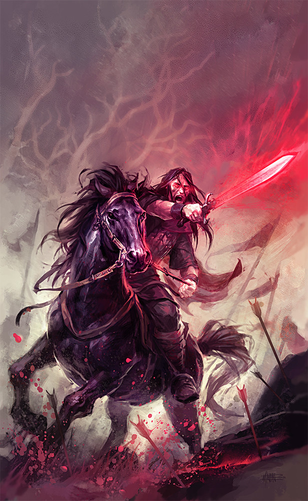

Published: 2005-09-15 23:12:54 +0000 UTC; Views: 33229; Favourites: 841; Downloads: 1332
Redirect to original
Description
This is my new work - again cover for a fantasy book taking place on desert in kind of arabian world. The motive should be a horse man escaping from sand storm. It's quite hard for me to draw horses so I was trying to improve a little bit. Comments and crits are very welcome. I may be correcting some details (now I'm kind of fed up with it, but I wanted to finished it today)all Photoshop
Related content


Comments: 55


I feel like I'm picking everything from your gallery. Horse anatomy is a bit of a bugger especially when they're in motion but you've done a very good job at it. The sandstorm is incredible. Do you have a technique or just have a go and see how it turns out?
👍: 0 ⏩: 0


Definitely impressive. I don't know if I could do better! I don't think so. My passion lies with warrior cats, but how the determination has been captured on both horse and rider's face is ASTOUNDING!!!
👍: 0 ⏩: 0

it's looking like Arabian Knight....
....______[link]
👍: 0 ⏩: 0

I'm amazed by the sand storm ! Soooo Gorgeous... everything else too but the storm !!!! just WOW !!!
👍: 0 ⏩: 0


This is very nice, I love the idea and influence behind it; the art style perfectly suits and portrays the main theme of the image.
👍: 0 ⏩: 0


You're work is amazing! I really envy you for getting the chanse to illustrate so many books. There is one major thing that I'd like to point out tho. And that is that the legs of the horse is positioned wrong. This might not be that important, because most people won't realize it just by looking at it, but for someone who knows how a horse moves it looks kindof odd.
Anyways... You're work really is fantastic!
👍: 0 ⏩: 0


I really like it, the horse is great! The only things I would say would be that the face and nose is maybe curved down just a TINY bit too much for an Arabian, and to show speed a little more, stretch the head and neck forwards. Likewise, the forelegs could stretch forward also, just to show how the horse is really giving all it's got. If you wanted to get fancy, you could show just a snip of white around the rims of the eyes, which would give the horse a wild, frighted look.
On the whole, it's great, and there are really very few details to fix!
👍: 0 ⏩: 0


The work on the sand is awesome! A really cool horse, and a 
👍: 0 ⏩: 0


👍: 0 ⏩: 0


you are a great painter.. i love your work.. you are my new fav. artist.
i'll see your work so much i can..
really great work, i'll send a massege to imaginefx and tell them about you, if it's ok
 (Wink)")
👍: 0 ⏩: 0

Lower the horses head and neck - stretch them out to give a greater sense of speed and urgency. Roll the horses lips back to show he's giving all he's got. Show his breath and the whites of his eyes. Lower the rider tighter over the horses back to again show the speed needed to outrun the storm.
Suggestions only. Your work is excellent.
👍: 0 ⏩: 0


this looks pretty awesome. drawing the horse went very well, imho.
but the sand on the ground looks a little bit like orange water to me ...
👍: 0 ⏩: 0


You captured the colors of the desert. The horserider's face looks surreal.. fearless & not afraid to die. Although the sandstorms may have been a little too light. Whenever i see the composition.. the rider stands out compared to the sandstorm. You could have made the sandstorm bigger, dustier & angrier. (and inserted like smokish figures and stuff) But overall, you did a fine work here. The horse may not have been anotomically perfect, but nonetheless i know u kud rapidly progress in it. Keep up the good work.
👍: 0 ⏩: 1

thanks very much for the comment and the advises/crits! I guess that you perfectly selected the main probs of this artwork  (Smile)")
👍: 0 ⏩: 0

Oh man! This is just stunning piece of work...GREAT skill in every aspect!
Keep on uploading your kickass work!

👍: 0 ⏩: 0

I really hope you keep extending a reputation for such beautiful imagery and get paid accordingly in the coming years. This is wonderful and so very detailed. I'd love to have heard what the author or whoever it was you spoke with told you in relation to the idea of what this would look like before you created it. It's amazing the difference it makes having free reign as opposed to specific details. The entire conceptual design for the two characters is amazingly eye-pleasing in and of itself, let alone the environment and event taking place.
As far as C&C, I have minute things in mind and please know that they are only things I notice and nothing I'm negatively criticizing this wonderful work for. I would suggest that the dust cloud in the background come out further to the left to give it a bit more depth/action and better relation to angle or point of view. You could also bring a bit more of the more granulated sand into the foreground under where the front hoves had just landed to show where they had just kicked up from as well to give it a touch more "timeline" rather than an event that just began out of thin air. The horse's right front shoe actually looks like a laced up shoe to me and the sand "blended" in with the shoe itself looks out of place. Just under the dust cloud to the far right looks a little unfinished also.
Well, that's more than I've written in any comment so I'll shut up now and just start staring. Thanks as always for posting your talents!!!
👍: 0 ⏩: 0

The horse looks pretty damn good to me, dude.
And the sandstorm looks fantastic!
- ][ocus
👍: 0 ⏩: 0

Perzo, again i must bow before your skills, U are The Man! But actually, I would make the head of da horse bigger, not smaller. And the guy is a little bit smaller, then usually guys on big mad horses in deserts are. The mouth of the horse is extraordinary good, better then from Géricault and the whole picture is really good. It has got this sense of quality, it really reminds me too of some classical painting than of some average fantasy painting. The storm left to the horse is not as good as the storm behind the rider, because it reminds me of some locomotive made dust and vapour. I really like the exquisite minimalistic use of textures of sand in the right lower corner. If not for some details and the trace of computer brushes, i could really mistake it for something classical, not for computer made fantasy art from 2005. I do not like the eye of the horse, it looks a little bit like Bambis eyes. the whole pic is great, the horsemouth is excellent. i would just make the man bigger, the horse head bigger, the horse neck longer and maybe check the movement of the horse. the movement is ok, it looks reallistic and logical, but sometimes even the reality is hard to believe, for example some photos do not look real but are real, in this case this real pose of the running horse is just a liiiiitle bit unreal, it could be more hectical, dynamic. Keep on amazing us, man.
👍: 0 ⏩: 0


Looks above-the norm as book covers go - in fact, it reminds me more of a historical 18th-century romantic painting.
👍: 0 ⏩: 0

That is very beautiful. You have captured the moment perfectly. Great work
👍: 0 ⏩: 0

You are a master! The use of colours are amazing.
👍: 0 ⏩: 1

podla mna je to super kresba, odo mna kritiku na toto necakaj
👍: 0 ⏩: 1
diky moc, mne tiez kone moc nejdu - dost som sa s tymto natrapil
👍: 0 ⏩: 1

Your style is truly beautiful, I really love how you managed the dust and all the materic sensation about the sand.
I think the horse is really good, I'm not a specialist. Maybe the rider is a bit too small as proportions, head to head, but nothing that may be so evident. And (another maybe) the neck of the horse is a bit to straight and thin, usually is more curved and if stretched like that there's more muscle. But, again, nothing that annoys the image, and it depends from horse to horse ")
Beautiful and balanced already, get paid well! 
ana
👍: 0 ⏩: 0

came out really good!
nothing to complain about ;]
👍: 0 ⏩: 0


Very nice brushing!
and the details are just impeccable!
👍: 0 ⏩: 0

nice work
Maybe raise the right leg of the horse higher out front and strech out the neck & head more to give it more of a sense of drama of urgency of running away from the storm
👍: 0 ⏩: 0


Thats looking excellent. Great composition and very nice sense of movement in the pice.
Keep it up
👍: 0 ⏩: 0
| Next =>