HOME | DD
 mikiko-art — Lettering Tutorial

Published: 2013-12-15 20:20:43 +0000 UTC; Views: 125458; Favourites: 6288; Downloads: 1414
Redirect to original
Description
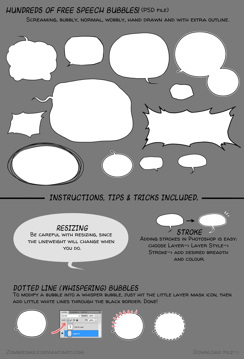
[Update] Since people keep asking "why not use comic sans?", its universally known as a font that mainly amateurs use. (The image of home made flyers comes to mind) It's the Crocs of the design world, and if you want to be taken more seriously, it is advised to use a different font.As promised! This is how I letter my work. Hope this is helpful to someone!
Here's some more useful links:
•Handlettering tutorial by MyNameIsMad
•Download 300 finished speech bubbles
Related content


Comments: 238

This is very useful, thank you! ^^
👍: 0 ⏩: 0


Can someone explain to me, why comic sans is so damn wrong thing? I see it is ugly, but hey, it is ugly for me and I can feel that there is a group of people who think otherwise.
The question is: is there any objective reason why not to use it?
👍: 0 ⏩: 2

Mainly the reason is that is it clumsy and amateurish. It really is about what impression you want to make.
👍: 0 ⏩: 0

Comic Sans is a bad font because it is ugly when not scaled down to really small sizes, like 5 pt. It was created for that sole purpose - to be seen when scaled down to such sizes (You can compare it right now, open up a Word document and write something in Comic Sans and in Times New Roman side by side, and resize them to 5 pt. Comic Sans is easy to read, while TNR is not. Otherwise the font is easy to read for autists and old people. It's really not that bad of a font, except it is really distant and by graphic design it's really not that good. Also, the font, when created, was so popular that everyone, literally everyone used it EVERYWHERE. Even in business, so it got old pretty quickly. All in all, Comic Sans, Papyrus, The Jokerman are just objectively really ugly fonts that some people still overuse.
👍: 0 ⏩: 0


Great tutorial! Thanks for posting (:
👍: 0 ⏩: 1
 (Smile)")

Seriously... i can't wait for your crash'n burn comic ! I want it so much *_* !
👍: 0 ⏩: 0


Thank you for the tutorial, most of what you say here is equally as useful for using speech bubbles by hand as well as on the computer
👍: 0 ⏩: 0

Slightly off topic, but it seems as good a time as any:
I agree with your statement about the danger of using Japanese sound effects when not fluent in the language, but I have noticed that English is sometimes lacking in a diversity of sound effect options by comparison. For instance, that subtle zazaan kind of noise that is used to mimic waves, which doesn't have a particularly similar option. Or another example, the traditional POW punches or RATTATATTAT gun noises tend to come across as a bit cheesy (for those of us who immediately think Adam West Batman, at least) or over-used. Do you have any suggestions for actual sound effect usage?
👍: 0 ⏩: 1
japanese as a language has a lot of onomatopoeia as vocabulary, and as such, there's just a larger range of them around, so yeah. I do get stuck looking for sound effects myself.
The trick is, I find, to just write what you hear. you imitate the noise you're going for, and try to write it in letters.
For example, a bass sound (since my comic is about musicians) can vary between Dmm, Dn, dun, vmm (mostly amp) and similar sounds for a low plucking noise.
👍: 0 ⏩: 1
Do you ever worry that the sound you are trying to convey won't come across to certain audiences?
👍: 0 ⏩: 1
yeah, it happens. especially cause I speak multiple languages and get confused about which one work best in which. :T
but you kinda just have to go and try I guess. I do have beta readers who let me know if stuff seems odd.
👍: 0 ⏩: 1
Thank god for beta readers, am I right?
And thank you very much for taking the time to answer my questions.
👍: 0 ⏩: 0

What's wrong with Comic Sans MS!
👍: 0 ⏩: 1
as ~FinoRaptor says, it's like sandals with socks: bad design choice, bad taste, amateurish.
👍: 0 ⏩: 1

you're welcome... *OOO* you mentioned me!
👍: 0 ⏩: 0
Comic Sans are like sandals with socks xD... THANKS!
👍: 0 ⏩: 1

Very helpful indeed. Gracias! X-D
👍: 0 ⏩: 1

Very useful!
👍: 0 ⏩: 1
all the oney I listed should be OK, I think. I got them off free websites.
👍: 0 ⏩: 1
alright, just want to be sure. ^^
Thanks!
👍: 0 ⏩: 0

eh? why is using comic sans a mistake?
👍: 0 ⏩: 2
it's like sandals with socks: bad design choice, bad taste, amateurish.
👍: 0 ⏩: 0

internet seems to hate comic sans xD
👍: 0 ⏩: 0


Thank you so much! You're so helpful!
👍: 0 ⏩: 1
glad to be of help.. :3
👍: 0 ⏩: 0

Thank you, that was really helpful...
")
👍: 0 ⏩: 1

Aahh, strokes! I've been wondering how to add those white and black borders to things!
Thank you so much for this tutorial, it's very clear, helpful and concise. Wonderful work!
👍: 0 ⏩: 1
you can also add them by going into Edit-> stroke! and stack them soto speak. C:
no problem~ Glad it's helpful.
👍: 0 ⏩: 0

oooh yeah the japanese sound effects... ado sensei's phd was about their use in comics...
👍: 0 ⏩: 0

I use manga studio to create my comics but this is very helpful for me to use for photoshop!
I will totally come back to this!
thanks!
👍: 0 ⏩: 0

Hmmmmm do you have links to the external sites that host those fonts? I'm looking for them now for myself, but it could be something that people might like to get their hands on right away along with the speech bubbles and other resources that you have linked. Just a thought :3
👍: 0 ⏩: 1


This is absolutely extremelly usefull !!! thank you so much for sharing your precious advices *//u//* !!
👍: 0 ⏩: 1

Thank you so much! This is exactly what I was looking for.
👍: 0 ⏩: 1

Wow! I feel silly that I never thought to type text first, then draw the speech bubble around it! Ahaha!
Thank you for more useful tips!

👍: 0 ⏩: 1
not a problem. glad to be of help! ♥
👍: 0 ⏩: 0

having read through this, I'm wondering if you'll make a blush tutorial next
")
👍: 0 ⏩: 1
<= Prev | | Next =>