HOME | DD
 Mintoons — Paper Matt chapter 1 pg2
Published: 2010-06-29 05:09:43 +0000 UTC; Views: 1311; Favourites: 2; Downloads: 0
Redirect to original
Description
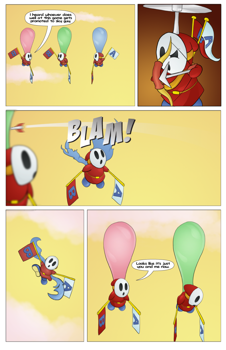
Finally the story continues....a little bit.Okay there was a lot of experimenting here. Firstly I exported from Photoshop, and then from Illustrator (instead of just importing the lettering into Photoshop like last time). This allowed more control over the size of the lettering, but I decided to go with a smaller font size this time (about 10pt). Maybe I should switch to a font that's actually designed for comics before it's too late. Hey Gorgeous (from kevinandamanda.com) just doesn't seem to have an appropriate amount of leading on it...and I have to keep crediting the source as stated in their agreement. Shame. It's the Paper Mario 2 dialogue font.
Anyway, first time doing sound effects in Illustrator, and also my first time using depth of field and motion blurs. Just in case you ask "why didn't you put a blur on the propeller and the falling shyguy?", well I tried it and it looked stupid, and the comic masters in the field say blurs should be used sparingly.
Does anybody know if png's are a lossy or lossless picture format? I thought they were lossless, but regardless every time you export them from an application (like from Photoshop and then from Illustrator) you would lose some of the picture quality.
Oh and as for the story, it is going somewhere, but you probably won't be able to see it until pg5.
Related content


Comments: 4


Thanks. I'm real slow at updating it.
👍: 0 ⏩: 0

Noooo poor blue shyguy! hehehe. I've never done much with depth of field or motion blurs, I should probably start trying to make a bit more sense of it, though. 8) It looks good what you've got here!
I don't know a great deal about illustrator, but I know you can really easily adjust the leading and kerning on fonts in photoshop (I'm only using CS3, though, I'm not sure if this is universal), among other really precise adustments you can make to text. You can access all the adjustment tools in the "character" tool window, and play around with everything from there. Hope this helps! ")
As far as I know .png's are lossless, but then again, I don't export back and fourth between photoshop and illustrator, so that might not be the case in this instance.
👍: 0 ⏩: 1
Thanks. You can also adjust leading in Illustrator, it's just the problem of having to adjust the leading every time and remembering what I adjusted it to.
I was using Illustrator because it seems to be how professionals letter comics, and I'd learned how to use it in digital design this semester.
👍: 0 ⏩: 0