HOME | DD
 MissDawn — Chess

Published: 2006-07-12 01:17:42 +0000 UTC; Views: 266; Favourites: 3; Downloads: 11
Redirect to original
Description
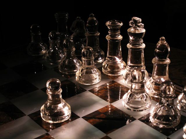
Glass chess setEdits: blue tint, contrast, crop
Please comment. I'd like to hear your feedback on the interpretation you have or what you like/dislike about this photo. Critiques are especially welcome, like on composition, color, lines, style, and grain. Thanks.
Related content


Comments: 19

 (Wink)")

This is an awesome shot. The reflection of the chess pieces add a nice effect. I think it would have been better with less grain, and if you had sharpened the image.
👍: 0 ⏩: 1

Yeah...I know. you're not the first to suggest that. I should redo it.
👍: 0 ⏩: 0

Exquisite (Smile)")

👍: 0 ⏩: 1
Thanks! An X-ray, huh? That's a pretty orgininal thought.
I'm glad you like this.

👍: 0 ⏩: 1
Just the first thing that came into my head when i saw it

👍: 0 ⏩: 1
I like that. It's the truest form of comment then...when its the first reaction.
👍: 0 ⏩: 1

it's a good idea and a very beautiful subject you used, but I don't like the execution here, to be honest. The shot is very grainy (iso 400 is somewhat high for a "studio" shot - as you can set the camera up on a tripod or any stable base try and use the lowest ISO possible) Color modifications often increase the grain and it's quite obvious here. The piece is also blurry, very much looks like an enlargement of a part of the original. And finally, I don't think think the tight crop suits the image, the figures need a bit of space to breathe...
So, if you still have that chessboard, retry this with lower iso or, if your camera's iso can't be changed, with more light
I think this is the worst critique i've given you so far, but i have to because I love the concept and know you can execute it better

👍: 0 ⏩: 1
Thanks so much for the critique! I need that. You know what, though? I put that darn set away yesterday...after it was sitting and making a mess for weeks. It just is tedious, so I procrastinated. And now I want to drag it out again...
Ha ha. Oh well, all artists must suffer, right?
I'll take heed to your suggestions. Thank you.
👍: 0 ⏩: 0

OOh, I really like this piece, though I wish it was centered more. makes me feel like I walked into another world, as if the chess set is larger than life and in front of a icey river.
👍: 0 ⏩: 1
Thanks so much. Good luck with that icy river and my giant chess pieces!!!
👍: 0 ⏩: 1
LOL no no no the knight will have to cross the icy river and climb the giant chess pieces to save the princess!
👍: 0 ⏩: 1
Ha ha!! I should try to do a piece like that. It'd be funny.
👍: 0 ⏩: 0

hmm. i'm not too sure that i like the blue tint, but that may be because i'm not exactly following the concept.
when i saw this i first thought of [link] except this is... different. it made me think that the chess pieces could symbolize people who have battles (because chess is a game) within themselves (because of the reflection).
but then i noticed the empty space on the right side of the photo. i don't know if that has anything to do with your concept. if it doesn't, i think i'd prefer that it be cropped out or filled with another chess piece.
i love that reflection though. alot.
and this makes me miss my boyfriend cuz he plays chess.
👍: 0 ⏩: 1
Thanks so much for taking the time to reply, by the way.
The concept here is kind of spiritual, I guess. That's why I used a blue tint. I wanted the pieces to have a sort of angelic, pure feeling, like ice. Hence, the cross piece is the central figure of attention. The horses are kind of guarding the two "angels" in the middle, like a king and queen. The reflection is religion and faith down below, on earth. Like humans only know a ghost, reflection, version of what truly is our God. The empty space is there because I think it represents our ability to fill in what we're unsure of.
A lot to interpret from a photo, and I didn't really realize the depth of this when I took it, I was just kind of trying to do the "angel/god and reflection to the people" concept. ANd when I cropped it, the idea of negative space and filling in what we don't know was great. I hope I have not confused you too much.
👍: 0 ⏩: 1
that is a very nice concept. i guess what's great about this piece is that it can be interpreted many ways. i like photos like that.
now that you've told me your concept, i think the blue is a good choice, but i'd like to see more intense whites. and maybe a less purpley blue. i think that would look beautiful.
👍: 0 ⏩: 1
Thanks. Maybe I will crop it, too. But I will definitely make it a cool blue with more intense white!!! Thanks so much.
👍: 0 ⏩: 0