HOME | DD
 MissDawn — Inadequate
Published: 2006-03-07 02:19:39 +0000 UTC; Views: 176; Favourites: 7; Downloads: 6
Redirect to original
Description
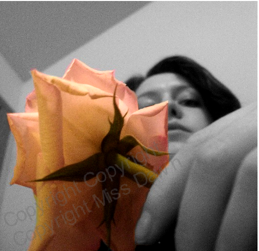
I got a rose for Valentine's Day from my boyfriend and I felt inadequate to its beauty. I felt I didn't deserve such a thing. So, I was just fiddling around with my camera and the flower and came up with this. I like how the angle of my ceiling contrasts the curves of the rose and my face.Related content


Comments: 9

beautiful photo... nice B&W and leaving the rose color is a great idea!

👍: 0 ⏩: 1

Thanks very much! And a fav! It's my lucky day.
 (Smile)")
👍: 0 ⏩: 0


Great choice of selective colouring, but I still think the more beautiful thing is behind it. Nice angle, too, by the way.
👍: 0 ⏩: 1
Aww. Thanks. 
👍: 0 ⏩: 0

I love the colors. It makes the rose stick out because everything else is in black and white. I can understand how it is supposed to make it appear that the rose is the more beautiful thing in the room, being it's the only thing with color. The concept and idea of this piece is very good.
👍: 0 ⏩: 0

i like the selective coloring and perspective. i think the grain is a little heavy though...no big deal. very nice shot!
👍: 0 ⏩: 0

as do i, this is really nice, like the selective color too
👍: 0 ⏩: 0