HOME | DD
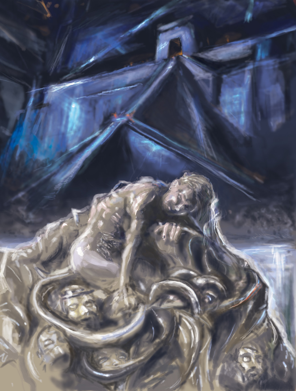
 Mitchellnolte — Auswuechse

Published: 2013-06-23 08:26:31 +0000 UTC; Views: 5847; Favourites: 114; Downloads: 0
Redirect to original
Description
I am not too sure what to call this but just something from the nightside within, through the gates of Mystic DeathRelated content


Comments: 16

A bit too dark to see, but it's the imagination that truly instills fear. Nice job.
👍: 0 ⏩: 0

This and the Daimon drummer = class act man, brilliant stuff.
👍: 0 ⏩: 1

thank you - sorry for the belated reply, i havent had much time to go through my deviantart submissions for a while
👍: 0 ⏩: 1

No problem at all, and my pleasure, as well. I completely understand. I haven't logged into my account in a couple of weeks until just now. Been crazy. lol
 (Smile)")
👍: 0 ⏩: 0

I would buy a print of this if I had the money. May I as what type of style this is is and where did you learn.
👍: 0 ⏩: 1
sorry i missed this query among my comment notes - it is created through a digital wacom drawing tablet - which is something lets me drawing directly into the computer using a stylus pen. i have learnt mostly just well off my own as i have always drawn and still am learning always
👍: 0 ⏩: 0

thank you - sorry for the belated reply
👍: 0 ⏩: 0


thank you, though i hope to one day get to your level of skill! your work is brilliant!
👍: 0 ⏩: 0

Much more loose brush strokes than I normally see in your work. It looks like a demonic altar offering. The colors are very earthy, some parts look muddy.
👍: 0 ⏩: 1
i like loose brush strokes sorry
👍: 0 ⏩: 1
I wasn't saying it was a poor design decision to use a looser style. I am simply stating what I see. It's pretty good, but it is not my favorite of your gallery.
👍: 0 ⏩: 1
thats ok, this was a quicker picture i just did over the weekend. I have more detailed works that i have been working on since last year and 2011 even but i havent put up any of those yet as they are taking quite a while as i can only do a little at a time with them.
👍: 0 ⏩: 0