HOME | DD
 ModalMechanica — Armourrr
by-nc-sa
ModalMechanica — Armourrr
by-nc-sa
Published: 2011-11-07 01:45:45 +0000 UTC; Views: 8206; Favourites: 261; Downloads: 195
Redirect to original
Description
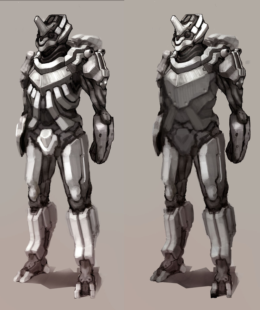
Design Variations, which do you like more?Related content


Comments: 74

")

I would like more indeed!
Nice designs! Very well done!
👍: 0 ⏩: 0

o i like those scrapes/stripes a lot on the armor
really nicely textured
👍: 0 ⏩: 0

I really like the 2nd one but the 1st version has more details.
Really nice work!
 (Smile)")

👍: 0 ⏩: 0


I'm really digging the armor but as I've been drawing my own guys I've been really think about how they'll end up looking if they're ever animated. Looking at the mid section, soldiers and forearms I think your guys would be pretty stiff on the battlefield. I can picture pretty funny situations where they can't bend over to pick up their gun lol. I hope I'm not coming off as offensive. 0_o I mean these guys looking really awesome and I can't wait to get to the level your'e currently at. Thank you for sharing these : )
👍: 0 ⏩: 1

Yeah, you're probably right haha. And thanks mate, just keep drawing and you'll make it no prob :'D
👍: 0 ⏩: 0

")

maybe a 'belt' to divide the torso and the abdomen?
👍: 0 ⏩: 1

That is epic!looks a little tight on the person though, I like the one on the right more: Smoother and it'll go best with pixelated camo.
👍: 0 ⏩: 1
thanks for the inputtt
👍: 0 ⏩: 1
that's two ts to much. Go back to grammar school. Loljk!
👍: 0 ⏩: 1

Reminds me of a smaller, more squared-off version of the Guyver suit.
👍: 0 ⏩: 1

Hmm… I'm gonna say the one on the right, mainly because the extra torso armor feels unnecessary on the first one.
👍: 0 ⏩: 1
yeah i agree, thanks!
👍: 0 ⏩: 0
second one. first's rib things around the abdomen is just too 난잡해
👍: 0 ⏩: 1
it doesn't 'go with the flow' it looks like its not a part of the body
👍: 0 ⏩: 1

ich denke das linke design sieht besser aus weil es irgendwie beweglicher wirkt
👍: 0 ⏩: 1

Left seems more "detailed", but the one on the right has my vote for practicality.
👍: 0 ⏩: 1

Shimmering-Sword [2011-11-07 22:09:14 +0000 UTC]
Left is flashier, but I have to go with the right one for practicality.
👍: 0 ⏩: 1
Yeah I've been thinking the same, thanks mate. We're going to need to have a power armour duel soon eh? xD
👍: 0 ⏩: 1
Shimmering-Sword In reply to ModalMechanica [2011-11-08 23:11:06 +0000 UTC]
Some day I want to do some form of collab among scifi artists. Similar to what tabnir did, but worked on by multiple people.
👍: 0 ⏩: 1
owo that would be badass, when your commissions lighten up abit we should go for ittt
👍: 0 ⏩: 0


Why not combine them? I like the details on the left.
👍: 0 ⏩: 1

Left one, it is more segmented - more protected and looks angular enough.
👍: 0 ⏩: 0

i like then left one the most, because it has a higher contrast of colors
👍: 0 ⏩: 0


Really cool! I like the way your 'striped' brush strokes help accentuate a sense of plane orientation and form... if that makes any sense. And the shapes themselves are very interesting.
👍: 0 ⏩: 1

Left implies lighter armor but slightly more movement, right looks restrictive but more able to take a hit.
👍: 0 ⏩: 0


right one, i like the ratio of black and white, would translate well in movement/action poses.
looking good bro (=
👍: 0 ⏩: 1
| Next =>