HOME | DD
 MoonLightSpectre — Drown. Preview.
by-nc-nd
MoonLightSpectre — Drown. Preview.
by-nc-nd

Published: 2008-12-25 18:13:56 +0000 UTC; Views: 4733; Favourites: 102; Downloads: 0
Redirect to original
Description
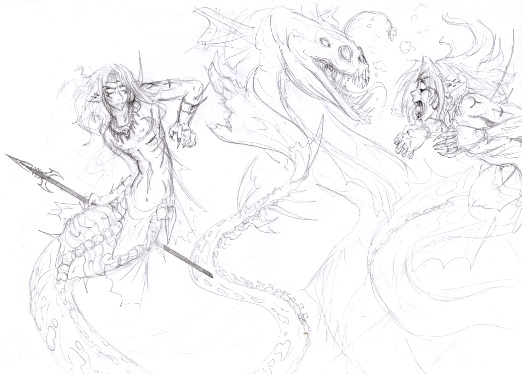
Time for some serious stuff! Full view please
A new picture and OC design I have been working on during the past weeks.
Once upon a time a black star fell from eternal skies into the mighty ocean and with it's downfall drowned a pirate ship sailing the calm blue waters. Falling deep into the seawater abyss the black star gave the last of its magic gleam to the ocean water and gave it birth. Once come to life the seawater opened it's welcoming arms to the remains of the sea ship and the dead bodies of those who sailed it. All but one bodies sliped into the bottomlessness of the ocean, all but one - one, that came in touch with the black star's living water and was itself infused with undying energy of it's glow.
And a man who once walked the earth and sailed the sea awoke, himself part of the ocean water and part of the black star's dark legacy.
And water of the mighty ocean fell in love with that man and thus took a human-like shape to approach him and welcome him in a new stage of his existence. But the newly reborn rejected the water spirite's affection and reached for the surface to find a way back to the wold of the living and human things... He, who forgot his former names and faces called himself Deekay, a dreary name to mark the deadly omen that he carries.
I hope I'll be able to color this picture soon, seems like a nice element for a portfolio showcase.
Cheers!
Related content


Comments: 20

Very nice concept-- it reminds me of something Hans Christian Andersen would write. (Though he tends to have female leads...)
👍: 0 ⏩: 0


I love the stories you make up for your characters. It's a great illustration to, goes well with the store. I like how the guy looks a little shocked.
It looks good in greyscale but I look forward to seeing the coloured version still.
👍: 0 ⏩: 0

I have always collected mermaids, so when I saw this naturally I loved it, but I really like how in depth it is. Love your style you have added to each character. I totally adore this. I like to look at a picture as the artist intended..sure people can come up with ideas, and things to say about a picture, but thats all opinions
I like your original idea, I dont like to change stuff
👍: 0 ⏩: 1

Imo, it looks really nice. I like the circular composition of the bodies, and the way the white strands tie in the people, as well as bringing them to the forefront.
The only thing I can say with what I *feel* is certainty, the ship looks awfully clean for being bashed to death on the rocks.
Otherwise, I think its really nice.
~Istra~
👍: 0 ⏩: 0

This is gorgeous! If it looks like this as a greyscale preview I can't wait to see what it looks like when it's finalized. The detail is amazing, especially the female's tail. I was looking really closely to see every last detail! And the repeated star theme is subtle, but makes the piece pop. Your character design and background are strong, and gorgeous (I'm running out of descriptive words...). The only thing that strikes me is that the background looks disproportionate to the characters, but if it's set underwater, once the color gets added I'll bet that won't be a problem any more. Great work!!!
👍: 0 ⏩: 1

What exactly do you mean by disproportionate? Could you tell me more about it please
👍: 0 ⏩: 1
I'm sorry! ^_^;; What I mean is that the characters look bigger than the background should allow, like they're cramped into a smaller space than should be, esp. with a ship in the background. Like I said though, I'm sure that's more to do with the fact that it's in greyscale than anything else. Once it's colored, you'll be able to add a lot more depth to the water between them and the ocean floor. Although I've got to say, I love the way your art looks when you do greyscale, it's so clean and unique!
👍: 0 ⏩: 1
thanx (Smile)")
👍: 0 ⏩: 0

It's very nice, has a lot of life! I would enhace contrasts but hey, thats just my point of view. Can't wait to see it colored!!!
👍: 0 ⏩: 0

The composition feels nice and balanced to me, but I personally don't like the sharp bend in the mermaid's tail. I think it kind of ruins the flow. (For me, anyway. XD)
👍: 0 ⏩: 0

This piece looks really nice so far. The feet are what I like the most about it, actually, and the man's left hand (his left, our right). The wrinkles on the groin and knees of his pants are really tight, too. Although subtle, the background is haunting. I get the impression this man is drowning, and the mermaid-like woman is looking on with a hint of excitement at the prospect of having an underwater sentient friend... (Wrote this before reading the comment, to see if I was right.
If you're going to keep this piece as a grayscale, you might consider adding more 'darkest-darks' and 'lightest-lights', as my professors call them. It'll make the piece '
I think if you just splash some darker darks and lighter lights on there this piece'll have an excellent sense of weight and importance to it!
👍: 0 ⏩: 0

i like how the star theme is seen through out the picture.
maybe have the two traced in slightly darker outline? so they pop more from the background.
and the story 
will there be more about them?
👍: 0 ⏩: 1
I didn't go for line weight at all since I wanted to color it in a painting-like style 
And, about the story...I don't know, I might develop Deekay a bit more as a character...or may not

👍: 0 ⏩: 1
well then i cant wait to see it in color. and really want to see more about them.
👍: 0 ⏩: 0

aww this is pretty...cool... i like the way they look..
👍: 0 ⏩: 0

Ohhh this is stunning! I love this so much as it is, im scared if the colors dont go and ruin it.
👍: 0 ⏩: 0


I think it looks good for a portfolio too! ")
👍: 0 ⏩: 0