HOME | DD
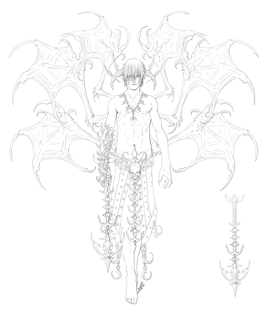
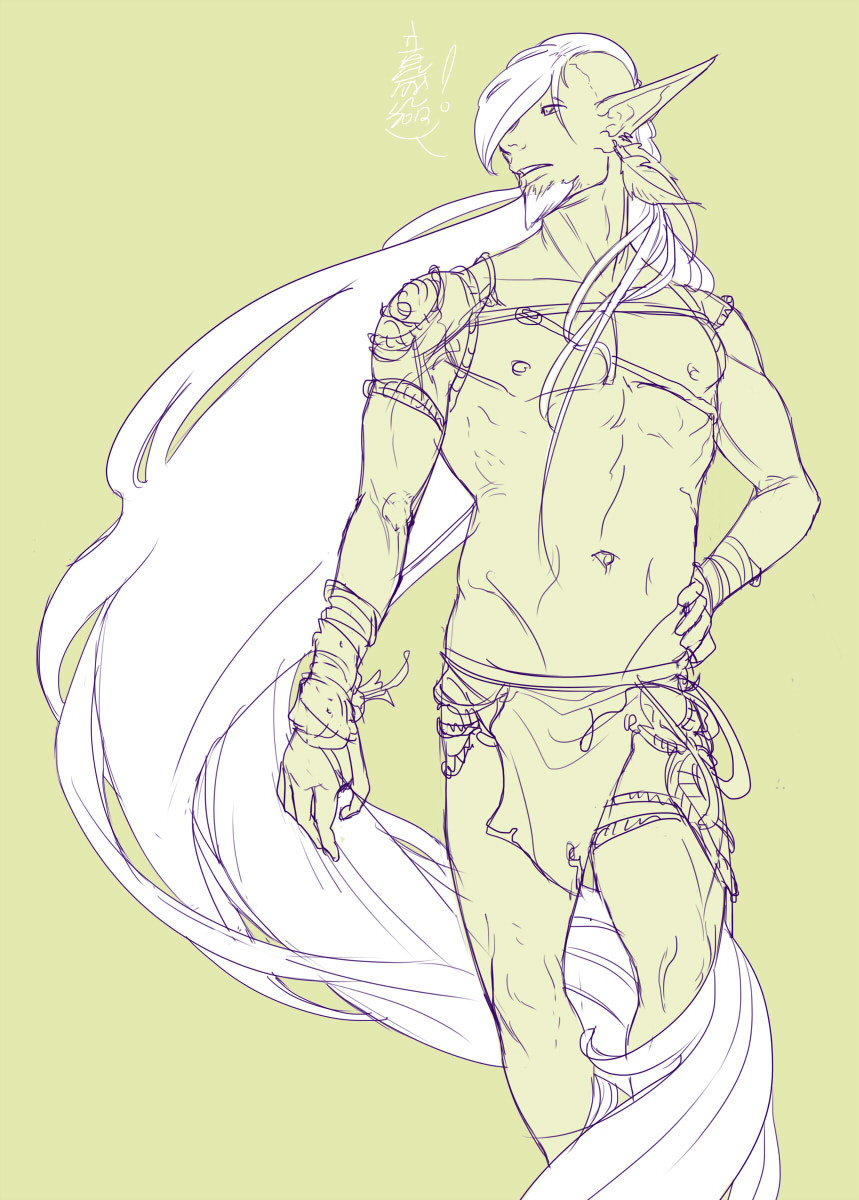
 MoonLightSpectre — Wrapped - Inks
by-nc-nd
MoonLightSpectre — Wrapped - Inks
by-nc-nd

Published: 2007-01-03 18:10:07 +0000 UTC; Views: 3548; Favourites: 43; Downloads: 89
Redirect to original
Description
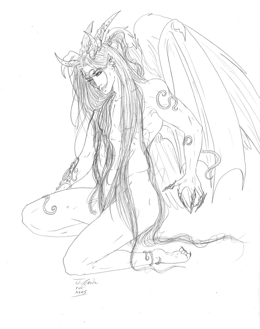
I'm trying to follow one of my artistic resolutions for this new year. Guess what it is.
Sketching may become a real problem when you somewhat get more or less good at it.
let me explain.
When your sketching sux, then inks may really make the picture look good and you're happy with them! But if you're fine with sketching and is able to make your sketches to look rather clean, you may feel like inks kill the essence of the picture, it's mood and dynamics... do they?
Anyway, my coloring really sux, so I'm submitting the sketch and lineart for the moment.
For all you girls (and Guys) to enjoy
 (Wink)")
Male athonomy is hell to draw... I swear I'll learn how to do it one day

Related content


Comments: 47

I love this, and all your work, but I do have to say I like the one on the left a bit better only because of the expression... The one on the right looks like hes happy, so its confusing why he'd being saying WTF, haha. And I'm sure you've gotten comments from that before. Either way though, love it~~
👍: 0 ⏩: 0

"When your sketching sux, then inks may really make the picture look good and you're happy with them! But if you're fine with sketching and is able to make your sketches to look rather clean, you may feel like inks kill the essence of the picture, it's mood and dynamics..."
So damn true... I feel the same about my drawings...
That's why now I'm trying to stop using mechanical pencil (since it's what, to me, makes my sketches better, because I can reach the details with it...), and use only a regular pencil (thought it's quite messy and unclean...)
👍: 0 ⏩: 0

I like the un-inked version better, but that's only because, to me, I think it feels more natural and unrestrained. I like both versions, but I think the lineart is better than the inked.
👍: 0 ⏩: 0

I am so biased when I say I like the inked version better...but your sketches look so pretty there's no need to really do it...I wish mine looked that nice! They are always so messy and such.
But he is a sexy man~! I think you did very well with his muscles - they look loads better than mine!! XD And his design is so nifty, as always!
A definite fav!


👍: 0 ⏩: 0

and it was much fun to play with - much easier that what I though ^_^
👍: 0 ⏩: 1

Yeah it is fun to toy with...you pulled it off gorgeously!
👍: 0 ⏩: 0

You draw males waaaay better than I do. ^^ Your linearts look better too.
👍: 0 ⏩: 0

the inking looks great. there's so many delicious details in this picture, it's awesome. love the perspective and anatomy as well. I demand you color this

👍: 0 ⏩: 1

Umm I have almost colored this, exept for the background, but I think it looks soooo lame 
👍: 0 ⏩: 1
sure! if you wanted me to *shrug*
👍: 0 ⏩: 1
Here - [link] I think taht the coloring is so unbalanced, I couldn't even find an appropriate theme or color for the background 
👍: 0 ⏩: 1
honestly I don't see anything wrong with it ;__; lol. I never really do backgrounds so I'm not sure what to suggest ;x *i know, I'm useless =/* but you could try accentuating the contrast in the color so it pops out at you more, it would compliment the perspective, I think. sorry I'm not very helpful n.n; but your coloring is so smooth and nice, I don't see anything wrong with it!
👍: 0 ⏩: 0

*I* think the inks make it explode with even more awesomeness! The details you put into your lines -and- coloring are a mind boggling blur of scrumtralescence. x3

👍: 0 ⏩: 1

gosh, i'd love to have the same chest tatoo !!! the ones you draw have that little KOTORish thing about them ... anyway, your sketches get better and better. love it ... though i'm more into girls

👍: 0 ⏩: 1
")
👍: 0 ⏩: 1
randomness can sometime be the little thing that makes it different ... and it also depends on who draws. I think your random tatoos are the coolest ... and btw, when will you stop underestimating what you draw ? !!! grrrr 

👍: 0 ⏩: 0

wow!! just woow amazingly smooth lines!! damn your lines are soo amazing and complicated! (girl how can you do that?! amazing pic love love yay!
ps-damn the abs! *melts*
👍: 0 ⏩: 1

It changed the face A LOT, but the feathers look a lot better!
👍: 0 ⏩: 0

looks awesome. You did good job with the anatomy. He looks bigger and tougher than other guys you've drawn
I have the same problem you know. everything I draw with pencil looks a lot better than inked. Inking is my achilles ankle XD
 (Smile)")
👍: 0 ⏩: 0

If I had the time and the patience I would probably attempt to color this. But since I don't at the time I'll just tell you that you are amazing at anatomy.
Wonderful work.
I myself usually prefer sketches because I love how the graphite looks. Inking takes quite a bit out, sometimes. Other times it makes the picture even better.
👍: 0 ⏩: 0

it looks really good! sketching isnt that hard to do. sometimes i feel like my drawings lose all life to them when i ink them. thats why i hardly ink more. and you did fine on the anatomy.
👍: 0 ⏩: 0

really?
👍: 0 ⏩: 0

хехе ет мальчик в подарок женской половине населения %)
👍: 0 ⏩: 0

omg i totally know what you mean. >< i drew this awesome sketch two weeks ago and to this day i keep staring at it in photoshop not wanting to ink it. but at the same time, its too messy to color. @___@ *SIGH*
anyways, THIS IS AWESOME! the amount of detail is amazing, and i love the varying line-values. both versions look great to me, though the inked one makes the background figure out more. (not sure if that was what you were aiming for 
👍: 0 ⏩: 0

I agree with ~Tesslar and the other ones who mentioned the mood-change of the picture. The rest of the inking is great, I think, but the facial expressions seemes a bit 'tamed'
Perhaps you can use layers to do just the face again??
")
👍: 0 ⏩: 1
I actually like the face as it is, though the mood is different.
👍: 0 ⏩: 1
In that case: Never mind
👍: 0 ⏩: 0

I know what you mean. I do a ton of sketches and more inking now, half of which hasn't nor will likely go on my DA, but I've realized sometimes the sketch looks a lot better than the inked version or visa versa. Nice job thou ^_^ is he supposed to have 4 fingers? XD
👍: 0 ⏩: 1
yes, four fingers, and three toes
👍: 0 ⏩: 1
haha awesome! XD wonder if that would be easier than having 5 each
👍: 0 ⏩: 0

Oh god, I know you start thinking that the picture looks really good in sketch form but once you start cleaning up it doesn't always look as good/ like you wanted it too. Almost like it lost a bit of it's life. But then again line art usually does look best when someone else does it OO.
This picture makes me smile
👍: 0 ⏩: 0

awsome as always. I just love the way you draw. However I did like the schetch expression better than the inked one. on the inked it does'nt look like he's saying "wtf", but it does so on the first one where he looks more grim.
👍: 0 ⏩: 0

Мускулистый такой... И с бантиком вместо фигового листика
Мастерский лайнарт, ты молодец!
👍: 0 ⏩: 0


Like said above, they do have a bit different feeling to them, yet I still like both. His pose and detail composition looks very interesting, may I ask if you inked it freehandedly (with a tablet) or used some vector stuff? I still can't do smooth, clean line arts well myself.
👍: 0 ⏩: 1
I can't stand anything vector
👍: 0 ⏩: 0

Мне очень понравился справа, у негоглаза красивые. Слева злой какой-то
👍: 0 ⏩: 0

I think the expression changed...which may have been the point of hte picture... Hm. I know my sketches always look better than ink XD But that's cause I make so many mistakes when the stuff is permanent.
👍: 0 ⏩: 0

It did change quite a lot when you inked it.
But the inked version is still not bad. Of course the expression changed and therefore the mood there was, but it looks still good and coloring might be able to save it.
👍: 0 ⏩: 0
