HOME | DD
 mrgraphicsguy —
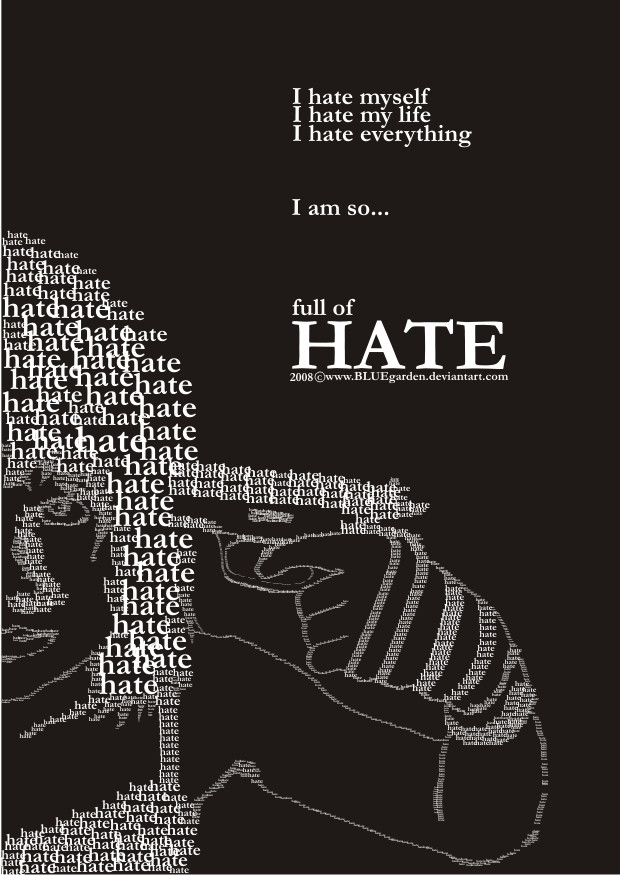
Tears of Hate
by-nd
mrgraphicsguy —
Tears of Hate
by-nd

Published: 2007-02-17 19:16:46 +0000 UTC; Views: 65032; Favourites: 1283; Downloads: 5440
Redirect to original
Description
And yet another typo work. A friend asked me to create a typo piece dealing with racism and I tried my very best. Hope she likes it - and you out there as well!Related content


Comments: 341


buen trabajo...
buenos colores y disposiciòn de texto , hubiera elegido una tipografia palo seco regular.....pero igual buen trabajo
👍: 0 ⏩: 1

If I only understand that languagee...
")
👍: 0 ⏩: 0


 (Wink)")
That's an honor for me  (Smile)")
👍: 0 ⏩: 0

Thank you very much!
👍: 0 ⏩: 1

no problemo....its really cool of you to do a piece like this..kind of inspiring actually
👍: 0 ⏩: 0


very nice... love what u said there
👍: 0 ⏩: 1


Very well done. People should learn to stop hating and learn to start loving. They get so much more out of it.

👍: 0 ⏩: 1
Thank you very much. And yet you inspired me for a new work... thanks!
👍: 0 ⏩: 1


You know, it's been a while since I faved this, but now that I think of it: It would make a grand S.H.A.R.P logo. You truely do have a talent, and I hope it serves you well!
👍: 0 ⏩: 1


brilliant! the colors are great, and the words that really stick out are the real powerful ones. Nice work
👍: 0 ⏩: 1


adore the angle of the text against the stroke of the portrait. my only suggestion would be using a darker, more aggressive colour than yellow for the text ...it's got a great sentiment too.
👍: 0 ⏩: 1
Thanks for your comment! I don't know why, but the yellow seemed to be perfect for me
👍: 0 ⏩: 0

yes, i had a school project last week for my typography class. i did it on education nd poverty
👍: 0 ⏩: 0


very powerful indeed 
👍: 0 ⏩: 0

I love your style... stark, honest, raw, and gorgeous.
👍: 0 ⏩: 1
I hope I can keep it for further works
👍: 0 ⏩: 0

I love it.
I would marry it @.@
👍: 0 ⏩: 0

| Next =>