HOME | DD
 mrgraphicsguy —
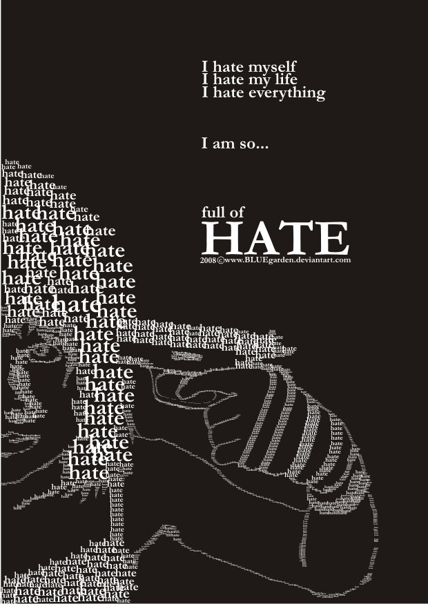
Tears of Hate
by-nd
mrgraphicsguy —
Tears of Hate
by-nd

Published: 2007-02-17 19:16:46 +0000 UTC; Views: 65032; Favourites: 1283; Downloads: 5440
Redirect to original
Description
And yet another typo work. A friend asked me to create a typo piece dealing with racism and I tried my very best. Hope she likes it - and you out there as well!Related content


Comments: 341


I maybe the foul-tempered one but I too also hated rascism!
👍: 0 ⏩: 0


i find it simple. It dose not saying anything that has not been said before.
👍: 0 ⏩: 1

That's right. But it wasn't my intention to say something new. My intention was to take that strong message and make a piece of my favourite art - typo. That's it. And that was the part where it's not just simple. It took me some hours until I got the final result.
👍: 0 ⏩: 1
i hope you don't find what im saying to be mockery, or rude; it is not intended to be. I love humanity, and in turn are greatest way to express things to the masses: Art. what you created may be a great work of skill, but as art i find it lacking.
👍: 0 ⏩: 1
In case, it's not my favourite piece in my gallery. However, there's a discussion whether typography can be art or not since years. It depends on the eye of the viewer to like it as art or as demonstration of skill.
Thank you, anyway!
👍: 0 ⏩: 0

Impressive! It's very well laid out, nice & simple, too. The colour scheme is good. It would make a great poster.
👍: 0 ⏩: 1
So buy it as print and put it on your wall
👍: 0 ⏩: 0

")

I would have integrated more the image... Blank blocks don´t suit it so well... But it´s a good work nonetheless...
👍: 0 ⏩: 1
I tried many combinations of images and text... and I decided to take the blank blocks since it was the best result. Tahnk you for comment
👍: 0 ⏩: 1
Hehe... Well I guess if it suits you  (Smile)")
👍: 0 ⏩: 0


Most awesome
👍: 0 ⏩: 1
Thank you very much for faving!
👍: 0 ⏩: 0

Excellent message AND artwork.
Both combine together to make a powerful statement.
Kudos
👍: 0 ⏩: 1
That was what I wanted... combining a strong message with my favourite kind of art. And I'm glad that I did it so well that everyones likes it
👍: 0 ⏩: 0

very outstanding point. fuck society and its robotic influences on everyone.
👍: 0 ⏩: 0

Unit against racism!!
this si onderfully done and i thankyou for trying to help get the message of anti-racism across
👍: 0 ⏩: 0


It works. I think you accomplished what you wanted. It has a powerful message.
👍: 0 ⏩: 0

scream that out everywhere you are!
👍: 0 ⏩: 0


That is the most powerful thing I have laid eyes on in quite some time. Help yourself to a

👍: 0 ⏩: 1
I'm glad that you like it!
👍: 0 ⏩: 0


Lovely! Much congratulations on DD, you deserve it
👍: 0 ⏩: 1
Thank you! It's a big honor for me!
👍: 0 ⏩: 0


It's a little dramatic and presumptuous
👍: 0 ⏩: 1
Well, that's an aspect of art. You'll always find things which are exaggerated - and they're meant to be. My deviation is not a neutral thing, it's provoking. That was what I aimed at. Why should anyone think about it when everything is just neat and well belanced?
Thanks for you comment!
👍: 0 ⏩: 1
I suppose, and I'm not trying to condone racism, I just feel like saying racist people are cowards and attention whores and they hate themselves etc. is a little ridiculous.
👍: 0 ⏩: 1
Of course it is! It's like you'll say "Smoking kills everyone"... of course smoking doesn't kill everyone... but you have to state out such ridiciulous facts to force people think about the topic.
They shouldn't simplay agree with my work, I want them to think. And you thought about that, which is good! I'm not telling people that racists are attention whores... I just make then thinking about the work. And even thoughts like "What the fuck? Is he serious? What crap did he write there" make you think about racism. You can't fend that.
👍: 0 ⏩: 1
Yeah that's true, well I guess you accomplished what you wanted to do then.
👍: 0 ⏩: 1
Thanks that you discussed with me! I appreciate it
👍: 0 ⏩: 1
No problem, glad to be wrong lol
👍: 0 ⏩: 1
You weren't wrong, you had just your own opinion
👍: 0 ⏩: 0

The typography is great and instantly caught my eye.
I have to ask why the tears/blood is blurry while everything else is clean and crisp.
👍: 0 ⏩: 2
Thank you very much! I used a filter on the face and added the tears later with a simple brush
👍: 0 ⏩: 0
Thank you very much! I used a filter on the face and added the tears later with a simple brush
👍: 0 ⏩: 0

<= Prev | | Next =>