HOME | DD
 muckSponge — Blender Icon Pack v2
Published: 2009-06-27 14:49:31 +0000 UTC; Views: 7385; Favourites: 18; Downloads: 1165
Redirect to original
Description
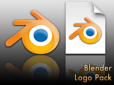
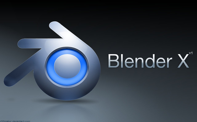
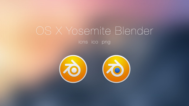
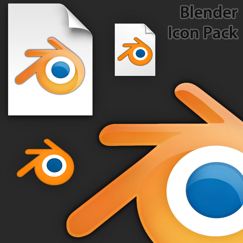
This is my second attempt at making the Blender Mac icon in higher resolution. This one is around 98% the same as the original, except up to 1024x1024 resolution. I've also thrown in two Windows style PNG icons, which are based off the Windows ones, except a bit more stylish. The files included are:- PNG's (1024x1024) App icon and file icon
- ICNS's (512x512) App icon and file icon
- PSD's (1024x1024) App icon and file icon
Enjoy! And please comment


Related content
Comments: 6

👍: 0 ⏩: 0

I like your first version better. All the first version needs to make it better is a Mac OS X style (size) drop shadow.
👍: 0 ⏩: 1

My aim wasn't to try to improve the icon, only to increase it's resolution. So therefore, I had to make it as close to the original as possible. So the first one may look better, but the Blender Foundation is less likely to want to use it because of this (I've sent my icons to the Blender Foundation, and they will most likely be using them in future releases). My second version is very accurate, so hopefully you will see it as standard for future releases of Blender. I did have a few problems with the drop shadow. I decided to keep it close to the original because Leopard icons are given their own drop shadow in the dock, and two of the same type of drop shadow might cause problems in Leopard
👍: 0 ⏩: 1

I see. Somehow though, I find the colours in this one a little bleak. But, see what other people say.
And if you were really going for stepping it up a notch, try transforming the icon to fit Apple's Human Interface Guidelines, and see if you can add more depth to the application icon. That would be my advice.
[link]
I'd have a look at the Windows side of things too, and try to find a mid-point for the application icon's 3D look.
👍: 0 ⏩: 0
