HOME | DD
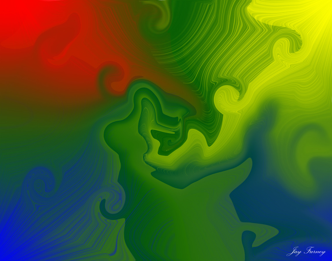
 Nestalgica — The Virus

Published: 2006-09-19 04:44:24 +0000 UTC; Views: 1067; Favourites: 16; Downloads: 6
Redirect to original
Description
for =JRegier because I say so.
1200 x 800 and cool as hell were his requirements, I think. Did I do it?
Please FULL-VIEW and enjoy

Related content


Comments: 26


Quite welcome 
👍: 0 ⏩: 1

Wow, that's a hell of a compliment

👍: 0 ⏩: 1

Pretty sweet, sir. Those're MacBook screen dimensions, I believe. I do have a couple of criticsms of this piece. The forms and iterations are awesome, as seems to be your trademark, but the colour palette is somewhat narrower than you usually work with. I think it needs a small amount of a third tone to really make it pop.
And as has been mentioned, the text could be darker and less starkly there. Since you're working with Elements, I'm not sure what kind of blending options you have available to you, but were I doing this I would make the text black and put an Outer Glow of a shade taken directly from the image around it. You'd be amazed how well that can help integrate text into an image. It's also sometimes fun if you rasterize the text layer after and apply a Motion or Gaussian blur to it, but that can create readability problems.
Anyway, this is a pretty fine image no matter how you look at it
 (Smile)")
👍: 0 ⏩: 1
I have yet to find that function, but I appreciate the critique very much
I applied a kind of filter to it -- does it look much better?
Yes, the colours are more limited than usual, but many gradients did not agree with the fractal, and plus I was going for more shape than colour anyways
Thanks so much for your thoughts; I always love getting in-depth reviews
👍: 0 ⏩: 1
I could send you a torrent for PS9 if you're not above stealing the occaisonal bit of overpriced devware.
👍: 0 ⏩: 1
'Course I'm not stealing any overpriced anything
You know my e-mail

👍: 0 ⏩: 1
OH WELL IF YOU'RE NOT INTERESTED THEN I'LL JUST RUN ALONG AND PLAY DOLLIES
👍: 0 ⏩: 1

ooo... the virus-ed cell and the sparkly little white blood cells to the rescue! HEE!
👍: 0 ⏩: 0

Nice work! But as BordomBeThyName mentioned, the typo shud be a little bit darker. But great piece
👍: 0 ⏩: 1
Alright, thanks ")
👍: 0 ⏩: 0

damn cool ))
how do you make this? photoshop + plugins?
👍: 0 ⏩: 1
No, it's with a program called Apophysis
You can check it out here [link]
👍: 0 ⏩: 0


wow, I like it
the text stands out a bit too much though...
👍: 0 ⏩: 1
I'm never sure where or how to put it on wallpapers

👍: 0 ⏩: 1
I'd say like 200px up would be cool...
maybe make it dark red with a white glow?
👍: 0 ⏩: 0


