HOME | DD
 Nether83 — Wheel of Time

Published: 2009-01-14 12:21:38 +0000 UTC; Views: 22353; Favourites: 87; Downloads: 11854
Redirect to original
Description
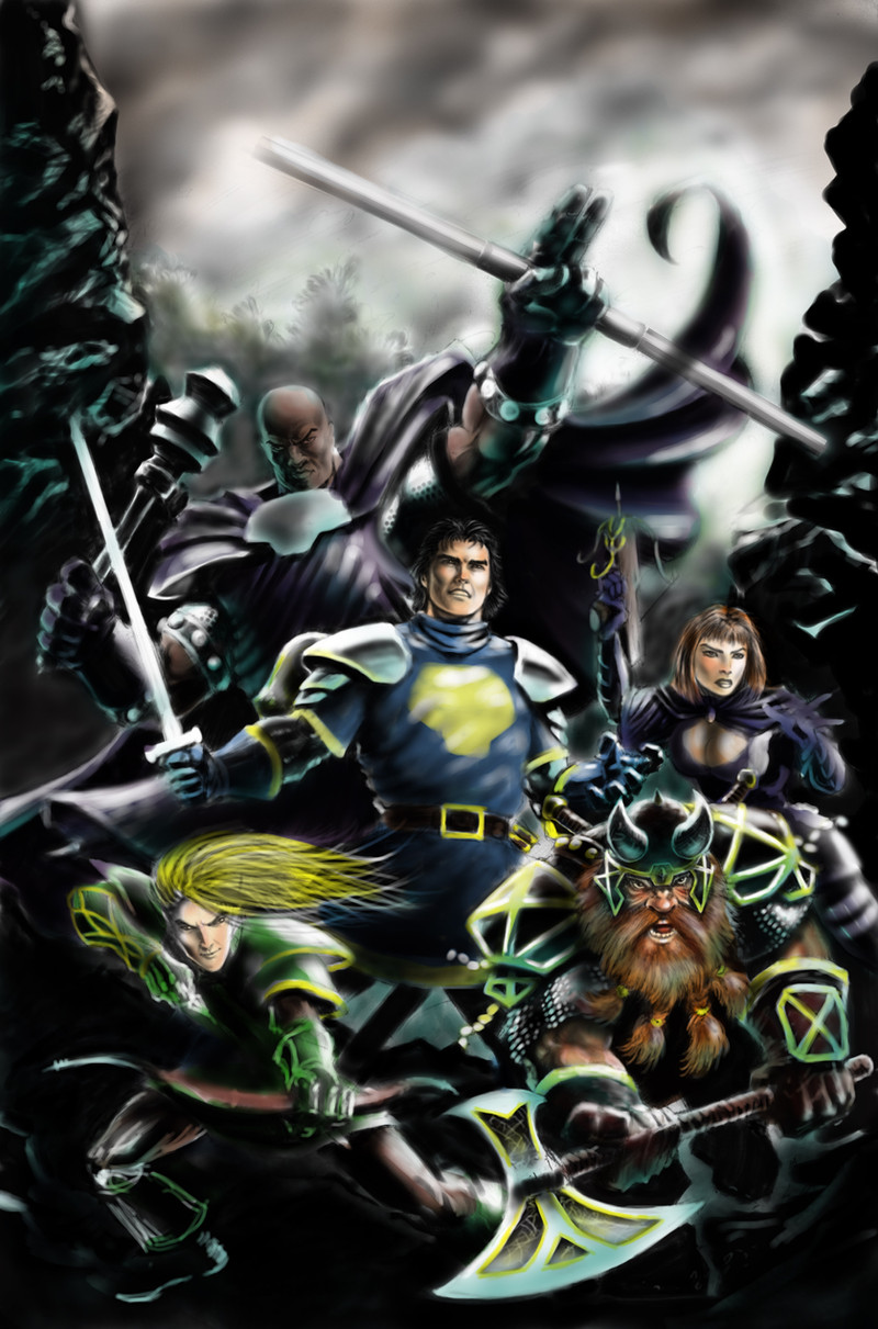
Finally this is finished. I've been doing it in short sessions over a looooong period of time, during which I've started hating so many things about it I almost didn't want to finish it. But I did, so here it is.Based on the Wheel of Time book series by the late Robert Jordan. Let this be a tribute to his work. Rest in peace RJ.
Original lines with pencil. Colors in Photshop CS3.
Related content


Comments: 24


hey, just letting you know this is being featured today on the Fan Art Friday blog on the front page of Dragonmount.com (a Wheel of Time fan community)
[link]
 (Smile)")
👍: 0 ⏩: 0

A quick, surefire way to beat Bal'zamon would be to throw a bucket of water on his head.
")
👍: 0 ⏩: 0

I completely forgot about that giant guy. wow! This is an awesome reminder
👍: 0 ⏩: 1

One does not simply call Loial son of Arent son of Halen "That giant guy".
(I assume you meant him)
👍: 0 ⏩: 1
Haha yes. The giant. In fact, I forgot about him again until I saw this reply.
👍: 0 ⏩: 1
xD Lol, it happens. Loial doesn't star as much as some characters.
👍: 0 ⏩: 0

I love all the details to this, and how many chars you managed to include, you can really tell who the majority of them are without giving it a whole lot of thought. There are some anatomy issues with certain facial features, but its really not as noticeable looking at the piece as a whole. I especially like all the detailing on the clothing. The way you did Lan is just great, it so looks like how I pictured him.
👍: 0 ⏩: 0

Laaaaaaaaaaaaaaaaaan! He looks awesome ^^ Just a bit...Too old ")
👍: 0 ⏩: 1

Here I go with my try at an 'advanced critique', hope you don't take offense. No inflammatory words here (I hope). Here goes:
Yeah, I agree. EVERYONE makes Lan look so old! That's just not right? It's not as if Aes Sedai stay ageless while Warders age FOR them (he's aging WAAY too quickly here), but Warders also share in some of the ageless quality due to their bond. So Lan shouldn't look so old here. I'm not criticising you exactly, but everyone who thinks that Lan is Grandpa Simpson. They should go draw some botox in.
Otherwise, your artwork is great! I just LOVE Moridin and the Trollocs! Rand's expression is awesome and fitting, but I take issue with the hair. I don't think it's described as long and lanky...Likewise with Mat and Perrin. Mat is meant to look less 'fade-like'. That's some crazy nose action you got going on there. Perrin looks kinda...fat, more like a baker than Wolf-brother... Remember that the main characters are meant to look handsome and attractive! Your Loial is epic-best I've seen so far. All the women look great, especially Egwene and Moiraine. So good job and keep up the good work!
PS: Who's that guy in the mask?
PPS: Is the balding white haired old person at the top right Padan Fain?
👍: 0 ⏩: 1
Oh whoops. One more thing:
PPPS: Min looks awesome; I think you really captured her tomboyish looks! Though I can't quite remember if she has long hair at this point. Oh wells.
👍: 0 ⏩: 0

To critique for the sake of critiqueing, I am a bit iffy on the Two Rivers boys, mostly Rand with the hair. However, that's all the negative I have to say. otherwise, this i a VERY good job, and I also liked the line art for it. I think that is the best impersonation of Loial I have seen, not all funky and stuff. Very good, very good...
Oh, and I can't go without saying that Min looks a lot like a boy. You did greaton her, lol ;D
👍: 0 ⏩: 0

Not bad really.
Now, if you could one for each book...?
 (Wink)")
👍: 0 ⏩: 0

It's been like 6 years since I've read a Wheel of Time book. Yet looking at your pic I can name aaaalmost everyone. You really captured 'em. (And you made Lan into a total badass, so you win points for that too.)
👍: 0 ⏩: 0

I really love how you did the black haired guy who looks a bit like an Indian. Nice piece it shows that you put a lot of work in it.
👍: 0 ⏩: 1

That's one part of the piece I actually like. He's not actually an indian type character, but the books describe him looking like chiseled from stone with hard edges and somehow many of my dark haired drawings end up looking like indians. Weird, huh.
👍: 0 ⏩: 1
Indians are cool so I wouldn't mind it
👍: 0 ⏩: 0

Oh, you'd love some advanced critique today would'ya?! I have nothing to regret today so I'll be 100% advancing your depression then.
You could really practice drawing and try to make yourself better. One thing that especially got into my "irritation eye" is those damned ears. Like, OH MY FUCKING HOLY JESUS ANUS!!! They look like some weird fungus has eaten their ears off and has grown something funguslike on top of 'em. I was just kiddin'! What I'm trying to say is, that you simply need to watch an ear from different directions, draw, draw and draw it more, till you know how to draw it and all it's details with your eyes closed, with your left hand and finally...with a pen stuck inside your DilliDong while your hands are behind your neck. That's how I did it, now why wouldn't you do it like that 'eh? Mostly in all those ears, the basic shape is the biggest problem. It's like some invisible force is pulling violently their ears backward.
This goes with all your characters. There's that own style of yours to draw people and characters, but simply practising drawing real people and studying how their anatomy and angles of their limbs & fingers etc. work -should really help your works. These characters just look like they were made by a 16-year old highschooler. That is the most honest opinion you're going to get from me. Just like for an example,draw your chick man, think and stuff that wisdom in your drawings. I know you can do it man!
Now, RUN Forreeest! RUUuuuunnn!!!
👍: 0 ⏩: 1
Damn boy! You eat some special cereal today or what?! I think a glimpse of the good old I-crit-your-ass-to-kingdom-come-Saibankan just showed itself. Haven't seen that dude for a long time in here.
Yup, yup. 16-year old highschooler describes it quite well. I need to draw more, that's for sure. At some point I thought I should do the whole thing all over again, but then again, I'm too lazy. I still like parts of it though.
👍: 0 ⏩: 1
I was just pissed off today, that's it. But I knew you'd appreciate my honesty since you asked for it. I've been thinking of getting rid of this Saibankan-profile and getting a new haircut. More professional one to be more accurate.
Why can't I just change my username Goddammit?! Stupid fucking DA. Now I just need to figure out how to erase this profile... Hmmm...there was that big titted cosplay lardass who gets enormously offended if I suggest a good titty-bang-bang...
👍: 0 ⏩: 1
Just go and give one of your famous "advanced critiques" to one of the admins and you're sure to get fired. I keep a more professional(is that possible?) profile in Conceptart.org. There's only a couple of things in that gallery, my DW3 contest work and that Haukikana thingamajig I did for my brother.
👍: 0 ⏩: 1
conseptart.org's been always a place where I really haven't had the clue where to go in there. It's a really messy place and the pages take like forever to load. But maybe I could take a chance some day.
👍: 0 ⏩: 1
It's a bit weird yeah, but once you get the hang of it, it's quite simple.
👍: 0 ⏩: 1
Well, if I happen to become a conseptart.orgist someday I'll note ya.
👍: 0 ⏩: 0