HOME | DD
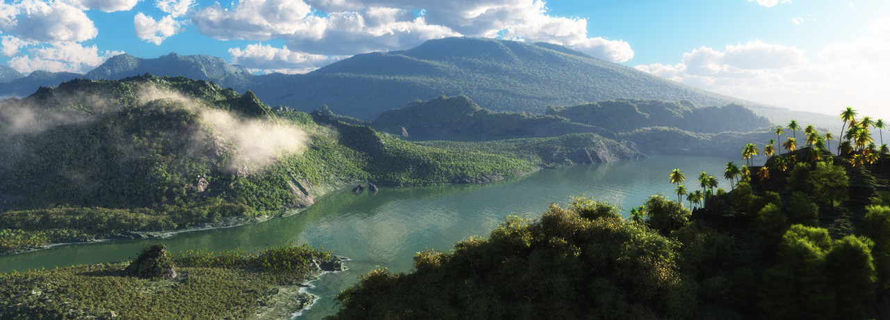
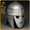
 neutrix — Solstice Bay
by-nc-nd
neutrix — Solstice Bay
by-nc-nd
Published: 2011-09-07 02:33:56 +0000 UTC; Views: 9754; Favourites: 466; Downloads: 431
Redirect to original
Description
Made in Vue 9 xStreamCreated this image for e-onsoftware's 2011 "3D Environment Competition"
Any constructive criticism will be much appreciated! I'd like to know what I have to work on, what I'm getting right... so I continue to grow as an artist.
Thanks!
Website: neusenz.com
Follow me: neusenz
Related content


Comments: 121


A really great image - just a few quick suggestions, rather than a formal critique:
1) The clouds, especially as you pan left, seem a tad too crisp. There is enough distance and haze over the hills to suggest that they would be washed out slightly more.
2) The haze seems to be too evenly distributed over air, water and land. In reality, haze has its greatest effect on land, lesser on distance air and water. So: The water is closer, and atmospheric haze would cancel out a bit more. The haze is great over all the land areas, but I would sharpen and bring up the tones of the water just a tad, perhaps increasing very slightly the blue tint in the water as well. Not overly much - just enough to make the water stand out a little more. Likewise, the blue sky, especially on the left side, should not show as much haze, and should pop out just a little more.
Great image, however, regardless what you do with it from here.
👍: 0 ⏩: 0

A beautiful landscape, love the mist on the shaded part of the hill. Excellent attention to detail!
")
👍: 0 ⏩: 0

woah awesome, i just thought it would be a gread done photgraphy!
👍: 0 ⏩: 0


Well done!! Looks great! I really need to learn to use this program....how'd you manage it???
👍: 0 ⏩: 0


Wow, just wow I wish I could critique this, I'm looking for SOMETHING but I can't find it, well no wait. The clouds that are over the large hills/small mountains. They look more painted on, less like they blend in. And it appears they're going behind the hill/mountain where I don't think they should. But that's more personal opinion then artistic critique, but I did try to point out something. Keep up the art work and best of luck on improving even more
👍: 0 ⏩: 0

Oh my god. I thought it was real and was going to ask where it was shot at. <;D Absolutely stunning.
👍: 0 ⏩: 1

haha, glad I created some confusion there
Thanks!
👍: 0 ⏩: 0

I This is wonder-place )))) But i'd like any main object or scene... maybe on the island!
👍: 0 ⏩: 1
cool.. it's definitely missing a main focus point. I'll add one on my next piece.
Thanks for your input
👍: 0 ⏩: 0
Thanks! I actually thought that was weakest point on the piece while I was working on it
👍: 0 ⏩: 1

I gave you a critique. I hope I got all of my feelings out on it lol
👍: 0 ⏩: 0

Stunning colors and composition
I thought this was a photograph. I would never have been able to tell the difference.
Check out my art!
[link]
👍: 0 ⏩: 0

nice one. i like it.
To improve it you could scale the trees different. The Part left in the front looks likes there are bushes and not trees. Maybe i generaly higher scale for the trees would help. Of course it is not realistic but i think it would improve the look. Also you can add some surf on the water. Also more contrast will be good, i miss some brown earthy areas or white/yellow sandy areas not only on the coast. Also pick up some areas to focus on like the sandy coastline in the front a little to the left. Or the the trees on the right. The peak in the front to the left is a little wierd. Don't really know why. It looks like it's really high because of the scalation of other parts and i don't want it to be so high. I like the bloomy colors on the trees in the right. In comparison other part are dull but i think a little more contrast to the green (yellow, brown) would improve it. Maybe some suggested sunrays which shine trough the clouds.
That where the thoughts i had watching the picture. It could be i'm talking a total bullshit and some other guys know more about it. Working as aleveldesigner i realize how big and complicated this is and the learning never ends
 (Wink)")
👍: 0 ⏩: 1
Whoa! great comments
I'll definitely work on those said details. You're on point when it comes to the "brown and earthy" areas. It's missing some of that.
Thanks for your input!
👍: 0 ⏩: 0


very realistic render. i have never tried vue (i am a blender man) and now i am interested in trying it. excellent work.
👍: 0 ⏩: 1
I haven't tried blender either! I've downloaded it, opened it, but closed it right away lol. I think I have enough headaches with Maya, 3Dsmax, Vue, RealFlow and others
You should definitely try it! It has a different workflow to the usual 3D software packages.
👍: 0 ⏩: 1
i will try it soon. blender can be a real headache. it has a lot of the negative features that come with open source software, and the interface is only starting to become remotely reasonable. still, the price is right for budget 3d work. if you have 3d max, you probably do not need blender!
one day i want to work with z-brush. some of the modeling details people get with that are amazing.
👍: 0 ⏩: 0


beautiful! lovely vivid colours in the foreground, and i like how they become washed out in the distance
👍: 0 ⏩: 1

I like this a lot. There is nothing I can find to complain about but I have a suggestion. Why not add an eagle or something soaring above the bay? That would bring out the depth better and also give the composition a focus. I have noted this as a weakness of much landscape modelling. Everything is super nice but you don't really understand why a certain view was choosen so your eyes just wander over the picture without any guidance.
👍: 0 ⏩: 1
Thanks a lot for your input!
I see what you're saying. You can't really tell if you're standing on a mountain, or flying on helicopter while you're looking at this. In the next pieces I'll add something of interest to achieve that "anchor" to put everything into perspective.
thanks again!
👍: 0 ⏩: 0

Your Welcome, I like nature photos a lot.
👍: 0 ⏩: 0

Very cool.
I have been making 3D too and I can't see anything to give a critique.
Well... Maybe the clouds are looking suspicious, but I am not sure.
I wonder... Was/is Vue hard to use?

👍: 0 ⏩: 1
hehe, the clouds do look "suspicious"... I need to work on them a bit more!
Vue can be a pain at times. Over the years it's gotten more stable, but I'm still dealing with crashes every now and then. It's a powerful program and kinda overwhelming... but once you get the hang of it, you can create some pretty sick stuff!
👍: 0 ⏩: 0

that's... awesome o.o
I don't know how to praise this o.o
👍: 0 ⏩: 1

this is overall a great piece  (Smile)")
👍: 0 ⏩: 1
The mist gave me so many problems! I was trying to go for something more subtle, but couldn't achieve it. It's true what you said: it feels like a morning scene, and the fog during mornings tends to be at low altitudes.
Thanks for your input! I appreciate it
👍: 0 ⏩: 1
| Next =>