HOME | DD
 nicktheartisticfreak — lost: part 1-2

Published: 2009-04-05 04:29:40 +0000 UTC; Views: 2909; Favourites: 67; Downloads: 0
Redirect to original
Description
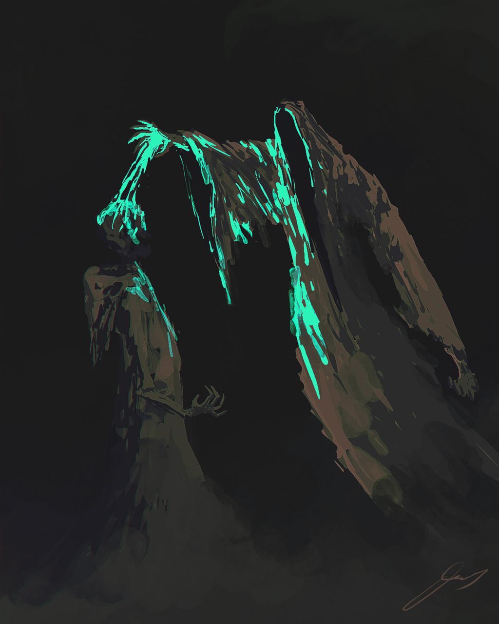
part 1 in a series inspired completely by ~PIROtehniche's done a series by the same name. --> [link] check it out.
this will be my first sequential art. i need practice.
by the way there is no plan with this story. none. so it might turn out lame or not make any sense.
\\\\\\\\\\\\UPDATE//////////// july 21 2009
here's the next four panels showing the spaceman exploring the cavernous ruins. maybe he will find something.
Related content


Comments: 99


Yup.  (Smile)")
Thanks for the push!
👍: 0 ⏩: 0

This is absolutely gorgeous. Say, the links go to a deactivated account. Is there another link that works at all? Thanks
👍: 0 ⏩: 1
Well, it appears that one of my favorite artists has had their account deactivated... fuck. Now I'm sad. He did all of his stuff in ms paint. What a legend.
👍: 0 ⏩: 0


wow, yes it has. thanks.
👍: 0 ⏩: 0

You're welcome!
👍: 0 ⏩: 0

simply brilliant man! this is some great imagery here
👍: 0 ⏩: 1
your very welcome
👍: 0 ⏩: 0


This is quite beautiful, with things to like, and things to improve.
First of all, I like the type at the top (unlike another person who has also commented on this), and the scratching nature of the illustration. It feels very nostalgic, like the cover of a pulp sci-fi novel.
I feel the transition from the first panel to the second is somewhat abrupt. When I read it, I imagined the falling craft whistling through the air, then momentarily confused as the action was truncated, with the ship having been resting there for a while after its crash. Perhaps you could add one or two more panels showing the descent/crash as it is happening, before moving on to the exit of the explorer.
The flow through 2-4, and 5-8 is lovely, but the previously unknown source of light (the explorer's staff) is confusing and halts the viewer while they ty to figure out the change of perspective. Perhaps there could be an extra panel showing the person "lighting" it?
I love the art. The grand scale of the structure/landscape compared to the little figure sets the scene as both mysterious and lonely. I'm intrigued as to what this explorer discovers...
Very well done.
P.S. Please ignore the double post, I wasn't quite finished editing my comment when the computer decided I was finished and sent my message prematurely.
👍: 0 ⏩: 1
i know exactly what you mean about the abrupt changes. it was done on purpose, however flawed that purpose may have been. i want to be efficient in telling the story. more like a story book than a comic. i realize that certain things require more explanation through sequential action, especially without text. hopefully the viewer doesn't get too confused. i'll need to think ahead, and if necessary add panels later.
thanks so much for your input. it really helps with a project like this. :}
👍: 0 ⏩: 1
Cool
Glad to give critique. Enjoying this work so far.
👍: 0 ⏩: 0
This is qthings to like, and things to improve.
First of all, I like the type at the top, and the scratching nature of the illustration. It feels very nostalgic, like the cover of a pulp sci-fi novel.
I feel the transition from the first panel to the second is somewhat abrupt. When I read it, I imagined the falling craft whistling through the air, then momentarily confused as the action was truncated, with the ship having been resting there for a while after its crash. Perhaps you could add one or two more panels showing the descent/crash as it is happening, before moving on to the exit of the explorer.
The flow through 2-4, and 5-8 is lovely, but the previously unknown source of light (the explorer's staff) is confusing. Perhaps there could be an extra panel showing the person "lighting" it?
I love the art. The grand scale of the structure/landscape compared to the little figure sets the scene as both mysterious and lonely. I'm intrigued as to what this explorer discovers...
Very well done.
👍: 0 ⏩: 0

wow, for being this your fist sequential story... it's really great.
The fist thing that comes to my mind is: "I want to see more!"
what about sending this piece, or any other you like to ours wordless comics festival? [link]
👍: 0 ⏩: 1
thank you! you will see more.
👍: 0 ⏩: 0


wow - i like this storyboard-style - neither dialogues nor soundwords.
👍: 0 ⏩: 1
yes! i have painted myself into a corner there. but there are ways around dialogue. i'm glad you like it.
👍: 0 ⏩: 0
i thought i sucked! but i'm actually really enjoying doing these. the landscape seems to be the main focus. not at all what i'm used to. so i'm really happy that you dig it! thanks
👍: 0 ⏩: 1

haha, np. i dread landscapes. i should stop avoiding them though, since thats the only way to get better at them xD
👍: 0 ⏩: 0

I just the love amazing detailing you give off Nick, even on your characters. You make everything belong its got a comforting feeling to it. amazing, amazing work once again.
👍: 0 ⏩: 1
thank you so much.
👍: 0 ⏩: 1
lol oh dont worry, I know
")
👍: 0 ⏩: 0

Whoa... instant love.
But PLEASE change that horrible, horrible font and draw / write the letters yourself... it's so NOT fitting with the awesomesauce following.
👍: 0 ⏩: 1
hmmm, i see your point. what style would you have me use? something simple, futuristic, retro future, digital? i'll think on it and change it with the next update in any case. thanks for the input, and telling me not to be lazy.
thanks!
👍: 0 ⏩: 1
Well, my feeling for the story is somewhat "grungy" / "scribbly". Considering this person is lost, I'd say go with something that resembles drawing in sand/dirt/mud or something. A rocky might work as well. But your lines are delicate and fine, thus it shouldn't be too thick or heavy looking.
It also really depends on where you see this story going, so far the world is looking deserted but once inhabitated by beings that sure had a feeling for monumental stuff. Maybe you can incorporate this "deserted" / "destroyed" / "fallen" attribute to your logo. Maybe you shouldn't think of it as text in the classical sense, rather as another opportunity to add a feeling for the atmosphere of the strip. So far it feels mythical, and somewhat scary - it has a bit of a Lovecraftian feel in a way, weird arcitecture, huge, but done with a primordial design.
Also, I wouldn't use Retro-SciFi stuff, or very technical fonts for this... obviously the spaceship crashed, and so far it's not a very hightech story at all (this might change though, I can only judge the stuff I have seen so far).
To make a long story short, paint/craft your logo in the same style you do your pictures, so it blends in with the rest and in the end it will be awesome, I am pretty sure. Just skip the Alarm-Clock font
Hope this helps.
 (Wink)")
👍: 0 ⏩: 1
yes it does! thanks for your help. i've got something that i'll slap on there next update.
👍: 0 ⏩: 0

WOW!!!!
my favorite panel is the one where u see our spaceman from behind going down that tunel,he really looks lost!!!!!good job...make more,and so should i...but i dont wanna rush it.....

👍: 0 ⏩: 1
i feel ya. the ideas have to come first. that panel was actually from an alternate idea i was going to go with, but it was weak. the panel was too good to give up so i worked the sequence around it. lol, so hard!
really happy you like it man.
👍: 0 ⏩: 0

thank you so much! 
👍: 0 ⏩: 1

No, really! i love the xtrange atmosphere, like a old comics books. Greeeeeeat work dude!
👍: 0 ⏩: 1

i will.
👍: 0 ⏩: 0


👍: 0 ⏩: 1
i'm sorry to hear about your eyes, lol. ")
👍: 0 ⏩: 1
How long do I have to wait for part two?
👍: 0 ⏩: 1
this is part one and two. four panels each. if it goes long enough i will simply call it a chapter.

👍: 0 ⏩: 1
I look forward to seeing more

👍: 0 ⏩: 0
| Next =>