HOME | DD
 NRWick — Colour Rendering Impressionist

Published: 2006-02-07 21:30:47 +0000 UTC; Views: 439; Favourites: 2; Downloads: 33
Redirect to original
Description
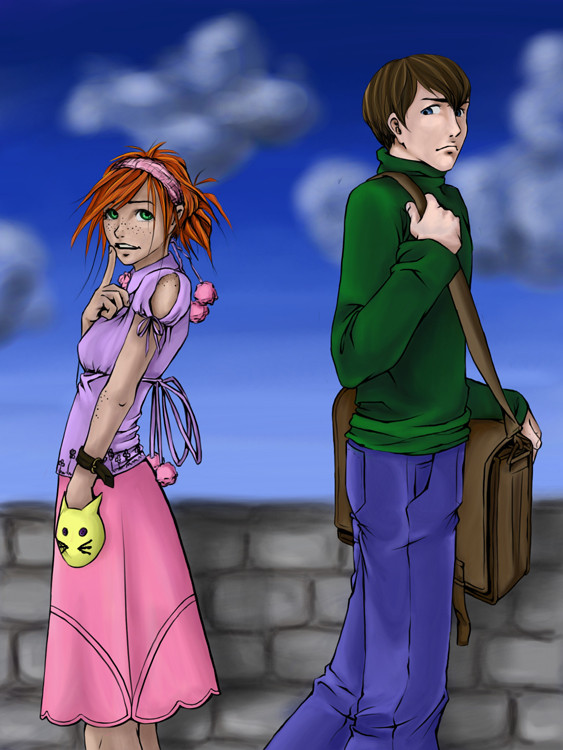
This was my final from my Intro to Illustration class last semester. If you are wondering what is up with it, well it is in an Impressionistic style and also is in High Key. Don't know what High key is? I shall explain. High key is were all of the painting, with exception to the focal point, is painted so the values are all in the top 30% of the value scale. Example: Black would be 30% gray. Get it? Then your focal point is supposed to be full value. Well, I was a little too hard with mine. You are supposed to spread it so it looks like a nice little spotlight. XD Mine didn't work so well. Ehehe. So yes. Ooh, I'm an "artist" now. X3Specs:
Liquitex Acrylic paint
Errr, paint brushes
Strathmore Illustration Board
27 hours of time... -_-
((oh and in case anyone wants to get on my case about the crits discouraged, I put it there because I am not fixing this. I don't care how awful it is. XD I do love to hear your opinion though, so don't hesitate to give input. Just don't expect anything to change, especially with this.))
Related content


Comments: 11

 (Smile)")

oh man... I remember having to think like that in school. Just wait till it oozes out of your pores. This is really cool to see after having seen your b&w rendering. great stuff.
👍: 0 ⏩: 1

This was actually from a year ago, so it does ooze out my pores now and I love it! ^_^ lol. Thank you very much I am glad you enjoy it.

👍: 0 ⏩: 0

Yep! And there is also low key and middle key too!
👍: 0 ⏩: 0

Ithink with a bit more blending it could look like a spotlight a bit more, but it doesnt NOT look like a spotlight.. if that makes sense. its hard to make a spot light happen with only colour XD i think it looks glorious tho! I love the muted colours in the non spotlight part too
")
👍: 0 ⏩: 1
Thank you very much! And I get what you mean about the spotlight. Heehee, we at school decided that it was a really durty window with a clean spot where a kid was looking in or something. XD we are dorks.
👍: 0 ⏩: 0

Keen o! That looks awesome ^_^
I woulda made the focal point the necklace hanging out of the drawer though ^_^
That was where I was drawn with the original ^_^
Anyway, but focal point is neat ^_^
it turned out really really good ^_6
👍: 0 ⏩: 1
Aww, thank you very much! You know, that was the original focal point, but I wanted to do full value on something with more contrast around it. But you are right, the necklace makes more sense.

👍: 0 ⏩: 1
