HOME | DD
Published: 2007-05-25 13:18:44 +0000 UTC; Views: 23086; Favourites: 398; Downloads: 250
Redirect to original
Description
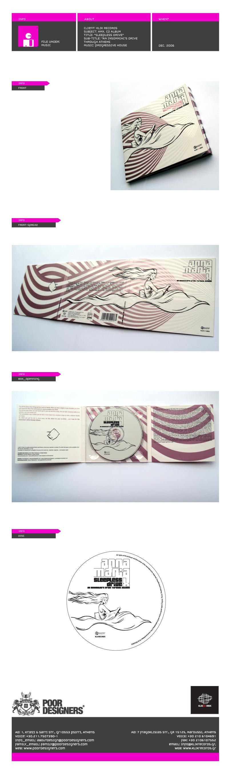
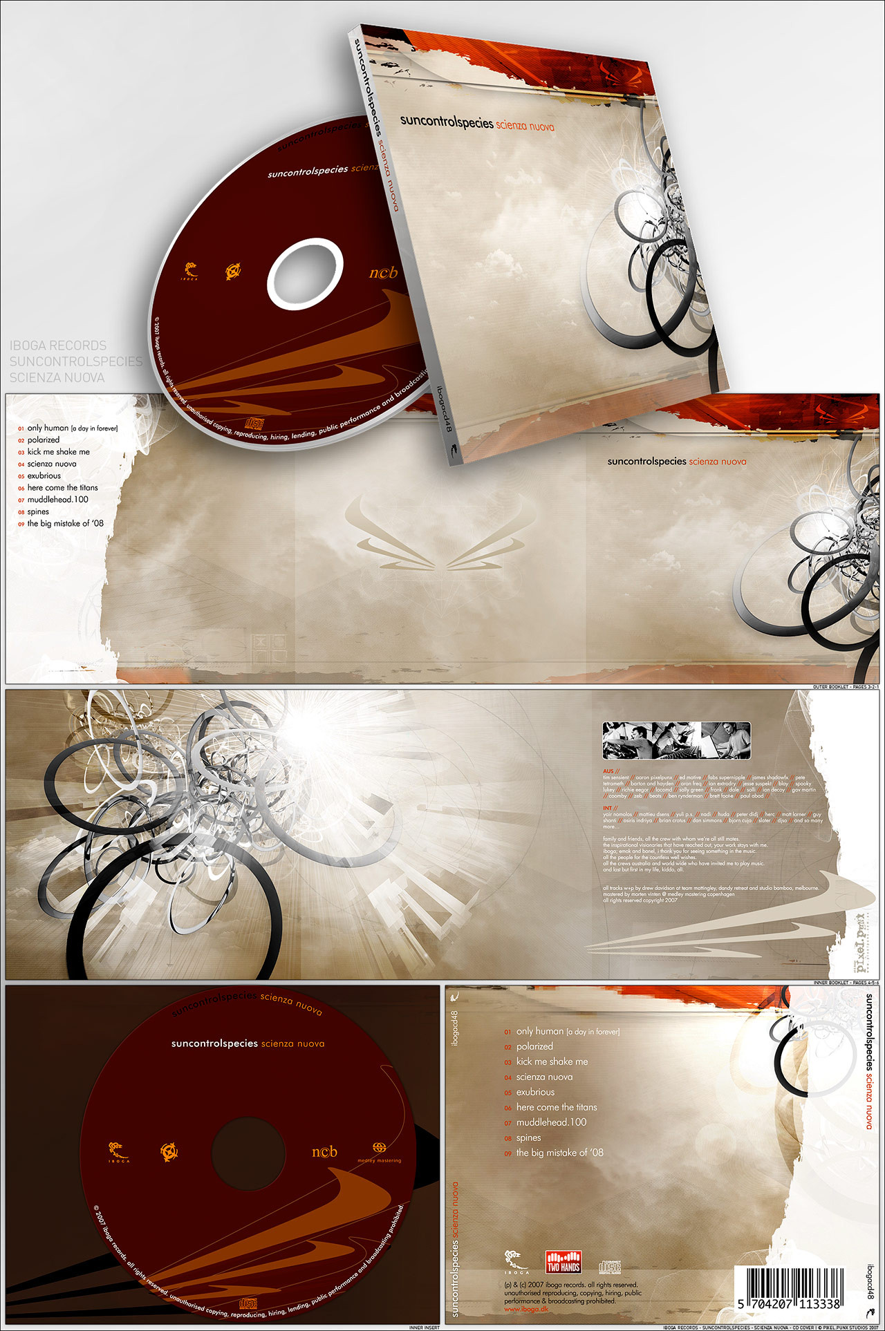
Noa Studios Cover design,Order at [link] !
Dedicated to =sunsE
Thanks to *ether
Edited on comments from:
~pitters
~verticalpoint
*SuperFex
~RazyBerry
~mesme8
~pedribeiro
`depthskins
Related content


Comments: 318

Really cool stuff!
Not really sure about the font on the track listing...
👍: 0 ⏩: 1
PascalPixel In reply to pedribeiro [2007-06-09 14:01:00 +0000 UTC]
ahw everybody seems to think that... how bout i try Myriad?
")
👍: 0 ⏩: 1
Thanks always a good choice. But you could still go stylish and find something else. But make it readable. After all, that's all that matters!
 (Wink)")
👍: 0 ⏩: 1
PascalPixel In reply to pedribeiro [2007-06-09 14:32:21 +0000 UTC]
thats the problem! nothing thats stylish is readable this small xD
👍: 0 ⏩: 1
Then neutral fonts will solve your problem. Myriad and Helvetica to the rescue!
👍: 0 ⏩: 1
PascalPixel In reply to pedribeiro [2007-06-14 18:56:06 +0000 UTC]
myriad is soo stretchy ... i'll have to make it smaller vertically
👍: 0 ⏩: 1
[link]
Try out some of Jos Buivenga fonts.
👍: 0 ⏩: 1


PascalPixel In reply to saltyshadow [2007-06-02 18:57:42 +0000 UTC]
omg! its an honour to have you comment here 
👍: 0 ⏩: 1

hahaha, no, it's really beautiful

👍: 0 ⏩: 0


lookin gewd
and yes of course - wasted =]
👍: 0 ⏩: 1
PascalPixel In reply to Wasted14 [2007-06-02 18:55:48 +0000 UTC]
but... you take like whiskey? or bacardi?
👍: 0 ⏩: 1
bacardi FTW definetly ^.^
Had blue gin on the weekend - not advised at all haha
👍: 0 ⏩: 1
PascalPixel In reply to Wasted14 [2007-06-09 13:49:28 +0000 UTC]
LOL! well i was playing a rickguy, i drank a whole bottle of red whine at the BBQ yesterday
")
👍: 0 ⏩: 0

heel netjes man! maar die pokemon waanzin gaat me iets te boven
👍: 0 ⏩: 1

don't like the typo
don't like the cd box
(not the design, the actual box with the black edge)
love the graphics
👍: 0 ⏩: 2
for instance the typ you used on the back, the songtitles etc
but i assume thats personal...
and the cd box.. wel, thats always an issue
👍: 0 ⏩: 0
PascalPixel In reply to dzn-citizen [2007-06-02 19:34:23 +0000 UTC]
what typo? and i dont like the black edge either but what do you expect from Lego Island's cd box?
👍: 0 ⏩: 0

Damn good job!!! Like this colors
👍: 0 ⏩: 1

I like the design, but you might try a brighter color scheme, if the music fits
👍: 0 ⏩: 1
PascalPixel In reply to bmyhousekey [2007-05-31 19:24:06 +0000 UTC]
i will next time for you then! ")
👍: 0 ⏩: 1
gotcha, good work though
👍: 0 ⏩: 1
PascalPixel In reply to bmyhousekey [2007-06-02 18:52:18 +0000 UTC]
would you like something 80's neon styled?
👍: 0 ⏩: 1
i think that would work. maybe it will pop a little more with high contrast.
👍: 0 ⏩: 1

i have three words for you mate.
Sick sick sick
👍: 0 ⏩: 1

Very good design...original retro twist. I'm diggin it.
👍: 0 ⏩: 1

Very cool design dude, love the idea
👍: 0 ⏩: 1

PascalPixel In reply to Wasted14 [2007-05-27 10:28:47 +0000 UTC]
thanks man! ... btw... you wasted?
👍: 0 ⏩: 0

nice colors, love the texture or the BG, one thing i;m not sure of is the block of text in the back cover the black square takes a lot form your design, in the front it doesn't really matter cuz' the size of the black rectangle is small.. try white and lower the opacity to kindda have like a see through effect... is just my opinion.. but other wise i love it.. good job!!
👍: 0 ⏩: 1
PascalPixel In reply to RazyBerry [2007-05-27 10:31:13 +0000 UTC]
...thats a good idea... but actually it shouldnt have a rainbow in the backcover at all... it was added on comment, but i can make it bigger and see-through yes... but that may take the attention from the front because it would equalise the colors? i'll try now... thanks for your good comment!
👍: 0 ⏩: 0

I still can't understand why you watch me. You are too cool. tsssst
This CD cover is awesome
👍: 0 ⏩: 1
PascalPixel In reply to Kjherstin [2007-05-26 16:02:42 +0000 UTC]
because i used your phone theme on my old phone, and i like your desktopscreens, cant wait for you to screenshot something with my themes in it  (Smile)")
👍: 0 ⏩: 0

<= Prev | | Next =>