HOME | DD
 patrickgs — Visual Style Concept

Published: 2008-10-02 13:04:31 +0000 UTC; Views: 8888; Favourites: 11; Downloads: 987
Redirect to original
Description
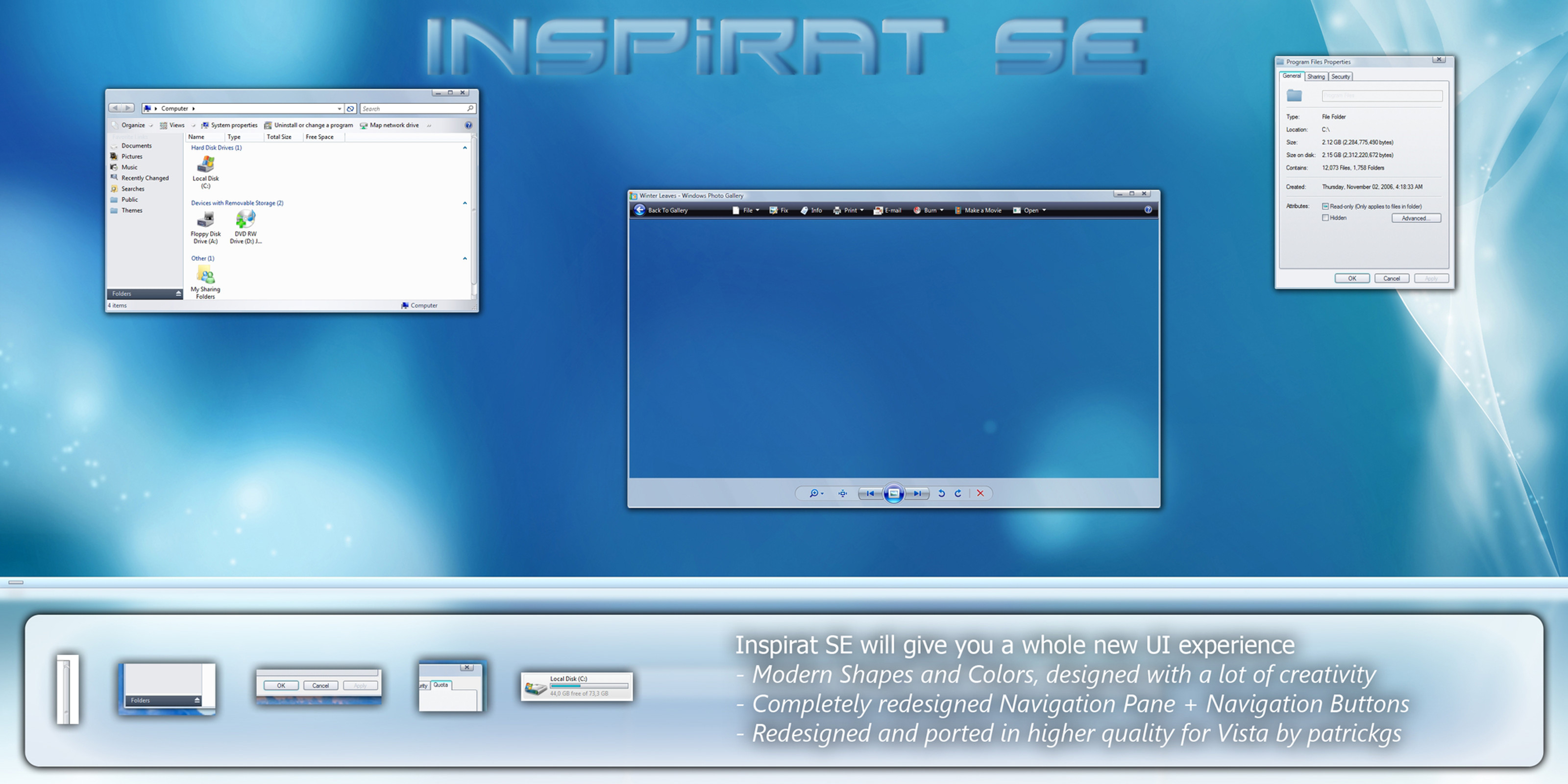
Hi everyone (Smile)")
I started collecting Ideas for a new Visual Style, based on a Window Mockup by
yepp that's it...
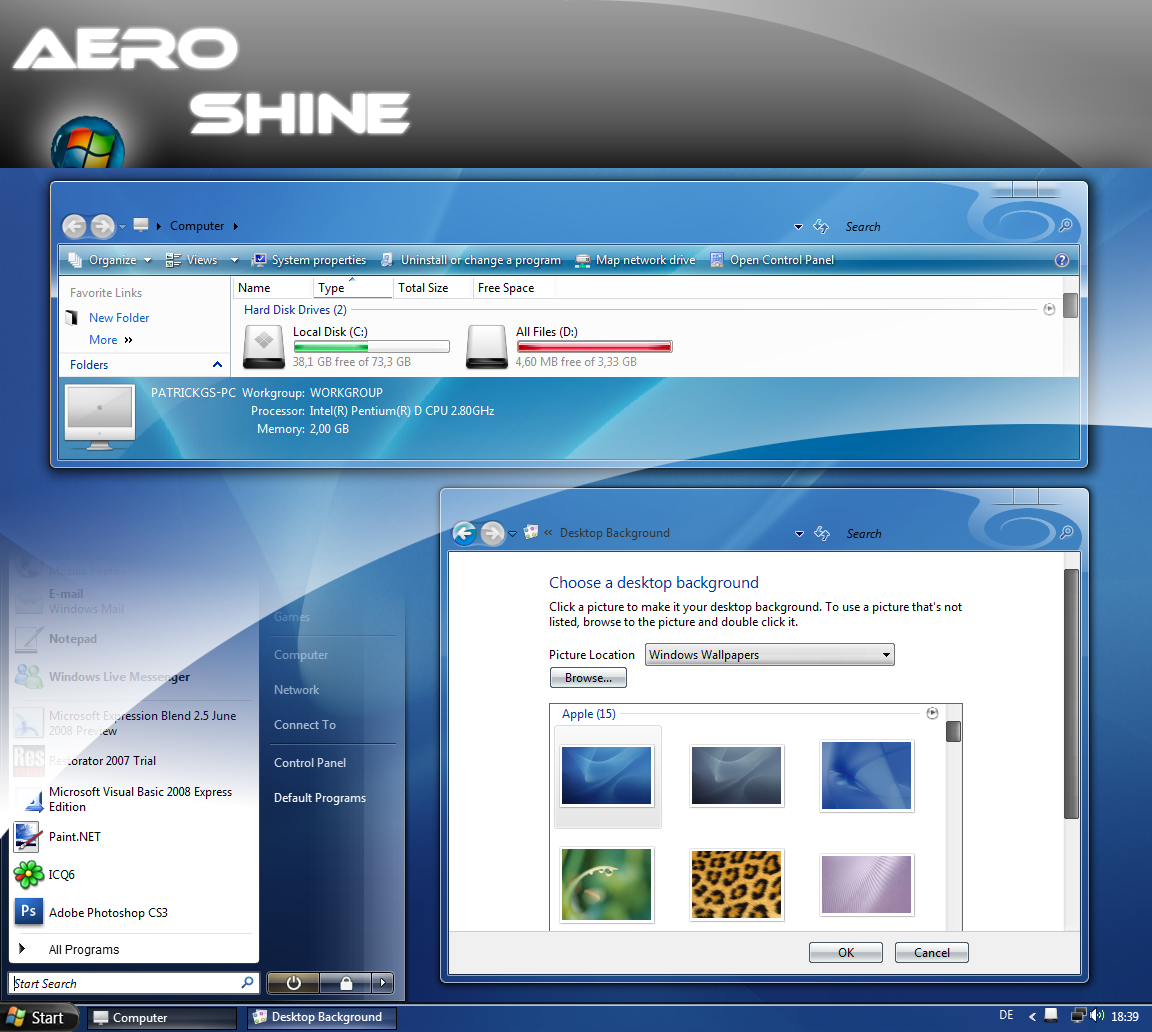
ohh and about VistaOSX '09 [link]
Related content


Comments: 24


[link]
you concept it but i created it for windows xp
👍: 0 ⏩: 0


Hmmm. Looks good atm. Hope something come out of it
 (Wink)")
👍: 0 ⏩: 0


")


cant really see much of the taskbar in action in this..but the explorer window looks fantastic! i really love the scroll..the whole thing actually reminds me of something kol would do
")
👍: 0 ⏩: 0


It's neat how GUI's evolved from a simple straightforward approach, to now having to display so much information all the time that the simplicity is completely lost.
👍: 0 ⏩: 1

some people like mimalistic others like it shiny
Everyone has it's own taste...
👍: 0 ⏩: 1
Well, no no, I'm talking about all GUIs. No matter what OS and setup one has, they're all getting more complex every day, whereas the original interface of, say, Windows 95 was very very simple.
It had your Title bar, regular File, Edit, etc. Bar, and then the Address bar. Then there was the whole Explorer Tree on the sidebar. But that was about it, if you had that much going on to begin with.
Nowadays there is just a whole lot more going on in a single explorer window, and I'm wondering if all these neat little buttons and slide bars actually make the system easier to use or not, or if they make the whole interface seem harder to approach when seen through the eyes of a first-time computer user.
Plenty of times this has come to the forefront when I'm trying to help someone get comfortable with their first computer. Often, most questions used to be answered by "Right click on the icon, and what you want to do is right there. Click on it", and now there's a whole slew of "click on the icon, then come up to this bar on top and click this to bring up a dropdown menu, then click the button having to do with what you want to do". This is especially easy to see with the hidden File, Edit etc. Bar. Was it really necessary to hide it away until you hit Alt?
I just think that Microsoft could have been a bit more careful with what they decided to hide away, and what they decided to put right in front of you.
GOINK
👍: 0 ⏩: 0


that's what i am trying to reach... freshness...
Danke!
👍: 0 ⏩: 0


But! I don't like the caption button's shadow, it's too intense, doesn't fit to the delicate colours of this visual styles
👍: 0 ⏩: 0