HOME | DD
 PaulNLD — Basing
Published: 2009-11-30 06:04:40 +0000 UTC; Views: 2199; Favourites: 16; Downloads: 95
Redirect to original
Description
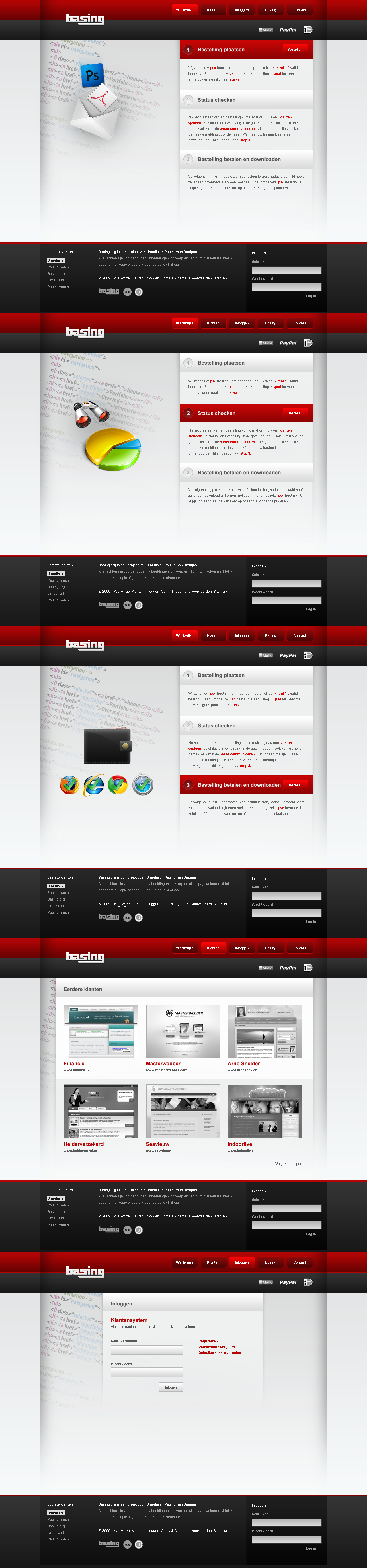
BasingBasing is a project with www.umedia.nl and for sale. Basing is another word for Slicing to xhtml . Used alot on the forum [link]
 (Smile)")
Update
2 new pages added
Related content


Comments: 22

Looks good - some pages are particularly better than others due to icons, setup etc.
By the way, you should consider letting the gradients go from top to bottom in the input fields on the contact page. Well, just popped to my eyes, hehe.
👍: 0 ⏩: 0


I love it. Pretty simple, but so absolutely f**king nice!
👍: 0 ⏩: 1

Nice job mate
👍: 0 ⏩: 1

Hmm okey! Thnx for being honest
👍: 0 ⏩: 1


photoshop logo'tje is nogal slordig aan de rand
👍: 0 ⏩: 0

even in het nederlands ")
Positief
- design is mooi
- kleur gebruik past goed bij elkaar
- leuk/goed concept aangezien veel mensen niet kunnen basen
kritische punten
- vind het op somige plekken wat leeg maar dat kan persoonlijke voorkeur zijn
- buttons zijn wat te groot lijkt me, maar aan de andere kant toch wel weer duidelijk
overal 8.0 , leuk idee mooi design!
👍: 0 ⏩: 0


not bad, whats getting me most is how the main section division mark on the half line doesn't meet up right with the buttons.
and these are nit-picky but....
perhaps a border radius on the external links in the footer, and the AA on the PS Icon is a little low.
I like the colors though, nice and snappy / glossy.
👍: 0 ⏩: 1

Not quite sure on the use of gradients in this one, maybe it's just my personal preference but they seem too pronounced.
👍: 0 ⏩: 1
")