HOME | DD
 PaulNLD — PH Designs concept 1

Published: 2009-10-18 10:13:38 +0000 UTC; Views: 3571; Favourites: 27; Downloads: 151
Redirect to original
Description
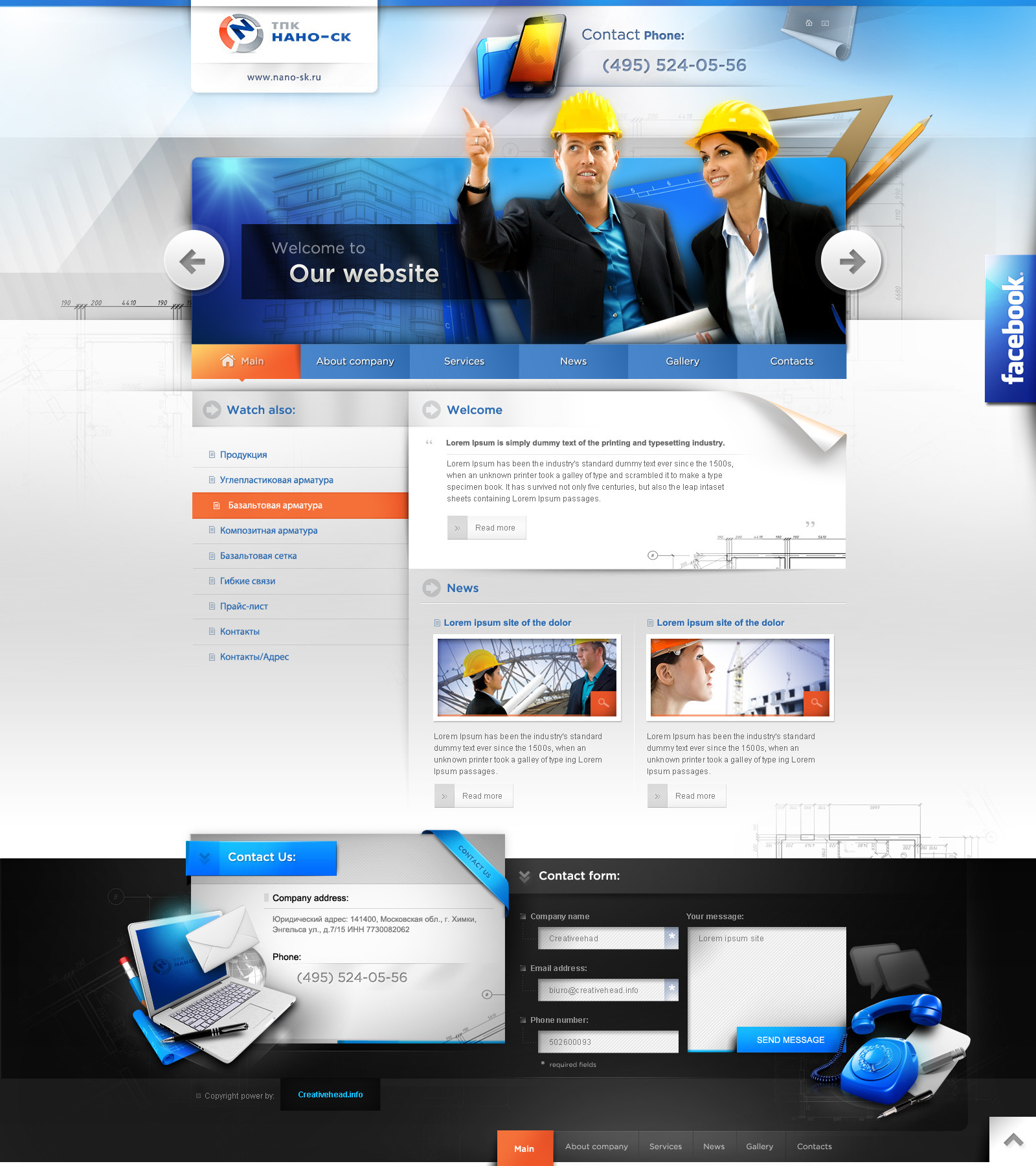
In the search to a new look and feel for my company im working on some different concepts. To find out wich is the best im hoping to get your oppinion on it.About the logo
This logo isnt the final one, Ill reveal the new logo later! This logo was made by =alexdesigns, though his logo concepts were good we just couldnt match our needs and feelings, so we decided to stop working on it together. Anyways I do want to show you his best proposal in my eyes! So give him a big hand
 (Smile)")
About the concept
So I was browsing and looking at other webdesign company websites and I came with the idea that my site has to Blow. You have to say
 WOW! when you look at it. So I came up with this colorfull concept.
I'd love to get some critique and comments from you guys! Let me know what you think!
Related content


Comments: 34

 (Wink)")

nice.
erg mooie gradients in de background.
maar ik vind de site niet goed ingedeelt.
3 keer naast elkaar wat klanten over je zeggen zou daar iets anders voor verzinnen voor de rest vind ik hem erg nice maar ben nog niet (blown away) hopelijk word ik dat wel met V2.0 ")
👍: 0 ⏩: 1

okey okey ")
Vanavond een nieuwe versie
👍: 0 ⏩: 0

Very shiny colors, and immediately catched my attention. I think it did the job, haha!
👍: 0 ⏩: 1
Haha cool ")
👍: 0 ⏩: 0

yaaaaaaaaaaaaay i like it, the new colours, the new logo, the new concept... ALL!!!
👍: 0 ⏩: 1
The logo wont be used
thnx for the comment
👍: 0 ⏩: 1

I have to agree with you, a portfolio needs to be bright, colourful and attractive to stand out from hundreds of others.
👍: 0 ⏩: 1
👍: 0 ⏩: 1
Good luck with the rest of the design then!
👍: 0 ⏩: 0


I like that logo by Alex. I 
Nice design, nice colors, traditional and comfortable menu.

👍: 0 ⏩: 1

imo the other one was better, this one is nice too bu i like the clean look of the current one.
👍: 0 ⏩: 1
Thanks for the feedback mate!
👍: 0 ⏩: 0


I love the color combination but i dont like the layut. I think the white stroke don't looks good. Try to remove it.
👍: 0 ⏩: 1
Okey thnx for your feedback.
Im not going to edit it yet. Ill make some concept layouts first
👍: 0 ⏩: 0

Love the colors. Dont like the Portfolio bit, seems to crowded; needs more depth. But overall looks good.
👍: 0 ⏩: 1

De achtergrond doet pijn an mn ogen ")
👍: 0 ⏩: 1

Een beetje te simpel in mijn ogen, de achtergrond trekt meer mijn aandacht dan de content zelf.
Je vorige layout spreekt me dan toch meer aan dan deze.
👍: 0 ⏩: 1

Sorry mate, it's not really working for me. The colors are a bit bland, actually. And the overall setup is pretty boring.
More specifically I think the logo text is too dark; doesn't fit the background and that the pixel fonts in the content area and menu aren't working very well.
Overall it looks OK, though - So it's not a disaster, but I'd say there is plenty of room for improvements.
👍: 0 ⏩: 1
I agree with you. Like I said, this is just a concept
Thanks for the comment
👍: 0 ⏩: 0

