HOME | DD
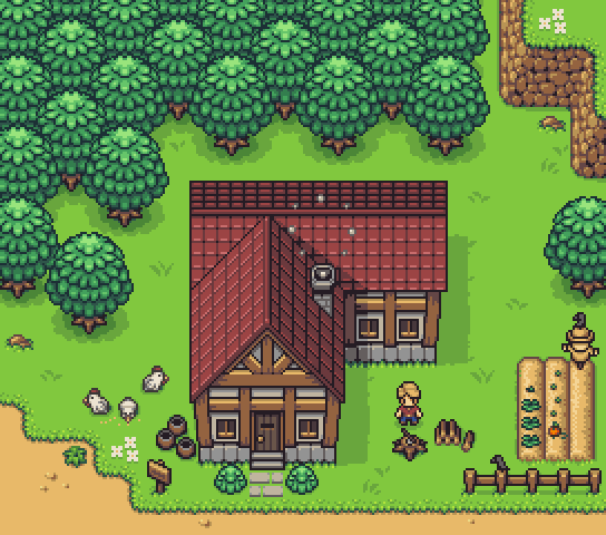
 PeekyChew — The Legend of Zelda Isometric Concept
Published: 2017-07-29 12:19:52 +0000 UTC; Views: 6431; Favourites: 74; Downloads: 44
Redirect to original
Description
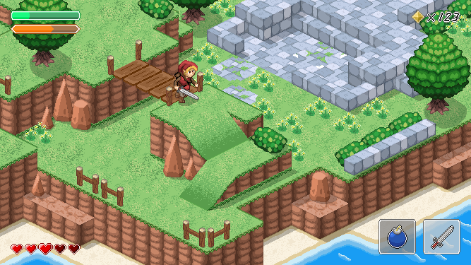
This is a paid concept that I did last year for ZigZaGame, a Japanese games company. The brief was a small scene with a style heavily inspired by The Legend of Zelda, using an isometric view. I took inspiration from a few different Zelda games for the scene, as it's one of my favourite series.What do you think? I was extremely pleased with how it turned out.
--------------------------
This is private, please do not use. You can find information on commissions on my profile, or email me directly at: jippily@gmail.com
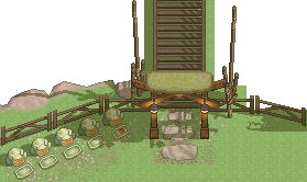
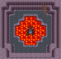
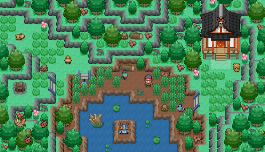
Other concepts:
Related content


Comments: 20

Overall


Vision
Originality
Technique
Impact
I've never done a formal critique, nor did I go terribly far with the pixel art route, but I've done some Zelda-inspired stuff as well, and I'd like to share some opinions. Some of these kind of stray into design questions which might go a little beyond the scope of what the mockup was intended for, so bear with me if that happens. e.deviantart.net/emoticons/s/s… " width="15" height="15" alt="
 (Smile)")
First off, overall, I like it; let's get that out of the way. I see a fair amount of Link to the Past influence, which I always enjoy. Isometric art is always tricky, so I appreciate the effort involved in making everything line up just so.
*I think the outline on the bushes and tree foliage is a bit too strong. Most other elements don't have as strong an outline.
*The triangular rock bits don't seem quite right to my eye. I'm not sure if they're supposed to be flush with the adjoining rock wall or not. They also seem to be too finely pointed for a natural formation. The blunted-off rocks look more natural to me.
*I think the overall contrast on the rock walls could be bumped up a bit to improve the perception of "depth". It does look like you're working within a palette, which I appreciate, but perhaps you could use palette entries which are spaced further apart.
*There's a lot of 90-degree angles in the "natural" portions of the environment which ideally ought to be rounded off. Like you've done with the edges of the sand tiles.
*I like the stonework, but the division between blocks is disproportionately pronounced on the "walls" versus the "floors" and could probably be averaged out a bit.
*Fence posts need a bit more shadowing compared to other objects. Oh, and I think the bridge's shadow would probably also be partially visible.
*I like how the other objects' shadows are offset as though the light is coming from a particular direction. Should the shadows be cast towards the upper-right, though, if the environment tiles are being lit from the lower-left? (Since we can't see the walls facing to the north, I can't tell exactly where the light is coming from, so I figured I'd ask.)
*I'd select a chunkier font for the rupee count; with the italicization, it's a bit hard to read at a glance.
*Perhaps some of the flowers can be made red or orange to add a bit more variance in color to the scene since it's largely green grass and brown rock.
*Does Link jump at all? I notice there's a ramp for him to get down off the rock formation, but no ramps at the stonework area. Just curious if he can hop up onto the stones, or if he can only drop down.
Anyways, I think this is a pretty solid foundation overall, especially for something that was intended more as a pitch than as a final product.
👍: 0 ⏩: 1

Really great points you made, you definitely see way more than my eyes did lol.
Though I actually really like the way the triangular rocks look, and don't look out of place to me, they just look like weird rocks haha. Kind of makes me think of DBZ and how all of the environment looks strange and different from each other, except this isn't so extreme and actually works together really well imo.
And link can only climb/jump up small/short ledges. So the ramp makes sense that it is to high for him to jump down, but that the other ledges/stonework do seem right for him to climb ^_^
👍: 0 ⏩: 0
I absolutely love it
👍: 0 ⏩: 0


Hey, this is really dope! I love the colours and how smooth the tiles look. I wouldn't be me if I didn't throw some constructive criticism in there, though  (Wink)")
The sea tiles seem to be less detailed than the grass and sand tiles. I think the map would feel a lot more consistent if you'd unify the amount of detail some more. As for the character: Have you considered giving characters a darker outline to set them apart from the background a little more? I think a visible contrast between interactive elements and a background would work nicely.
Do with it as you please. Either way, it's looking great!
👍: 0 ⏩: 0

")

I wish RPG Maker had an isometric engine, I've always wanted to make a game in this view! But enough about me, great work!
👍: 0 ⏩: 1

You could always try out Gamemaker. The coding language is extremely easy to learn and it's a lot more powerful than RPG Maker. Thank you!
👍: 0 ⏩: 0


Wow! This is so freakin cool!
Only thing that Doesn't look quite right to me is that grass texture. It looks too fuzzy/pixelated? Might just be me though
👍: 0 ⏩: 1
Thank you! And I know exactly what you mean. If I could go back I would probably have more detailed small tufts of grass rather than the kind of spray can affect that it has right now.
👍: 0 ⏩: 0

Can I ask you an honest question? How did you find it working with ZigZag games? I had bad experiences with them.
👍: 0 ⏩: 0

it's very nice, this looks like it would be a great art style for a 3DS or app based game
👍: 0 ⏩: 1
Thank you! It was actually part of a proposal for an iOS game but sadly I don't think it made the cut in the end.
👍: 0 ⏩: 1
You have a future in the business. It's good work.
👍: 0 ⏩: 0