HOME | DD
 phillyplaya — Elixer
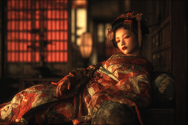

Published: 2002-08-31 17:27:52 +0000 UTC; Views: 795; Favourites: 8; Downloads: 139
Redirect to original
Description
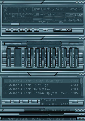
This will be my last 3d piece till I get my new pc (this coming friday). Different from everything else Ive done. I like how it turned out. Started this a while ago but never finished it. Also working on another winamp skin.Related content


Comments: 23


")

This one will definetly go in my favorites ^_^
👍: 0 ⏩: 0

niice. +10 points for blue being your choice of colors
👍: 0 ⏩: 0

Thats great Playa, the cool flowing feelings is very calming. The overall look is great, hope to see more soon
👍: 0 ⏩: 0

Interesting... I like the shapes... the colors.. looks wonderful...
👍: 0 ⏩: 0


I love the name. The piee is pretty damn amazing, you've really upped yer 3D skills in an extremly short ammount of time... all is very sick.
👍: 0 ⏩: 0

very nice,very detailed,nice color,different from ur usualy 3D work,keep it up,+ Favs...
👍: 0 ⏩: 0

-- whoop! I like it the border makes it even better tho i don't like borders - goodlooking piece--
👍: 0 ⏩: 0

I think that the border is a bit too big, and that's the only real flaw in the piece..but, that's just me. Nice work
👍: 0 ⏩: 0


I like the name man..I like the the theme here..and i like the constrat and the blending..and no big spikey shape..nice job...keep it up..l8er
👍: 0 ⏩: 0

Very different from what you usually do, But I dont like the fact that you can see were some of the tenticles stop, wish they were better blended, overall its neat, and it seems weveryone is trying that boarder now these days.Good Job tho, keep up the great work.
👍: 0 ⏩: 0

looks nice man, great colors, nice blending, the boarder looks nice and fits the graphic, good job
👍: 0 ⏩: 0


wow that's the shit man!
It looks a little blurry to mee, maybe something you blended, you stretched it, but anyway, it's all good, have a fav on me.
👍: 0 ⏩: 0


Very clean, you have the whole motion blur going on and nice cool greays and blues. The middle is a little too dark and grainy, I think this would have benefieted from a bright middle. Nice job.
👍: 0 ⏩: 0

I love the feeling of motion this piece portrays, however there are some things that take away from it...the frame is very distracting to me and it could have benefitted with a more custom one. and the next is the center of the piece, it seems to be too burnt, so it becomes grainy or solarized...
It's still very nice though
👍: 0 ⏩: 0