HOME | DD
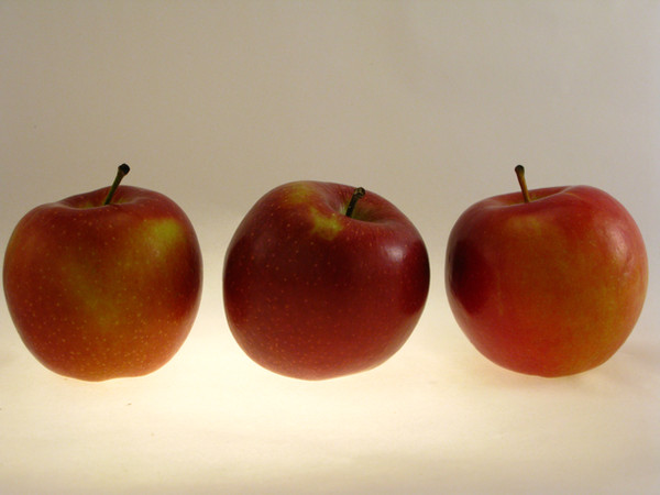
 phydeau — Stop Light

#free #win #apple #apples #green #red #stack #yellow
Published: 2012-05-21 21:32:44 +0000 UTC; Views: 3402; Favourites: 58; Downloads: 101
Redirect to original
Description
I'll be having applesauce with dinner. (Smile)")
UPDATE: Because of the critiques I've been getting for (and thank you all for it), I've made the red apple noticeably more red and lightened the background.
Copyright: [link]
Related content


Comments: 26

Overall
Vision
Originality
Technique
Impact
Hi! I'm writing this critique for a.deviantart.net/avatars/f/e/f… " alt=" " title="FeedbackFrenzy"/> . I like how witty this overall idea is. I wouldn't have though of this particular photo as a traffic-light. The light in this photo works perfectly. It's soft and subtle and what was exactly needed for this. On the other hand, I feel the top apple isn't really bright enough and doesn't give off the same apparent color as the other two apples do. Also, the background could have been whiter in order to give the fruit an overall brighter appearance.
I still love the wittiness this photo has and I would love to see the same wittiness in your other photographs.
👍: 0 ⏩: 0


Originality
Technique
Impact
Hey there! I'm writing in from a.deviantart.net/avatars/f/e/f… " alt=" " title="FeedbackFrenzy"/>
I like the idea of this piece though I feel that it is lacking the kind of impact it could have with a bit of tweaking.
The main thing I noticed when looking at it was the dullness of the background and how the solid grey seemed to leach out the colour of the apples. Maybe working with contrast and balance could result in a brighter, more white background which would serve well with the fruit.
The bottom two apples look great. There is a wonderful amount of detail and the colours are sharp and bright. The top one, however, seems to fall a bit flat due to the large amount of shadow. It looks almost out of place against the other two. Taking in a brightening tool may help with this.
Overall, though, it's an excellent start to a rich, colourful piece e.deviantart.net/emoticons/s/s… " width="15" height="15" alt="
👍: 0 ⏩: 0

Overall
Vision
Originality
Technique
Impact
Hello e.deviantart.net/emoticons/w/w… " width="25" height="20" alt="

a.deviantart.net/avatars/f/e/f… " alt=" " title="FeedbackFrenzy"/> contest!
e.deviantart.net/emoticons/e/e… " width="18" height="15" alt="

First of all, I'd like to start off by saying how appealing to the eye this is. The colour combinations makes me think of a traffic-light as they stand here. The shadows are hitting nicely onto the grey background. Did you do this in a studio? The grey background makes the photo seem so classic, and it reminds me of an old painting I saw at a museum once. When it was cool to paint fruit baskets e.deviantart.net/emoticons/s/s… " width="15" height="15" alt="
The apple-tower is not completely straight e.deviantart.net/emoticons/e/e… " width="15" height="15" alt="
")
e.deviantart.net/emoticons/s/s… " width="15" height="15" alt="
I don't know how you've edited this picture, or if you even have edited it! I think you have, though. It's almost too perfect e.deviantart.net/emoticons/s/s… " width="15" height="15" alt="
e.deviantart.net/emoticons/s/s… " width="15" height="15" alt="
e.deviantart.net/emoticons/b/b… " width="15" height="15" alt="
")
I also like the reflection of light in the apples - but only because it's there on all three e.deviantart.net/emoticons/s/s… " width="15" height="15" alt="
A quick summary of the rating:
Vision: I think your vision is spot on. At least I feel this way, because I can see from the picture that this is exactly how you wanted it to look and I'm sure there is a message to be found somewhere.
Originality: I find this very original. As I said before, I haven't seen anything like it. Only in these old paintings, but it's a totally modern spin on fruit e.deviantart.net/emoticons/b/b… " width="15" height="15" alt="
Technique: This picture shows me that you know exactly what you're doing. It looks like it's done by a professional!
Impact: It also had a rather large impact on me. It made me think, and I like that.
Overall, I don't have much negative to say about this piece, I really like it as it is e.deviantart.net/emoticons/s/s… " width="15" height="15" alt="
I hope you found my critique somewhat useful e.deviantart.net/emoticons/b/b… " width="15" height="15" alt="
👍: 0 ⏩: 0

Impact
Hi, I'm critiquing this piece for #FeedbackFrenzy group 39.
First of all, I love this concept. I've never seen something like this, a very cool idea! And executed so well.
The grey background looks very professional, maybe you could have done it on the street instead though. In a way it interacts with the surroundings, that would of course be hard but maybe nice.
The red apple is so much bigger than the rest, that makes it look a bit of. Also it is much darker than the others, That's a shame, you don't really see the red and it doesn't seem to be a part of the whole. Maybe try to find a lighter apple or adjust the lights so it will be lighter. Or digitally edit it to look lighter. I do think the orange and green apple look good, don't change anything about that!
Over all an awesome photo, keep up the good work!
👍: 0 ⏩: 0


Fantastic! Very original. The colours are amazingly vivid. Love it.
👍: 0 ⏩: 1


Heeeey, I'm from FeedbackFrenzy, and I just wanted to say that this is a pretty awesome pic, man!
I feel like this should totally be a stoplight! The colors on the fruit really pop with this piece, and I feel like the light really speaks volumes for the colors in this piece! the positioning is great, and even if we didn't have the idea of a stoplight in our heads, then this would be the ideal way of stacking these. The background is fantastic providing a ton of contrast to the apples! Even the shadow on the bottom feels super deliberate! I don't really have a negative, here. This piece is fantastic!
👍: 0 ⏩: 1


👍: 0 ⏩: 1

Hello! This comment is for from team #40
Great work! really, my first association was :"hmm..the stoplight!")))
i like the composition: it's quite simple, but it looks awesome and impressive with a yellow apple in the center of photo
it makes some contrast and attract the attention to the center area
although, i think you could improve this piece using some tools like PS to bring more color
it seems to me that these apples should be more bright, more vivid..
overall, it's great piece that can really evoque some feelings while looking at it
keep it up!
Regards, Anna
👍: 0 ⏩: 1

Hi, I am going to critique this piece, courtesy of #FeedbackFrenzy .
First of all, I like smoothness of the colors. I also like the grey background and how it adds dimension and keeps the image clean. I also like the lighting and how it reflects off the apples. This compliments the background as well.
Some things to consider: At first I didn't realize the apple on the top was a red one, try getting a brighter apple to match the brightness of the other two. Also, try shooting from different angles to get different shots, you never know what you're gonna get!
Sincerely, Jonathan
👍: 0 ⏩: 0

Critique for FF ^^
Really interesting concept, and I like how the apples are fully one colour instead of a red with yellows in it and the like. The light reflecting off the apples also adds texture to the photo by showing how smooth they are. I also really like the simplicity of this; it's simple but really intriguing. However, the white background is coming off as a dull grey, and I think it detracts quite a lot from the image. Very creative though. Keep up the good work
👍: 0 ⏩: 1
A lot of people are complaining about the grey. This was actually shot against a white fabric. I might need to fix that.
Thank you.
👍: 0 ⏩: 0

Hi there, here is your critique from #FeedbackFrenzy
In my opinion this is one of the best photos in this frenzy when considering originality and execution together. The ability to see something beyond the obvious is a rare gift. One idea that came to mind is making another with a bright-red apple to signal 'stop'. Also the image could have been a tad more cropped at the sides in my opinion. Would sit easily on any wall!
👍: 0 ⏩: 1

Celebrate 
#Art-Express
Artistic Expression
👍: 0 ⏩: 0

Greenis my favorite. I like this still life.
👍: 0 ⏩: 1