HOME | DD
 piiteer — Draw A Box - Organic Boxes exercise

#drawabox #exercise
Published: 2015-10-13 16:02:41 +0000 UTC; Views: 1379; Favourites: 2; Downloads: 0
Redirect to original
Description
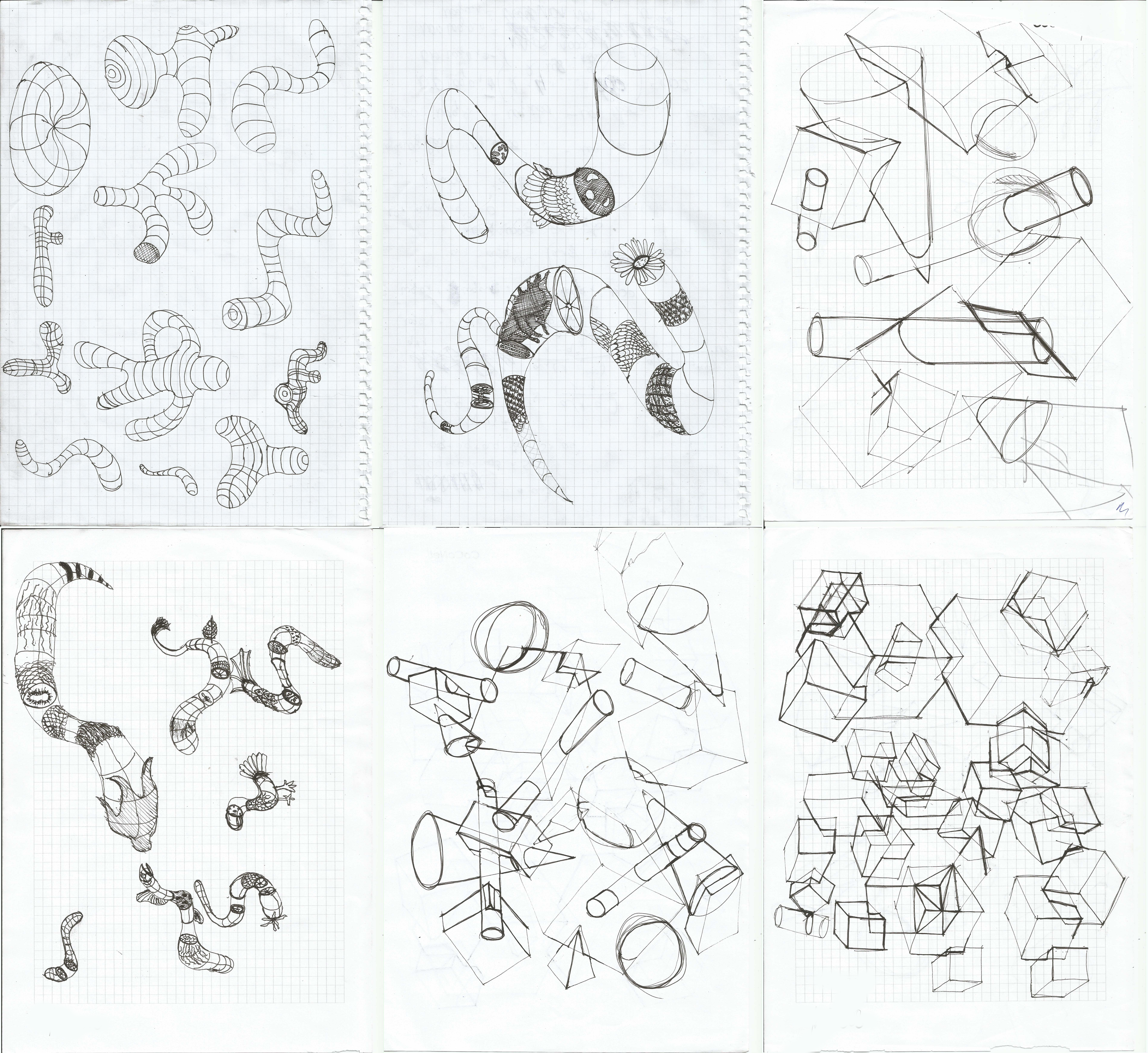
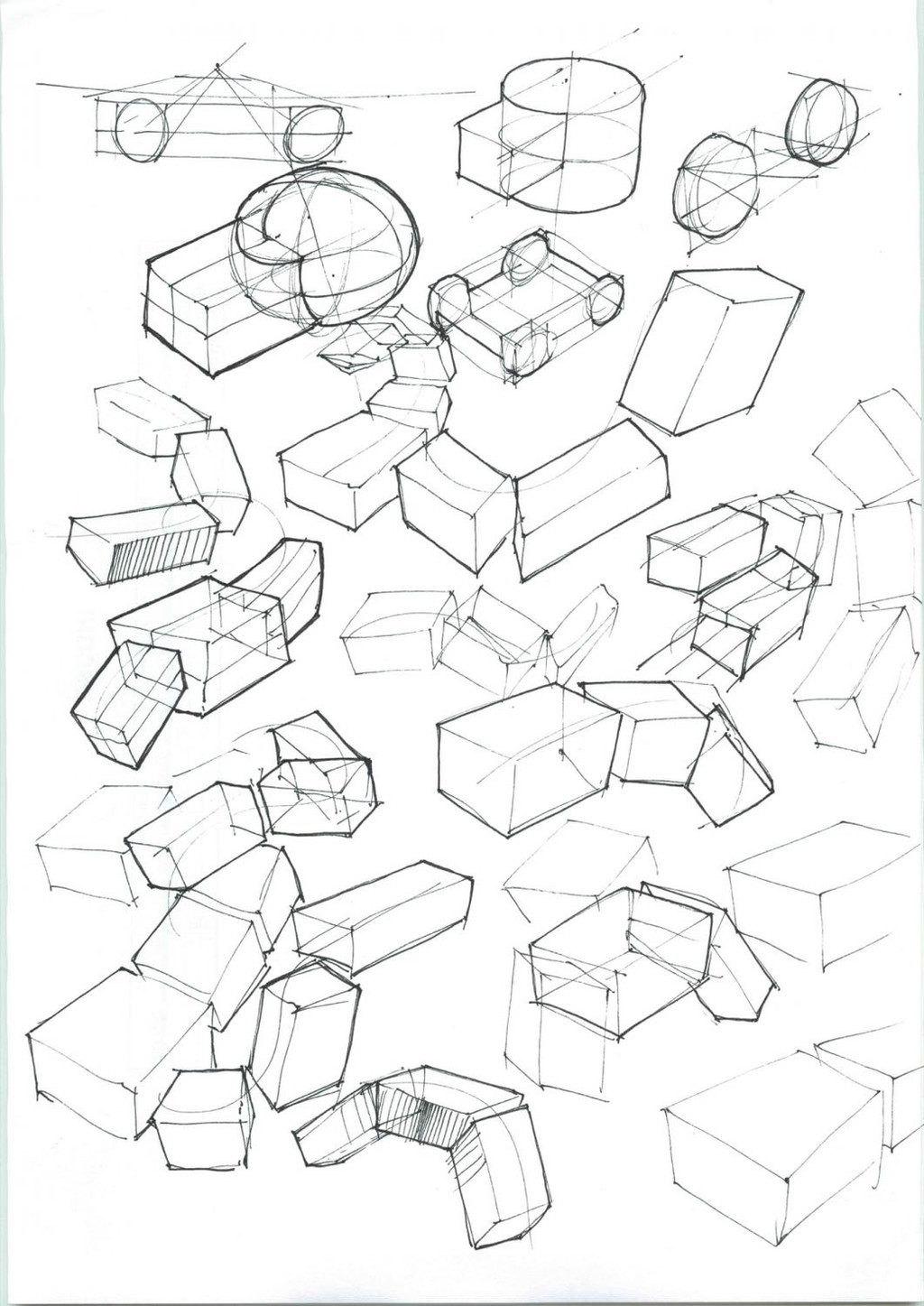
Here is my second try at the Organic Boxes exercise.I can see that it's much better than the first time I drew this. It's probably because I focused more on perspective and line weight.
Completing the 250 Box Challenge earlier this week could have helped too
 (Smile)") .
.
Related content


Comments: 3

Good job, you have improved for sure!
I'd like to give you a few more tips on achieving depth in this exercise. Firstly, avoid dramatic perspective in this exercise. I mentioned keeping the perspective depth even over the boxes. That's got to do with how much the sides converge (which depends on how far away the box is in space). The sides tend to converge more nearby and less the further back in space you go. In this exercise it is often best to not use much perspective distortion and to use diminuation and overlap to read depth to the viewer. Basically, avoid extreme perspectives on these boxes. Even if the box looks okay alone, if it doesn't fit in with the perspective of the OTHER boxes in the scene, you will jar the viewer- like THIS explains.
Bizarre, extreme convergence also made some of the boxes look warped overall, so they don't even make sense on their own. Be warned- too much convergence makes a box look weird, because you are telling the viewer that this object is not square-cornered.
One final suggestion: try playing with the size of the boxes, like making the ones near you BIG, like they are in your face, and the ones further away much, much smaller. You can make a part of the nearest box take up a great deal of our field of view, and the smallest box be really tiny... that will reinforce the feeling of depth. Don't be afraid to make nearby things BIG and faraway things small... smaller... smallest. Just try different things out and see how they look!
Finally, there are some excellent books on perspective that will help you with this stuff. Perspective for Comic Book Artists by David Chelsea is the absolute best perspective book I have ever read- and certainly the most thorough, even though it is all in easily-digestible comic book form. If you get only one perspective book, get this one. It beats all the others.
I also like Ernest R. Norling's Perspective Made Easy , which is a fairly good simple introductory book on the subject. A lot of people recommend it. But I like Joseph D'Amelio's Perspective Drawing Handbook even better as a reference guide, as it is much more thorough- particularly concerning ellipses.
👍: 0 ⏩: 1

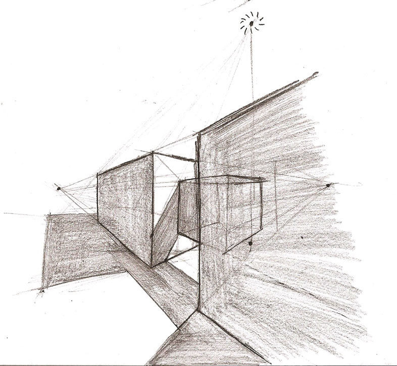
I drew this during one of my lectures and I actually didn't look through all the instructions to this exercise. I just started drawing boxes
Thanks for recommending some books regarding perspective. I will definitely have a look
👍: 0 ⏩: 1
I see, that explains the graph paper. 
Yes, check them out, perspective can be a lot of fun!
👍: 0 ⏩: 0