HOME | DD
 Plague-Doc-Matteo — Bionicle MOC: R0dn3y D13t3r
Published: 2013-05-27 18:28:38 +0000 UTC; Views: 5849; Favourites: 116; Downloads: 0
Redirect to original
Description
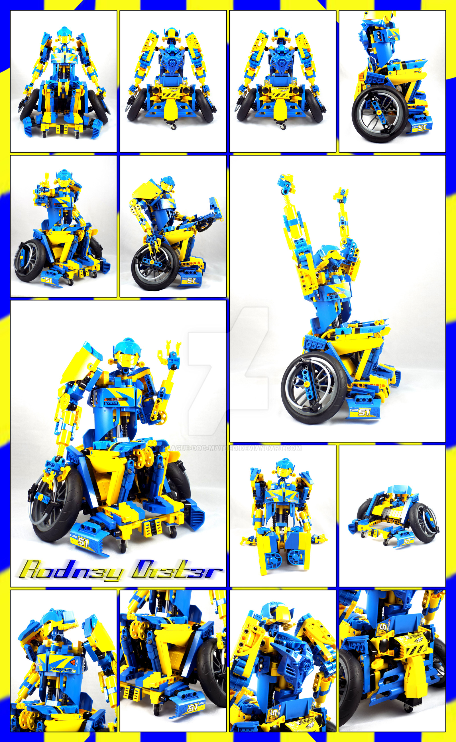
Edit(2/15/2016).Soooo....Rodney got some updates. The main ones are:
- completely rebuilt the arms
- filled out the legs
- color blocked things a bit better
- improved the shoulders and other internal structure in the torso
- improved internal structure of the wheelchair
- made the wheel chair more of a cross between a wheel chair and a race car
- added a fifth wheel in the back to be more accurate to a real athletic wheelchair
About the MOC
Rodney was another "preplanned" MOC for me. I had the concept of a MOC in a wheel chair for a little while before actually building the MOC. However, the concept originally was somewhat different. He originally was going to have four arms, and a more beast like head with a mouth and teeth, his name was going to be "Kumpel" which has one meaning of "friend" or "buddy," and his color scheme was going to be blue, Violet , and black. After purchasing 8494-Ring Of Fire off ebay I simply had to use the parts with the stickers on them, which drastically changed the landscape of this MOC. I lost the four arms and beast-like head but was able to more heavily incorporate the racing influence I wanted him to have, as well as incorporating another concept I had for a while, which was having internal suspension within the MOC's body. I had conceptualized this as being either in the thighs, shins or torso. Seeing as how Rodney is a paraplegic, the torso was the only place this would work. It also made building his torso a lot easier.
")
Rodney is the third member to my "Liberated Robot Series ." You can also view the individual photos of Rodney, as well as all the other Liberated Robots HERE.
Bio(also updated)
Rodney Dieter was an athletic robot who participated in the robot racing league for years with great success. He won many races and almost seemed programmed to win. No matter what his competitor's tried Rodney and his owners always seemed to be a gigabyte ahead of the competition. That is however, until Rodney got into a terrible crash and was very badly damaged. The extent of the damage was devastating and would have required that Rodney be completely rebuilt. Instead of forgoing the cost to rebuild Rodney, his owners decided to scrap him download and rewrite his software into a new robot. The night before Rodney was scheduled for deletion and scrapped a mysterious gray robot showed up and rebooted him. With the help of another brightly colored robot that was traveling with the gray robot, they helped rebuild Rodney during the night while no humans were around. However, they didn't have the parts necessary to repair him completely and Rodney couldn't walk. They instead used parts from the garage next door to fashion him a makeshift wheel chair, a old device humans used when their lower extremities did not function properly. After fixing Rodney to a point of stability he explained to the other robots that he was going to be deleted and scrapped. When they heard this they immediately made Rodney part of the group and left the Garage.
For a while Rodney was another member of the group. He eventually became accustomed to both life as a fugitive robot, and life in a wheelchair. He even became quite good at maneuvering in a wheelchair. Unfortunately, his time with the group would be limited. One day the group was on the run and they came to a dead end. The other able bodied robots were able to scale the wall. While they were trying to help Rodney over he was hit with an EMP blast that knocked him unconscious. The other robots fell over the wall and were able to escape, but Rodney was apprehended and returned to his owners. Once back in the garage they rebooted him to analyze his new code. When they saw how well he was able to move within the wheelchair they instantly saw that Rodney would make a great spokesperson for disabled individuals. So they build him a new wheel chair gave him a new paint job, and started a new robotic sports league where they used old busted up robots. This gave Rodney an new lease on Life as well as helping other damaged athletic robots get a second chance to perform their functions and not become scrap. Now Rodney continues to play wheelchair sports and continues to help other robots become part of the Disabled Bots League. Meanwhile, the other group of bots that helped him escape his fate remain at large...
Related content


Comments: 135

Thanks for the critique.
The chest is opened like that so you can see the shock absorbers. What would be the point of having those in there if no one ever got to see them?
👍: 0 ⏩: 1

I don't think you should completely cover it, just a bit so they're not completely "unprotected"
👍: 0 ⏩: 1
He's not that kind of robot though. And if we're talking practicality, they're the sturdiest parts of his body. They wouldn't need protecting. He's an athletic robot, not a combat one. Besides, they look cool, that's reason enough.
👍: 0 ⏩: 0

Overall
Vision
Originality
Technique
Impact
Well hot diggedy damn! A wheel chair MOC! I honestly say that the wheel chair is my favorite part of this MOC, I wish we had more of these kind of MOCs, it feels fresh, new, and interesting. The body of the MOC is great along with the limbs and arms, how ever, I am not a fan of the head, unless its supposed to be like that, then I understand. Also, the wheel chair should have a remote control, like those technic sets, the ones with remote controls in them, looking forward to more of your cool stuff bro!
👍: 0 ⏩: 2

Thanks for the comment. I appreciate that you took the extra effort to write a critique. This ended up being more of a comment with a rating, but that's okay I suppose.
What don't you like about his head? He's supposed to look like a guy wearing a helmet. Most everyone else seemed to like the head. I know I'm very proud of it. I thought it came out really well.
I think that's my favorite thing about this MOC as well, how different and "fresh" it is. That seems to be one of the things that people reacted to pretty strongly. it also feels like one of those things that would make people go "shit, why didn't I think of that." If I can get other MOCers to kick themselves for not having come up with the idea or doing it first then that's a nice littler personal victory. 
Well see that's the thing, this is meant to be one of those Athletic wheelchairs, not a powered chair. So if I was going to add powerfunctions, which I don't even have, and that shit is pretty expensive just to get started, I woulda had to incorporate it into Rodney, and not the wheel chair, because it would have had to work to where his arms actually spend the wheels, not that the wheels just moved like in a powered wheel chair. So it would have been way more complicated and I think it would have suffered aesthetically. PF's would have been cool but would have been more trouble than its worth. I also have no experience with PF, so I'd have to learn how to work with it. I think when I finally get some I'll be making a lot of test MOCs just to get the hang of adding it to MOCs. Maybe a PF'ed wheelchair MOC could be Rodney's rival.
👍: 0 ⏩: 0

Overall
Vision

Technique
Impact
You know what the hardest part of making a critique is? Making a decent intro. Every time I try to play it straight, I end up with an incredibly stone-faced and boring intro that only the world's most boring English teacher could come up with. In any case, here's a critique for a MOC. .....Oh.
The colors seem like a bit of a mess. Not that they're really random or schizophrenic, but they're not broken up enough. They all kind of blend together into a giant blob of yellow and blue. It could use more black just to break it up more.
The arms when raised seem a little awkward. This is probably because the shoulders are mounted so high.
The flags on the backs of the shoulders seem like they should be larger, and on the wheelchair instead, but that's really just nitpicking.
The story has a pretty big plot hole. If he's a robot, couldn't they just give him new legs and install them with some software?
Now, here's the biggest flaw. The wheelchair seems to be inaccurate to actual racing wheelchairs. Generally, racing wheelchairs have three wheels. One on the front, two on the back. Meaning, if this guy gets up to top speeds, he's gonna face plant.
Now, with all of those flaws, you may notice that this critique is pretty positive. Allow me to explain why.
This is genuinely the first time I've seen a MOC in a wheelchair. Seriously, I can't name even one other MOC in a wheelchair.
The head is nice, in that it actually looks like a racing helmet of some sort, rather than being the original idea of being a monstrous head.
The overall silhouette is pretty solid, even if his waist is a bit wide.
The details are focused and spot-on, so it doesn't look like an over-complicated mess.
Lastly, the proportions actually look decent. He doesn't look like some kind of cluster-fuck from one of H. R. Gigar's fever dreams (I'm talking to you, Wretched Stare. >:c).
Isn't that odd. For once I actually like a MOC enough to say the overall review is positive. '-'
👍: 0 ⏩: 1
Thanks for the critique. You brought up some fair points and a couple of them I had considered, researched and all that.
The racing wheel chair: Yes you're right I looked into that. I went with an "Athletic" wheelchair because I felt the racing one was a little to linear. Like if he had that kind of wheel chair all he could do was racing, where as the Athletic wheel chair is used for a wider range of sports like basketball, tennis or what ever else. To really show him playing a sport I woulda had to come up with some kind of ball. The best I could probably do there is pulled one of the "cores" out of Midoris skybike and used that, but those aren't completely spherical. I thought about adding an attachment like thing where the front of the wheel chair comes off and it goes from athletic to racing, but that was more trouble than it was worth. In this case I chose to commit to the option that gave him a wider range of sports he could potentially play.
The colors were meant to be blocked together a little more and not so much a mishmash of the three colors. With the legs I tried going for a striping effect. Yellow on the outside, Blue in the Middle and Black on the inner part of the legs. In hindsight I could have carried this theme up the arms as well and replace the inner parts of the arm with black, leaving the middle blue and the outer parts yellow. Since I got Aquagon I changed the HF parts that make up his shoulders, mounting his arms to the torso to yellow since Aquagon comes with three of those parts.
As for the story, he couldn't have everything fixed at once, it was a list of priorities that had to be fixed, and so they fixed his internal systems first so he wouldn't die(I'm thinking Rodney might be from the HF world), then returned use of his arms and were gonna work their way down. So in actuality, they could fix his legs, he chose not to to keep supporting his new sports league for disabled atheletic bots.
I can see what you mean about the arms. They work well though.
I moved the flags to his back instead of on his shoulders. The idea was that flags typically go on the Wheelchair, so I wanted to do something different and put them on him instead just for atypicallity.
Thanks man. I think the proportions are a little off in his arms, but considering he's an athletic robot, not a human and now, in a wheel chair, I think there's room to play with the proportions a bit.
I never bothered with that whole Silhouette thing. I don't really care what the outline looks like I'm concerned about how the MOC looks overall. If I get it to work well, that's nice I suppose, but its never a concern of mine when actually building.
I think this review came out more positive because you understood what I was going for more here. MOCs like Premod and Kutumah were pretty unusual and Kutumah especially went against the grain of typicality. A lot of the things you tend to bring up I do intentionally. Like premod being a clusterfuck of spikes and being really really busy. I wanted that look of "clusterfuck of evil coming at you." Ku you faulted for looking fat and having skinny arms, since he's a war god but again, that was intentional. You've probably noticed by now, but I like to find the beaten path in MOCing or concepts, and then tell it to go fuck itself. That's my approach to MOCing.
I'm starting to like your critiques more though, you throw some real perspective at it all, it gets me to take a second look at my MOCs and reconsider things. It also helps affirm that I carried an idea through, though you make it come off as a negative, which actually makes it a positive. Thanks for the Critique Magith.
👍: 0 ⏩: 0


Vision
Technique
Well Dave, I've been quite impressed by some of your recent stuff. Kumignasi, Gweeb and now Rodney have all been your style at it's best.
A paraplegic MOC is certainly something I haven't seen, and yet you've set a high bar for a nonexistent category. The tilted wheels are something I wouldn't have thought of that really evoke sport wheelchairs. Not to mention the wheel handles. The atrophied legs are not immediately apparent, but are there. The use of Bohrok and Gali bodies make for some interesting arms. Plus the colors work like a charm, and I would know. The head looks aerodynamic and the Pakari as a hat is quickly becoming popular. I do like the flags, but I think they would look better attached somewhere they wouldn't move (like the back). The integration of the springs is impressive, although I'm not sure what they would do besides softening speedbumps.
Now onto the problems. Firstly the fingers looks too thin, and they don't match the color well. I'm guessing you don't have a lot of other parts, so that's not a biggie. However the bigger problem is the robotic look of the MOC. Normally athletes, especially paraplegic ones have very unique proportions. However Rodney's very robotic look doesn't evoke that. I'm guessing you weren't going for the organic look, but it still detracts from the look. On the other hand, I'm impressed with how much you've achieved here despite your shortage of parts.
Now onto my explanation of the ratings I gave. Firstly the vision is a mixed bag, the racing look comes across really well, but not the athletic look, The originality is high because of the wheelchair athlete thing. The technique is pretty standard for you, but I did like how well the springs in the chest work. The impact is also high because this thing strikes me as cool, but the detracting factors take away half a point.
Really great job Dave, I look forward to what genre of MOC you'll invent next. Let's see we have plague doctors, Colossus's, giant eyes with limbs, totem poles and now paraplegics. I'm going to predict that next time we'll see flying psychic platypuses e.deviantart.net/emoticons/x/x… " width="15" height="15" alt="

👍: 0 ⏩: 1
Thank you for that Liam. I can live with that score.
Hmmm So I'll address the issues you mentioned.
Fingers:Yeah, just don't have my normal finger parts in standard blue or yellow. I think both are fairly newer recolors that I haven't got yet. And all my black ones are committed. I stuck what I had on there. The advantage though is his fingers can lock onto the wheel handles though. Still not a big enough perk to justify those bony fingers. I will be fixing that ASAP
Robotic look: Okay this one confuses and surprises me. He was meant to look robotic. He's got springs in the middle of his torso for crying out loud. And I did mention he's an Athletic robot. I didn't want to tie him down to a set universe, but if I had to peg him to one, it would be the HF world where everyone seems to be a robot. 
As for the proportions, I felt I incorporated them well, strong upper body, weaker lower body. Maybe I didn't. What unique proportions didn't I properly convey?
"flying psychic platypuses" 

👍: 0 ⏩: 1
I wouldn't put much thought into the actual ratings, it's very hard to rate a MOC without a benchmark. However I do get the robotic look. However what I meant was that the robotic look made the proportions less easily identified. I do like the look, it's just an intrinsic issue with the very specific proportions on wheelchair athletes not translating well to the robotic look.
Actually now that you mention it I like the idea of the wizard hat o_0
 (Smile)")
👍: 0 ⏩: 1
Ah I gotcha. Well...he's going to staya robot, and all I'm really going to change is his fingers when I can. After that I think the only major thing I might do is if I can get my hands on any bigger motorcycle wheels, using those. Beyond that I'm satisfied with how everything came out.
👍: 0 ⏩: 1
I think that new motorcycle set has bigger tires, but they have offroad treads. I don't think that they have offroad paralymipcs so that wouldn't make sense
👍: 0 ⏩: 1
Yeah, and its the same wheel. But yes they do have "off road" wheel chairs. They don't have the treads like that, they just have really fat tires for more surface area.
👍: 0 ⏩: 0

Vision
Technique
Well damn, not often you see a handy capable moc that uses a wheelchair, I will admit I don’t really care for the colours, also I wish there were less technic parts as aren’t really used to great effect, the flags are also kind random, the fingers could have been bigger. Extending waist is cool, well that’s all I got to say about this ah crap still got 32 words to use. Well did anyone hear the one about the 1The-Messenger1 and the sniperray213? No well good bye and let the hate come in. o and do check me out. Meh
👍: 0 ⏩: 1
Thank you for the critique but I'm not posting this. I marked it as Unfair for being nonconstructive. Look, if you wanna write a critique, great, if you can't come up with 100 words to say about the MOC then maybe you should have just left a comment. I'm certainly not posting a critique with "let the hate come in." I don't need DrAma on my deviations. Again thank you, but please don't do that again.
👍: 0 ⏩: 1
I say "let the hate come in" because that is what would happen
👍: 0 ⏩: 1
Yeah I know and I don't need that shit around my MOCs. In fact I don't need that shit anywhere. Its bad enough idiots like Dickediter perpetuate that crap on DA. I've got nothing against you, I don't know you, but if you're going to contribute to that nonsense then I simply don't want to associate with you or anyone else who does. So I'm asking nicely, leave me out of it.
👍: 0 ⏩: 1
OK besides the "let the hate come in" thing what did you think of the Critique
👍: 0 ⏩: 1
Well like I said, if you can't find 100 words, a comment would suffice, but for what you actually said about the MOC, that's fair. I think it was mostly personal preference but this whole thing is subjective. The fingers I went with because I don't have any of the exoforce arms in blue or yellow, and all my black one's are committed. What technic parts do you think aren't uses to great effect?
👍: 0 ⏩: 1
well like welcometothedarksyde said it looks too mechanical. I believe that's the Technic parts fault.this also ruins the wheelchair thing.
👍: 0 ⏩: 1
But he was meant to look mechanical. I don't see that as a problem when that was the intention. "Athletic robot," its right there in the description.
👍: 0 ⏩: 1
then you could of just give him wheels
the legs are pointless
👍: 0 ⏩: 1

👍: 0 ⏩: 1
couldn't he just get a new pair of legs,I mean he's a synthetic not organic
👍: 0 ⏩: 1
R.E.A.D_T.H.E_B.I.O!
👍: 0 ⏩: 0

Technique
I think you nailed the vision of this thing right on the spot. If there was one thing I would change, and this is JUST my opinion, it would be the body's ma shape. I really love the head and all the curves it has to it, but I felt it looked like it would be on a smaller character or a female. But that's just me.
Okay, a racing robot in wheel chair with an awesome head bright colors. I can't say it's not original in any way...
Technique is all around great there are some little things that bother me here and there. But they are hardly noticeable. I don't know how you slanted those wheels like that, but they look good from here.
Impact I give five stars just because it makes me want to go build a wheeled MOC again. And that head reminds me that there is still dynamic stuff going on around here.
👍: 0 ⏩: 1
Thanks for the critique KK. Though you could have been more specific. What minor things bother you? "If there was one thing I would change, and this is JUST my opinion, it would be the body's ma shape." The what shape? Yeah you really could have been more specific about this whole critique man.
👍: 0 ⏩: 1
Oh sorry, I thought I explained that later on, he, guess I just didn't make the connection. No sorry, the body shape that I was talking about was later on in technique, I think, where I said that the head looked more fitting for a thin man or a female character. Sorry 'bout that.
👍: 0 ⏩: 1
Ooookay I gotcha. I wasn't sure if the two were connected. Ummmm I don't really see that. I guess it is just a personal thing. I see a guy wearing a helmet with like vertical wing like things on the side. I also bulked up his upper body while making his legs skinny as that's the typical physique of a paraplegic. The upper body gets used twice as much while the lower body atrophies from no use. If I were making him as a regular person I probably wouldn't have bulked him up so much in the arms and his legs would definitely be beefier and able to support his weight standing up.
I didn't build a MOC then say "hey lets put him in a wheel chair." I knew from the beginning he was to be a paraplegic.
👍: 0 ⏩: 1
I love the wheel chair and the color scheme! Yellow and blue are my two favorite colors.
👍: 0 ⏩: 1
Thank you. I'm glad you like it. Blue and Yellow are a great color combo, easy to work with in lego to because they're primary colors and have been around since the first Lego Bricks.
👍: 0 ⏩: 1
You're welcome!
Yeah, blue and yellow go together very well. Maybe that's part of the reason why I've always loved both of them.
👍: 0 ⏩: 0

I quite like the combination of concept and color scheme in this MOC. It's very bright, energetic and happy, like he has overcome his lack of movement problem and life happily with his condition. The backstory seems to confirm this somehow, even if it doesn't say he likes his current life
To start, the wheelchair is absolutely badass. Love the design a lot with the wheels at an angle, the turning small front wheels, and the use of racing car parts for the back and the front side. About Rodney itself (himself?), I'm amazed how you managed to use almost exclusively yellow and blue parts, with very few parts seen on black or lightgrey. Really like the torso desing with those exposed pistons and the chest using Technic strickers. The legs and arms are amazing, the firsts for its continuity and smoothness, the seconds for the mechanical look (love the cylindrical shaping on the lower arms and the huge shoulders). The head looks nice too, great use of both masks. Come to thinking, I haven't seen too many MOCs using Mata masks as such recently...
Overall a great work, my dear. A bright and lovely color scheme, a great design and build, and an unusual yet motivating concept. <3
")
👍: 0 ⏩: 1
Thanks Lianyu. 
I think you're giving me more credit than I deserve. The stickers and technic parts already came that way. I got them off of this lego set . That's why I ended up going with the color scheme I did and giving him a racing look. I did try to minimize the use of dark and Light gray where I could. So thanks for noticing that. When I rebuilt his arms from the first version I wanted his arms to kinda have a piston look to, and I had those R2D2 body pieces in yellow so it all just worked out. A lot of my builds end up working out the way they do because that's just what I happen to have. Rodney is definitely one of these cases. I see it, and go "oh that'd be cool to use" and try to work it into the MOC.
Thanks buddy.

👍: 0 ⏩: 1
Precisely: you could got from Bricklink those parts without the stickers, or just wash them up. Yet you decided to use them, and that's something to mention.
👍: 0 ⏩: 1
I bought the Set on Ebay and it came with the stickers already applied. The seller broke the set down and shipped it. Still it was cool to get them and I would recommend getting sets or parts with the stickers on them for this very reason. It can inspire the direction of a new MOC.
👍: 0 ⏩: 0

Neat! I think Rodney looks more mechanized than he did before. The wheelchair looks great too.
👍: 0 ⏩: 1
Thanks. Well then I guess I did a good job cause he's definitely supposed to look robotic.
👍: 0 ⏩: 0
Wooo! 
What's funny is that when I first saw him I though he looked alot simpler, I think what it is is that you cleaned up his look by using Brick pieces. Now he's all smooth
👍: 0 ⏩: 1
I know right? I actually manage to post something.
Thanks? I think that's a good thing. Smooth is nice though. ")
👍: 0 ⏩: 1
I must admit it's a pretty spiffy wheelchair

👍: 0 ⏩: 1
I know right? Like if I had to roll around in a wheel chair I'd want it to be as awesome as that one.
👍: 0 ⏩: 0

nice work man, cool MOC. Really like your color scheme.
👍: 0 ⏩: 1
Thanks Chester. Though I can't take credit for it. That all goes to the lego set Ring of Fire and those parts with those stickers on em cause that's literally why it happened. The original colors were going to be blue and violet(old purple).
👍: 0 ⏩: 0

Thanks...I think. If it's 9,999,999/10 then that's really great that's like a lot out of ten. However if it's 9.999999 then I wonder what is so slightly minutely off about the MOC to get almost a perfect ten?
Seriously though. Thank you.
👍: 0 ⏩: 1
| Next =>