HOME | DD
 PlasmaX7 — The Guardian of Mycenae

Published: 2007-03-22 06:00:59 +0000 UTC; Views: 8609; Favourites: 145; Downloads: 245
Redirect to original
Description
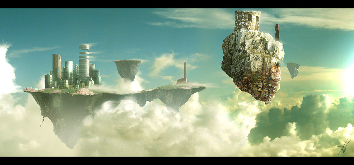
When braving treacherous paths through these misty valleys, be wary; for what you seek does not wish to be found. Over the waterfall rests a quiet, secretive people, who have gone to extraordinary lengths to extricate themselves of all remnants of humanity. Upon beholding the guardian tower of our lands, know this: If you are one of those from who the worthy have escaped, beware, for you have now entered the realm of Mycenae, and are not welcome.Matte Painting made with Photoshop CS2, stock photography of my own and a few from [link] , 2000x3000 original resolution, approximately 2 days.
Alternative version in my scraps: [link]
Edit: Updated with new version. Thanks to those who gave helpful critique!
Edit 2: Updated again. I've really gotta leave this one alone, it's killing my sleep. Fixed some odd brushstrokes, added detail to the building, changed colours again, changed contrast in certain areas, changed height. I swear I'm done.
 (Wink)")
Related content


Comments: 60

lovely atmosphere in here - high quality piece, really neat job
👍: 0 ⏩: 0


Thats cool...
An elevator to a world few outsiders have seen.
👍: 0 ⏩: 1

This is one of the few near-hospitable images I've made, then... I like imagining the spray off the waterfall, it's quite relaxing. Cheers.
👍: 0 ⏩: 0

very nice textures
p.s. bridge between canyons should have reflection in water.
👍: 0 ⏩: 1

I really love this man! I don't know how well I could critique it, the only thing that seems off to me is just how smooth the building is on the waterfall, maybe some texturing or something. Dunno, just seems too clean, if that makes any sense. 
But anyways, great work though.

👍: 0 ⏩: 0

hey this is not bad, I like how all the elements integrate quite seamlessly. however I am not sure if the water surface infront of such a cataract would be really that calm, I think you should have tried to integrate some sort of underwater rocks that cause some foam and currence.
and the way the rocks are cut on the top is confusing me, this looks kind of unnatural, a bit like lasso tool + delete. by the way, it usually helps to try and get similar rock kinds into the image, here the rock walls and the big rock on the waterfall look very different. just a small detail, but it helps to tie the whole image together if everything looks like it's coming from the same place
but yeah, otherwise that isn't bad. and I prefer this over the alternative version in your scraps
Daniel

👍: 0 ⏩: 1
Many thanks Daniel, I'll keep realism and continuity in texture at the height of focus in future pieces. Critiscism is very much appreciated!
👍: 0 ⏩: 1

Pretty good work on this, some parts seem a little unrealistic, but overall it's aesthetically pleasing
👍: 0 ⏩: 0


Wow! The muted, misty color palette is even better!
👍: 0 ⏩: 0

Wow, man!! I've missed the previous versions, but this looks great. Both the tower and the waterfall look great, and I love the grass from where the "viewer" is watching the scene. Well done  (Smile)")
👍: 0 ⏩: 0

I think having it rotated helps the focus alot! The textures and details are stunning, especially the waterfall. You should be very proud!
👍: 0 ⏩: 0


I've been looking forward to some new artwork from Sir Max for quite some time now 
")
The composition is cleverly implemented here; while there are quite a few bright spots across the piece, the eyes move up along the river and into the distant valleys quite well, it's as if the brightness at the lower half of the piece intricates the eyes to follow the lake from it's locale to the distance.
Furthermore, the details and scenery in this piece are magnificent, perhaps even majestic in quality; pristine waters, sharp stoney walls, and vivid grass in contrast to cold, metallic oppression (further emphasising the 'ye shall not pass' sensation
That said, the piece does have some things that I suggest could be improved. Firstly, the rocks jutting out from the waterfall have, shall we say, poor perspective quality. They seem very flat and unaffected by surrounding light sources, this mostly applies to the two large rocks jutting out to the left.
The metallic structure also lacks some work; the lights don't reflect, you can see the metal spire reflecting onto the base, but the lights do not, as if they are detached from the scene. Also, the tree branch at the top left have coloured edges; like jpeg artefacts after trying to remove them from a stock photo.
These issues said, they are quite minuscule in nature, and the overall piece is most impressive, both scenery, detail, and concept wise. Of course, fixing these issues would further improve its perfection.


👍: 0 ⏩: 2
Hoyl shit, self-pwnage. 'Intricate' is a word, you just used it wrong.
👍: 0 ⏩: 2
That is, when I said 'intricated'
👍: 0 ⏩: 1
Actually, you said 'intricates'
👍: 0 ⏩: 1
I know. That's why I said think of it as 'implicates'.
")
👍: 0 ⏩: 1
You know, even then it doesn't make sense. You wouldn't want to implicate my eyes!
👍: 0 ⏩: 1
Nah, you implicated the elements to guide the eyes.
👍: 0 ⏩: 1
")
I know that
👍: 0 ⏩: 0
Monsieur, you are truly the most brilliant noticer of details but intricate is not a word and I thank you for your comment! A piece that I have worked hard on just doesn't feel complete without one of your long critique sessions. I swear, you could get paid to do this.
Naturally, I completely agree with all your critiscisms but my perspective really sucks anyway and I may quickly reopen the .psd (for the hundredth time) to fix them. I'm not too displeased with the building, it being my first and all (my other piece 'Reign of Terror' doesn't count, castles are much easier to paint than science fiction buildings, and besides, that one looks more like a sketch anyway) but there are some definite improvements to made. For this painting I think I'll make only technical corrections; better buildings will come dans le future.
With that, I will now go and have breakfast. Thanks again Kyle.
👍: 0 ⏩: 1
Oh well, it was my pleasure.
👍: 0 ⏩: 0
Oh, hmm. ;D
Considering these people hate .. humans, how about a human pie?
👍: 0 ⏩: 1
They are humans, fewl.
I do believe they are quite partial to cakemeat, though.
👍: 0 ⏩: 1
AHA! Close enough.
Caaakeeemeeeaat! 
👍: 0 ⏩: 1
So you're not actually planning to comment properly on this one, are you?
👍: 0 ⏩: 1
Let the meat come to fruition before the cake giveth to ye.
👍: 0 ⏩: 0

Very nice piece. Looks like you are getting very good at matte painting, keep it up
👍: 0 ⏩: 1


looks like alot of work went into this piece...I think you did a great job!
👍: 0 ⏩: 0


If I remember the first version, this one is much better! Just a bit too green imo, but all in all very mighty!
👍: 0 ⏩: 0


This one is definitely better then the other one
not sure of the tree in the upper right corner though.
awesome work
👍: 0 ⏩: 0


Nice job there. I like how everything feels like it came together in its own world with its colors and story and all.
👍: 0 ⏩: 0
Fabulously realistic and a wonderful atmosphere. The tower in the waterfall is astounding!
👍: 0 ⏩: 0

I like the building right in the middle..beautiful image
👍: 0 ⏩: 0


I agree that the scrapped version is better (due to better colors) but this is cool too. The tower's reflection in the water seems a bit off though. Otherwise, cool!
👍: 0 ⏩: 0

| Next =>