HOME | DD
 PolarisAstrum — Guardian Of Nightmares

Published: 2010-07-20 20:32:38 +0000 UTC; Views: 1194; Favourites: 76; Downloads: 0
Redirect to original
Description
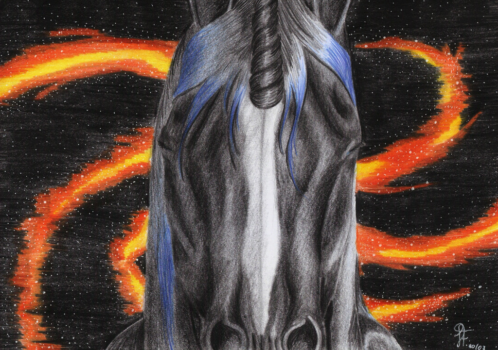
See both versions (new and old) side by side here: [link]The first of my old works to get a new, updated look.
[link]
"Guardian Of Nightmares" was drawn in 2005.
As being one of my oldest works, I thought it was an obvious choice for my "revamping adventure".
I tried to keep as true to the original work as possible, but I had to change some things, because they weren't working anymore, like the pose of the legs.
The pastels weren't cooperating and I'm not too fond of that tail, more yellow would have definitely made it look better. Too late now.
I must say, I've fallen in love with this work, I can't believe how far I've come.
July 2010
Colored pencils and soft pastels.
Related content


Comments: 61

I commented on the side-by-side deviation, but:
*major hugs again*
👍: 0 ⏩: 1


Lindo, Jô  (Smile)")
👍: 0 ⏩: 1

Essa foi a parte a que eu dei mais atenção, foi difícil porque haviam chamas em todo o lado e ainda estive um bom tempo a tentar perceber onde fazer as zonas claras e escuras.
'Bigada Lud!
E obrigada pelo 

👍: 0 ⏩: 0

Espetacular a evolução do antigo para este!
Muito bem desenhado e as cores estão mesmo boas. Como dizes, talvez um pouco mais de amarelo na cauda fosse bom, mas isso em nada tira valor à peça no geral!
Keep up W/ the great work!
👍: 0 ⏩: 1
Eu bem que tentei por mais amarelo, mas não deu XD Paciência!
Muito obrigada

👍: 0 ⏩: 0
<= Prev |