HOME | DD
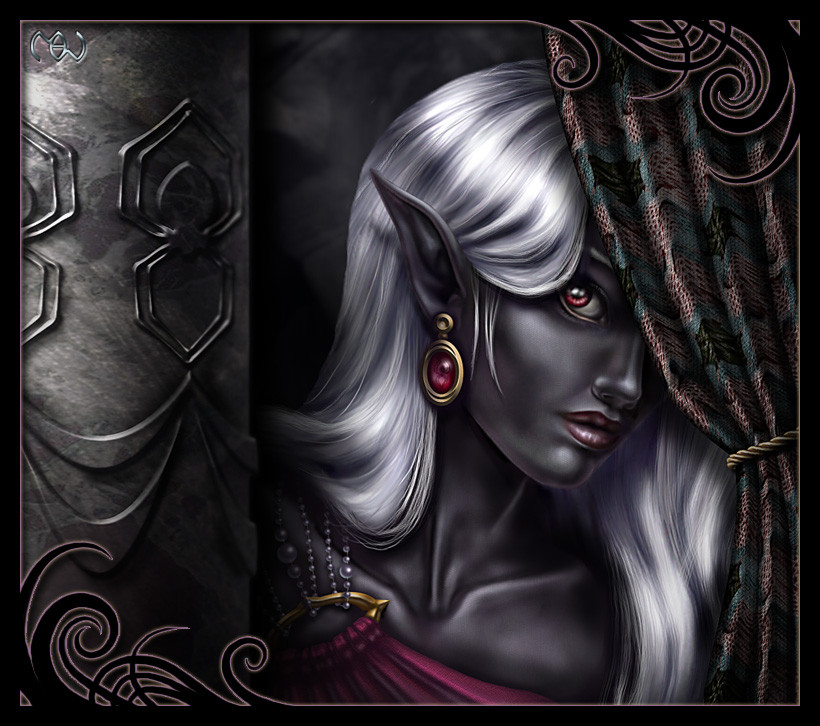
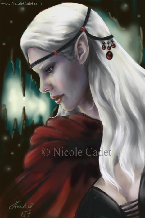
 Pookinator — Drow Female
Published: 2005-05-04 22:22:09 +0000 UTC; Views: 37950; Favourites: 429; Downloads: 5652
Redirect to original
Description
I'm still working on this, so I'd appreciate any advice or critiques you would be kind enough to give. Be mean; pick it apart; flame it constructively. If you do, I'll love you forever.")
The original, incredibly horrible doodle this is based on is in my scraps at: [link] I'm claiming the dinky doodle as the reason the proportions suck... you know, instead of laziness. It's not pretty; so don't waste your time if you've got better things to do. It's just an example of my stupidity and lack of foresight.
")
Painted in Photoshop with a tablet.
And remember, if you can't say anything mean, then don't say anything at all.
Related content


Comments: 45

I totally LOVE it, but since you asked me to be mean... Well the pattern on the curtain reminds me of a couch my neighbour had in the 90's... I like your original blue...
👍: 0 ⏩: 0


She looks excellent but feels old.
Was I mean enough?
👍: 0 ⏩: 0

the edge of the hair against the background doesn't look quite right; it looks like it was pixel masked with a soft brush, or something to that effect. mayhap you could draw a few individual stray hairs?
that being said, this illustration reminds me of the portraits for baldur's gate, a certain polish i haven't found in high supply anywhere else.
👍: 0 ⏩: 0

really good drow it is better than several ive seen today
👍: 0 ⏩: 0


put the critique on it and i'm sure a bunch of people would do it, including me
👍: 0 ⏩: 0

I love how it looks like you could reach in and pull the pearls holding up the robe. Very good textures and colors.
👍: 0 ⏩: 0

One of the best Drow pictures here on Deviantart!!
👍: 0 ⏩: 0


That's really lovely  (Smile)")
👍: 0 ⏩: 0

Beautiful! You did this really well.
Just wondering if you take requests? I'd love to have something done by you, you've got insane talent.
👍: 0 ⏩: 0


So beutiful, so realistic... If my English was better, I would explain everything, but... I'll just say I really like it.
👍: 0 ⏩: 0

Hey...I was wondering of you would let me use this for my avatar!!!!!...Fell free to say no if you want...I would fully understand!!!!!!!
👍: 0 ⏩: 1

Sorry, this is probably too late to do any good, but please feel free.
👍: 0 ⏩: 1
actually you have perfect timing cuz I"ve been meaning to change my avatar again
thx!

👍: 0 ⏩: 0

This piece is sublime. I can find nothing that might need correcting. Absolutely one of the most beautiful depictions of a Drow Elf ever created.
Thanks so much for sharing, and do favor us with more!
👍: 0 ⏩: 0


Intended or not, there is actually a second face: on the column. A happy-face, with spiders for eyes, and bowing drapes for lips.
It could be imagined as a sort of twist on the traditional theatrical symbolic "comedy" mask (of the comedy/tragedy pair), which were sometimes represented on the walls, columns, and/or draperies of of old theaters. Attendees would come from miles around, dressed in their finest...
She certainly looks dressed and coiffed for such an occasion.
👍: 0 ⏩: 0

Wow, incredible work! I love the smooth realistic shading.
👍: 0 ⏩: 0

At least with her head half hidden and at that angle its hard to tell any flaws in proportion, and since she is an elf some deviation from typical human is expected!
Hmm cc, The way you did the spiders makes them look almost metallic or the stone is very shiny, just something to consider for later you may have intended it. Oh her I would give her a few other little fly aways but you did a great job on the hair. The most obvious thing I can tell is her eyes are very slanted which may be from the doodle or on purpose. There is a slightly not smooth part on the very bottom of her chin too. But really I think you did a great job on this. I randomly clicked on this in someone's fav's so I haven't looked at the rest of your gallery to compare at but your obviously talented.
ps totally personal preference but I am not sure if that drapery pattern is the most fitting. It could be that they remind me of my own drapes which I hate so I'm biased against them.
👍: 0 ⏩: 0

First of all I have to say that you did an great job on the hair. It looks shiny and white which can be quite a pain, especially when you have so much shadow cast on it. In my humble opinion the backgroud could be just a bit darker to bring her out more and put it in the background. Some where between where you have it now and the darkest shadows on her face would do pretty good. Or you could extend the shadow from the column a bit more, maybe an inch or two. It has also been My experience that a little more space between the fold in the upper eyelid and the lashes will give the eye's a more natural look. A really good painting though.
👍: 0 ⏩: 0


👍: 0 ⏩: 0

Simply astonishing!
You get a favorite well deserved 

👍: 0 ⏩: 0

Beautiful drowess. 
👍: 0 ⏩: 0

That is the AWESOMIST drow I ever saw, and trust me I've seen lot's of drow!!http
👍: 0 ⏩: 0

This is very gorgeous, fantastic. You have a talent for drow
👍: 0 ⏩: 0

Wow, it's amazing.. Great details, wonderfull pose, coloring... Fav, and brawo

👍: 0 ⏩: 0

Mindblowing... Absolutely. My got that skin looks good... And my god! That eye looks bloody real!
Fantastic job!
👍: 0 ⏩: 0

Mmm.... wow.
I use to love, love, love Drows.
Gah, how can I critique something I like so much? Behhh... o_o;
I was thinking about the ear since I have that problem... lower ears are more flattering... but that's been said enough. I also agree with the eye falling out of the socket. I don't think you'd see that much pink unless you have old lady/geezer eyes that sag.
Also perhaps adding some thicker eyelashes? That could just be me. I'm an eyelash girl.
Oooh! Yay. I found another thing. The chin line. At the chin there appears to be another light source, perhaps a purply one coming from underneath. Now I'm not in college yet so I don't know about light bouncing and the purple of the dress... so I might be wrong.
And the rope on the curtain doesn't really have much texture... my eye kinda gets pulled to it... x_x... wasn't sure if I should meantion that or not.
Heh, and if you want to get really, really picky... the tip of the ear. It's sort of smudged and the outline is blurry and not really crisp.
Gahh.... that was kinda silly. 
And I kinda like the border. o.o; perhaps it just needs to be like upgraded...?


👍: 0 ⏩: 0

Awesome detail. I wish I could draw that well. Keep up the good work. I can't wait to see more.
 (Wink)")
👍: 0 ⏩: 0

Heh...be mean, eh? All right, I don't like the border either. The space behind her head could stand to be a bit darker to give the whole piece a less flat look. Umm...I think that is all my amateur eyes can pick out. Overall, I love it. Her expression is priceless, and the skin tones are absolutely delicious!
👍: 0 ⏩: 0

The eye ball, it needs to darken a bit on the left up tilt corner, cuz right now it looks really freaky.. like it's gonna fall out of the eye socket. The lower eyeline.. it's too shiny all the way, unless she put on brilliant white eyeliner and has direct light shine on it.
And I agree on the ear part. I don't remember drows have ears right on the jaw, at least not according to R.A.Salvatore descriptions.
Ok, I can't get meaner than that. :sigh: since I can't even paint that good.
Oh one more thing, it's the hair.. I wonder how it looks like without the curtain blocking it.
👍: 0 ⏩: 0

That's awesome, seriously! Since you asked, I'll donate my two cents... There are only two things which come to mind. The first one is just personal a case of personal taste and, after clicking on your link, I can see is easily undo-able (I think) if you wish to un-do so! It's the border... It just seems a bit, I don't know, cheap? It's a nice pattern and alls, I just don't think it goes with this particular picture too well IMO.
The second thing is the ear... I don't know if this is what you were going for or not but it looks like it's dropped a good couple of inches down her face and landed on her jaw line!
Other than that, I love it and probably wouldn't have cared about the ear thing if you hadn't asked! Keep up the good work!
...Khufu!
👍: 0 ⏩: 1
Thank you! The border was definitely thrown on with a brush as last minute effort to give it a slightly more finished look. So the description of cheap definitely applies.
The ear: Ack! You're right. Her head/jawbone has been bugging me for a while now; it's always looked too... short? (for lack of a better description) I couldn't figure out why until you mentioned the ear. I think I can fix it a bit; everything is on a separate layer. Or maybe I'll just blame it on the bad sketch/laziness. Either way, thanks!
👍: 0 ⏩: 0

Well, As far as I can see, I see only little problems with the shadows
And not with the technique, but with the depth.
All shadows have more or less the same size, and this makes its feel like a 2 layer of paper collage.
I'd change the shadows of the column and the shadows of the head over the hair,
Hope it helps
👍: 0 ⏩: 1
You're right. I actually hadn't worked on the shadow from the curtain yet, but there are a lot of other areas that this applies to as well, especially the shadow from the hair... Thanks!
👍: 0 ⏩: 0


