HOME | DD
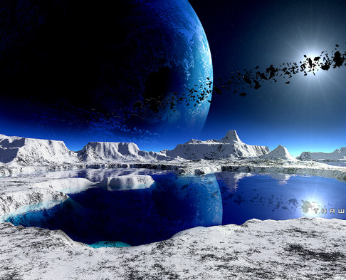
 powerpointer — Titan Alternate

Published: 2010-04-30 07:24:01 +0000 UTC; Views: 2528; Favourites: 86; Downloads: 130
Redirect to original
Description
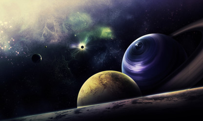
This was the original submission for "Titan" before the foreground planet was removed. I thought I'd submit it to the gallery for a while before relinquishing it to scraps


Definitely makes for a much different scene. I kinda like it this way, and I was very torn between the two versions of it. Tell me what you think


Related content
Comments: 36

do you have any reliable sites where I can it ?
👍: 0 ⏩: 2

Should work fine on CS5.
👍: 0 ⏩: 0

thanks
and one more question... does it work on CS5 ?
or just CS4 ?
👍: 0 ⏩: 0

how the hell you do the ring so sharpend and real!?
👍: 0 ⏩: 1

I'll have to post a tutorial on it sometime soon
👍: 0 ⏩: 1

made and submitted 
👍: 0 ⏩: 1

Quick! love it, thank you!
👍: 0 ⏩: 0

the rings should always the hovering the equator, i mean in a scientific point of view
👍: 0 ⏩: 0

In comparison with your "Titan" work, I prefer this one more. "Titan" feels a little too empty; obviously space is mostly empty space, but that doesn't make for very interesting art. 
That said, they are both very well done. As others have said, the green hue is a wonderful break from the typical blue/orange/red scenes.
My only points of criticism are:
(1) the ring on the right planet seems a little too large to me; it feels out of proportion in this composition
(2) the foreground planet has great texture, but most of it is lost in the shadow; I think you could have moved the shadow down a little bit, so that the majority of the foreground planet is in light.
Again, great work! A definite 
👍: 0 ⏩: 1

The nebula sucks, I admit
This piece is probably still in progress. I've messed around with it quite a bit and I'm still not entirely satisfied with the outcome...
To address your criticisms...
1) Yeah, the rings are massive. Then again, this is a bit more conceptual than realistic, but in a more realistic piece the rings would certainly look retarded. Good thing I'm an "artist" and I can do whatever I damn well please
2) I'll work on the shadow. I'll try moving it and see if it helps
Thanks for the comment and the fav
👍: 0 ⏩: 0

Love the green, probably the rarest colour for space-art, even I havn't tried it yet 
Your us eof gas giants is obvious in many deviations, but the science nerd in me is screaming at the fact the patterns and rings don't follow the same plane, meaning each pole should be at the furthest point from any part of the rings, here it seems the rings aren't running parellel to the equator 
👍: 0 ⏩: 1

Green's definitely my favorite color to work with
When you put little subtle hues in it, it really makes something special.
SPEAKING OF WHICH.... collab?
And thanks for the awesome comment dude 
👍: 0 ⏩: 1

Hmm, I'm not even in the mood for my own art at the moment, it's been by far my slowest year on dA artwise. Plus I wanna get these commissions done while they last, since I don't get them often enough to risk letting them slip away
👍: 0 ⏩: 0

The foreground planet is awesome when thrown into the mix! It would even make an awesome image by itself with a starry nebula in the background. I would love to see it in 1920x1200 or 1920x1080 though.
👍: 0 ⏩: 1


👍: 0 ⏩: 0


