HOME | DD
 ProgV — Concept of a power armor
Published: 2010-10-29 20:55:22 +0000 UTC; Views: 19701; Favourites: 253; Downloads: 856
Redirect to original
Description
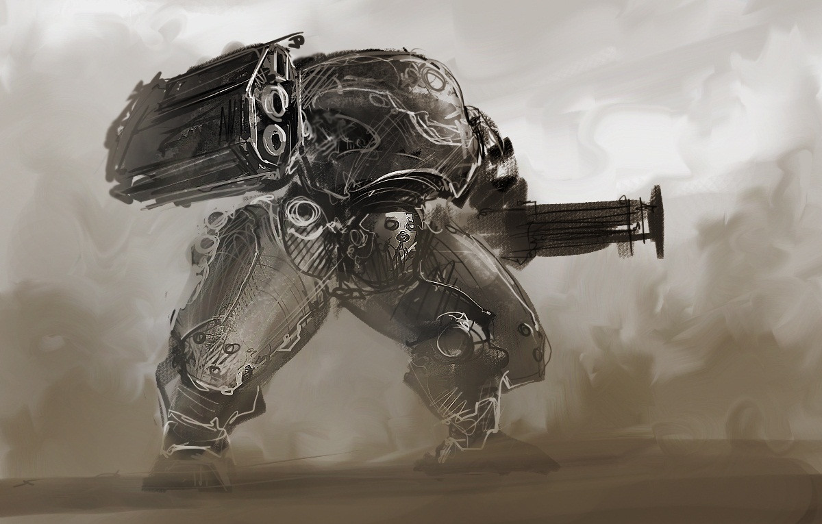
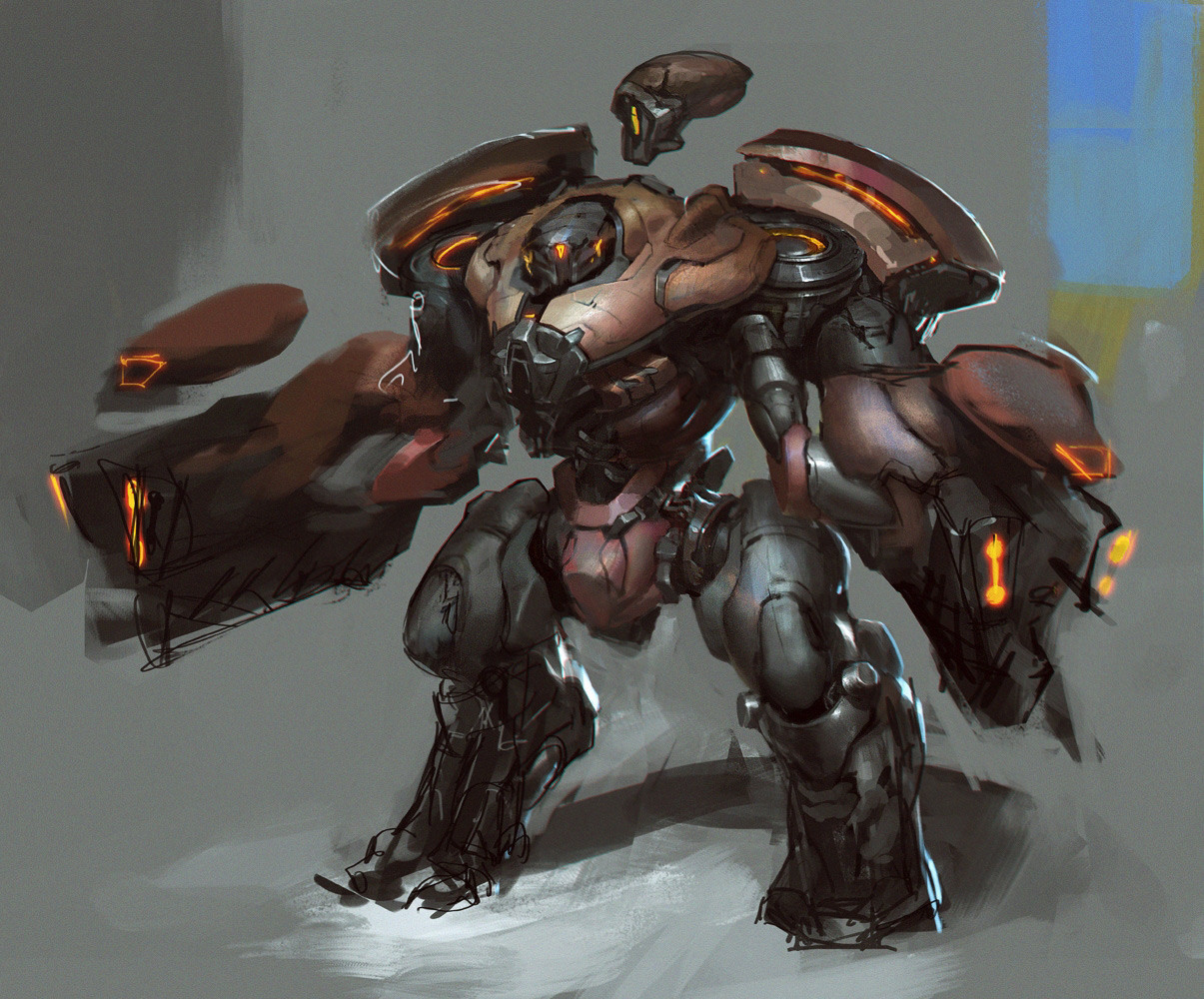
a speed painting of a power armor which is under designingI've been working on this project for 2 days
hope it will be finished soon =w=
Related content


Comments: 15


Ilike it because it doesn't have those flimsy chicken legs . Would like to see a version with more details
👍: 1 ⏩: 0


rule 1 of power armor
it must be cool (check)
rule 2
it needs a bigger gun (check)
rule 3
it must be armor (definitely check)
nicely done
👍: 0 ⏩: 0


awsome man im loving it
composition and prospective is stunning
but finishin the detail on everything will make it eye catcthing
and more pro like work
👍: 0 ⏩: 1

oh don't worry, this is just a speedpainting for a concept
highly finished design chart of this robot will be finished in this week. details comming soon =▽=
(I've been working on this project for lamost 3 days now...for my ACCD Fall 2011 application Portfolio )
👍: 0 ⏩: 1
sorry i didnt explain my self properly
what i ment was: u should use full opacity and flow for best result
so u get nice strong image of how it looks instead of getting
a smudged image if u use a brush with opacity of lets say 20%
btw check out my gallery if u like
👍: 0 ⏩: 1
yes I know that, I always use full opacity and flow... Did this work looks smudged by using the brush with low opacity T_T ?
👍: 0 ⏩: 1
u need a bit more hard strokes on both columns of the building so it looks much clearer
its up to ya really just suggesting
it still great
👍: 0 ⏩: 1
I agree with you
I'll try to make the buildings more clearly in the future =w=
👍: 0 ⏩: 1
best of luck mate
great concepts overall
👍: 0 ⏩: 0
