HOME | DD
 ProjectComment — Quick Comments
Published: 2016-07-07 15:30:28 +0000 UTC; Views: 74414; Favourites: 159; Downloads: 0
Redirect to original
Description
body div#devskin0 hr { }
Welcome to ProjectComment 's Quick Comments!
If you would like quick feedback on something specific (e.g. a quick answer to a burning question) this is the place for you to do so!
To take part, please reply to this journal with…
- Your quick, specific question (see examples below).
- Your artwork (linked or posted via thumbcode )
Our members and admins will do our best to answer your questions, but we cannot guarantee answers. Answers may vary in length, depending on your questions.
Example Questions
- I know something is wrong with the chin of the person I'm painting, but I don't know what it is exactly and how to fix it. Help please!
- I finished this piece, but now I'm not sure about the colours. Can someone tell me if they work together?
- I don’t think the composition of my photograph is quite right. Is there a way I can crop it to improve it?
- Specific questions about words and grammar, e.g. "Is the use of word x appropriate here?"
- Specific questions about clarity, e.g. "Is what I'm trying to say with my poem clear?"
- Specific questions about flow, e.g. "Is the reading flow disrupted anywhere?"
Related content
Comments: 6315

👍: 0 ⏩: 1

👍: 0 ⏩: 0

Most likely the wooden beams should have a gradient radiating from the star of David. You could also add lines where the crossbeams cross the main post. If you think about it, there's a chance that they are either in front of or behind the vertical post. The only way they would be on the same depth, is if the beams have a groove in which the post fits, but even then, there would be a dark seam between the two pieces of wood. You could also decide at which height the observer is and introduce a thickness to the crossbeams, showing the underside if the viewer is below and the topside if the viewer is below.
👍: 0 ⏩: 0

👍: 0 ⏩: 1
👍: 0 ⏩: 1
Yes. There will be a shadow behind the cross. Won't be very visible, though, considering it will be directly behind the cross too.
There should also be some shadows on the cross itself, I'd say. After all, the cross itself isn't flat. There should at least be one above the plaque.
👍: 0 ⏩: 0

👍: 0 ⏩: 1

👍: 1 ⏩: 1
👍: 1 ⏩: 0

This was for a color theory project using a lighter/pastel triadic color scheme. I also had to make a focal point using color, which was the yellow. So, I just wanted to know if my coloring and overall composition was effective?
👍: 0 ⏩: 2

Ok - composition and focal point. Hmmm... My first view of this was the thumbnail posted here, of course, and my eyes went to the blue area in the middle and then I noticed the eyes to the left of it. That revealed the face, and then the figure under the blue. The curtains above the character guide away from the focus, and the lower half is a jumble.
Consider this post: LinesOfAction
Again, just with the thumbnail, there is nothing in particular I see guiding the eye toward a focus, thus the composition, however balanced, fails. It has a middle, but not a target.
Looking at the full size image, I had to scan to find the character on the right. It had no distinction vs the background or surround -- it's simply there. Likewise the face on the left has a hidden body. It's a Where's Waldo kind of jumble with lots of decorative stuff but no particular theme I can see beyond curtain things on top, an open middle with some faces, and swirly textures in the bottom third.
As ExplosionMare commented, the lavender dominates and yellow/blue are accents.
I know very little about palettes and color theory much less the assignment, so to my ignorant eye this is a textural and composition mess. Yes, it's got the Third's rule in place, and the Warm/Cool thing in play, but from there I have no idea where you were going with this as a structural presentation.
The saying goes you can't tell the players without a score card -- I can't even find the players without looking real hard. So how, in this style (your palette assignment) can you distinguish the two characters? Note how the upper curtains are clearly curtains due to the blue streaks contrasting against the lavender. The two characters are a mix of circles and flowing lines. But, so are their surroundings. Try a texture change, and perhaps a contrasting outline/edge/shadow to reveal them. Reconsider the background character pose to make use of Lines of Action to draw attention to them or their faces to help reveal them as part of the composition.
Apologies if this sounds harsh -- I'm trying to get to the point of the question you asked. Pastels are rather out of my league. Just getting a working palette is a challenge!
If you want to see some great pastel palettes at work, take a look at Oglaf web comic. Often NSFW, but great color schemes! Have fun and good luck with your art assignments!
👍: 0 ⏩: 1
Thank you so much for your feedback!
Don't worry, you didnt sound harsh. I can see how the characters can get lost within the piece.
👍: 0 ⏩: 1

I feel like there’s so much lavender that the lavender looks like the focal point instead of the yellow. I suggest making the yellow brighter or to add more yellow to different areas.
👍: 0 ⏩: 1
Gotcha, I can see how it can give off that vibe
👍: 0 ⏩: 0

it was awhile back when i add something on gallery but if you want to i can share mines here that can improve,
i tagged you about this, again i'm sorry that i forgot about the gallery i couldn't remember if it was allowed or not,
it's mostly the shoulders that needs their improvements
👍: 0 ⏩: 1

To draw more realistic poses I would suggest using pose references or stock images as for example this.
For me, this picture nicely illustrates the deformation of the shoulders in the different poses. Additionally, you can see how the inner person's arms and hands partly hide the outer people's shoulders in this perspective. You can find many of these here on deviant art.
If you are more interested in drawing unique poses realistically from scratch, I would suggest looking at anatomy studies or even in anatomy texts (Wikipedia, Google, etc) to learn about how bone and muscle movements determine the body's appearance.
👍: 1 ⏩: 0

👍: 0 ⏩: 1
Hi
The story itself was amusing
")
I think that color wheel is the best way to choose color combinations that work nicely together. If you haven't read about that technique, that's a good idea to do for the future
But since you asked about this example, I think there's a couple of things you can do to reduce the amount of colorful areas and make it easier for the eye.
- color bubbles for characters that have different colors are a good plan, but the colors for them would better be connected to character colors. That would be easier to understand, and also that will remove some of brightness from the image. Like, make it pink for the girl, maybe yellow or brown for her mom, and brown or blue for the dog owner. Also, pastel colors would look better than intense, when it comes to dialog bubbles. As for me, with little comic strips I prefer to do white bubbles and color only text, choosing color to match the characters.
- The red and blue backgrounds for owner and dog look kinda out of place, maybe those would look fine with white or gray background, or maybe some monochrome pattern, if you want to amplify the images on the last panel.
- The intense green on the bush and on the frame with disgusted girl both look intense (which draws attention) and different in hue (one is warm, another cold). Using same hue for bush and for emotion of distaste doesn't look like a good idea, but maybe brown or yellow background could work just as well to show emotion, and that removes one less unnessessarily saturated hue.
With all this done you will have narrowed the palette to pink, cold green, brown and yellow with a little bit of blue.
Now, if we apply color wheel knowledge, then pink + yellow + cold green is a good combo. Brown is a muffled, non-saturated hue so it doesn't break the combo. Blue, however, may stick out. So to make it more balanced, use less saturated blue (grayish blue) and/or one closer to green.
These are just suggestions. Main idea is to read about color wheel practice and try to pick color combinations beforehand. It shouldn't be more than 2-3 (or 4 at most, and it's already difficult to balance) intense hues. Everything else should not stick out more. And it's better if some of the main hues are dark and some bright - here you do well using light pink with dark green. And if you know you have a habit of using too many colors, try to limit your palette on purpose. Try to draw an image using a palette of 2 complimentary colors, or something like that.
Hope the ideas will be helpful
👍: 2 ⏩: 1
👍: 0 ⏩: 1
Hah, actually I looked again later and thought that maybe the green you use on speech bubbles itself isn't bad. Green goes ok with pink. Just, the overly bright speech bubble, with color that doesn't make good sense about who it belongs to, sticks out a bit too much anyway.
Oh, maybe in next comic strips you can draw colorful outline around a white bubble? It can make it distinguishable, but without overloading the image.
Yeah, if you try and study combinations and try to challenge yourself to use limited palettes it can improve your color intuition in general, and then your spontaneous decisions will work out more often  (Smile)")
👍: 1 ⏩: 1
👍: 0 ⏩: 0

👍: 0 ⏩: 1
👍: 1 ⏩: 1
👍: 1 ⏩: 1
👍: 1 ⏩: 0

👍: 0 ⏩: 2
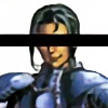
Hi!
It's great to see that you're learning to do realistic portraits, that's both a difficult and an amazing area
I can see some mistakes in this current work, and as I understand you still have some troubles with showing the head in 3D. Your image follows lines you see before you, but not yet shows the volumes behind those lines. Thinking 3D instead of simply following outlines will help to find the right angles for eyes, nose, mouth and all other parts.
I wanted to recommend a good video about drawing head: youtu.be/1EPNYWeEf1U
And of course practice and studying photo and living models leads to improvement  (Wink)")
I hope this tutorial (and other tutorials by this guy) helps you, it did help me
👍: 1 ⏩: 1
👍: 0 ⏩: 1
You're very welcome! And good luck with your studies
👍: 1 ⏩: 0
👍: 1 ⏩: 1
👍: 1 ⏩: 0

👍: 0 ⏩: 1

the lighting is very pink toned in my own opinion you could always add a layer of blue or yellow to it and see if that helps?
👍: 1 ⏩: 0

Ello.
How could I improve with the colours on these pieces?
Something just feels... Off about them, and I need a little help.
Not sure whether it's the anatomy (Or lack of anatomy), the colours, or anything else.
I just need a bit of help, that's all. ^^
👍: 0 ⏩: 1
👍: 0 ⏩: 1
Thanks a lot, I'll try to work on this.
^^
👍: 0 ⏩: 0

My most recent piece. Definitely looking for feedback and stuff to consider when I do my next project
👍: 0 ⏩: 1

👍: 0 ⏩: 1
My bad, but thank you so much for leaving me feedback. If I may ask, what part of my anatomy should I focus on?
👍: 0 ⏩: 1
👍: 0 ⏩: 1
thank you! :3 Shoulders and the core is still an area I struggle in, and something i'm definitely trying to put some practice in 
👍: 1 ⏩: 0

👍: 0 ⏩: 1
You could start by taking out the black outline. You could retrace the car with grey instead to make it fit better.
👍: 1 ⏩: 1
👍: 0 ⏩: 1


<= Prev | | Next =>