HOME | DD
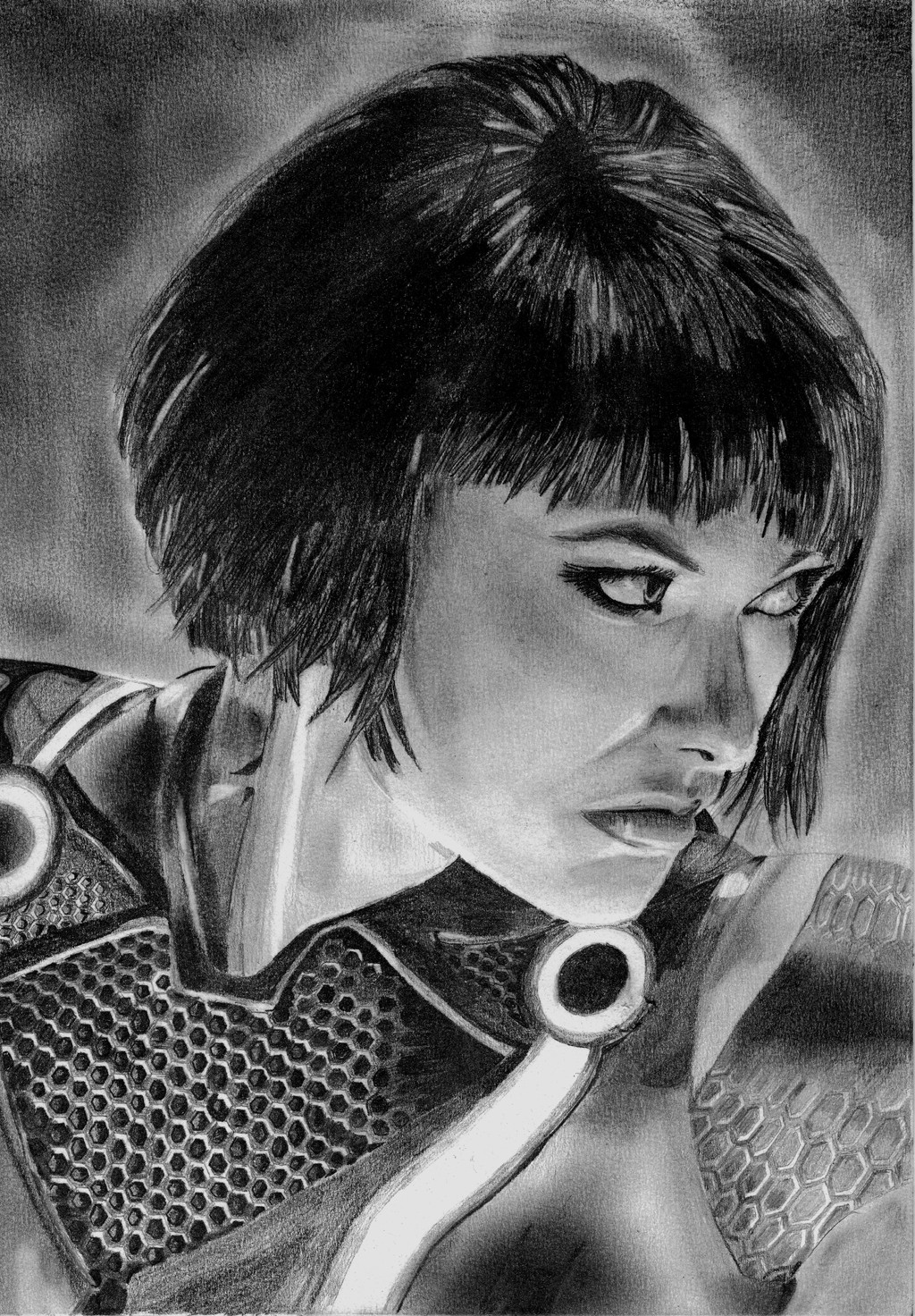
 QuestingRaven — Quorra

Published: 2012-10-27 03:16:18 +0000 UTC; Views: 1274; Favourites: 27; Downloads: 14
Redirect to original
Description
Another one for class. Quorra from Tron: Legacy.Media: Graphite and white Prisma Color pencil on grey card stock.
Related content


Comments: 22


 (Wink)")
")

Very nice, I like the angular background which is perfect for the way you are shading her, and the prismacolor pencil ( which is awesome ) is sparsely and nicely used on this, good work.
👍: 0 ⏩: 1

Thank you. This was a fun project, especially trying to achieve the signature "glow". I'm glad the less-is-more approach worked for the color and highlights
👍: 0 ⏩: 1
Yeah i think you have executed this quite nicely, and many has a tendency to overdo the glow effect, its quite a fine line, and in my oppinion you have kept within that fine line and it works.
👍: 0 ⏩: 0

Tron (especially the original) has always been a personal favorite of mine
👍: 0 ⏩: 0

Just pencil on toned paper  (Smile)")
👍: 0 ⏩: 0

Very nice work. How did you do that? Is that pencil? Charcoal?
👍: 0 ⏩: 1
I used 5B 3B and HB pencils on a grey card stock paper, with a white primsacolor pencil for highlighting
Oh, and lots of black fingertips for blending.
👍: 0 ⏩: 1
It's very impressive then. You're using this technique very skillfully.
👍: 0 ⏩: 0


It was fun to revisit the toned paper/pencil technique.
👍: 0 ⏩: 0


That looks fantastic. The use of the gray card stock was a good choice. It subdues the values really well to bring out the lighting. It also makes the light soft and delicate.
👍: 0 ⏩: 1
Thanks. It's a technique that I'd used in the past. I'm glad it turned out well for this.
👍: 0 ⏩: 0