HOME | DD
 rachaelm5 — Beyond the Outer Spheres stage 1 lines

#abstract #abstractdragon #fins #space #spacedragon #spines #teeth #wip #workinprogress
Published: 2020-04-18 20:13:42 +0000 UTC; Views: 488; Favourites: 47; Downloads: 0
Redirect to original
Description
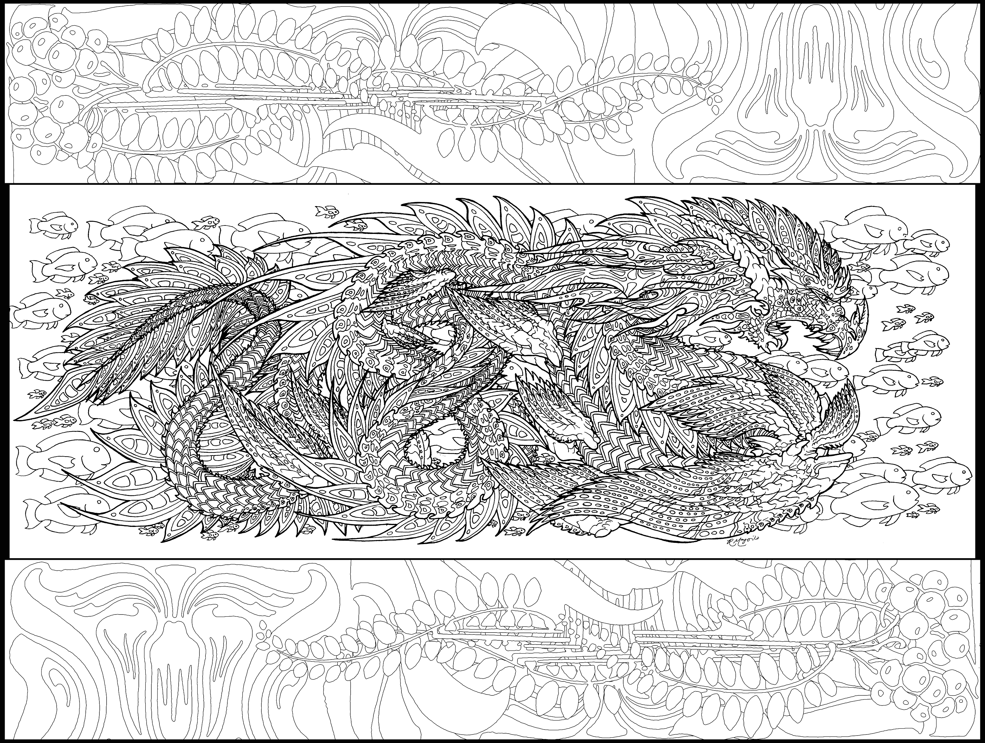
Here's a clearer look at this semi-abstract space dragon.The original is going to be slathered with watercolor, and it will probably be dark enough that I'd have trouble seeing the lines if I hadn't taken the time to ink it. I'll then go in and do the rest of the color work with my trusty Prismacolors.
Progress bar:
...
Related content


Comments: 8

👍: 0 ⏩: 1

Thank you very much!
Yes, there's no magic involved. With traditional mediums, it's a matter of lots of practice (about 30 years for me) and an understanding about how the mediums work together. The only way to get there is by trying things. Sometimes it doesn't work out! Sometimes it works in unexpected ways, and you have to decide whether or not to roll with it, or scrap it and start over. You mustn't be afraid to start over. You don't have to trash the failed piece (unless you find it cathartic, and believe me, I've come close on a few things...), but just begin again and take into account what you learned from the art project that didn't work quite right. My college watercolor professor said that when you're starting out, expect for 99 percent of your paintings to be awful. Use the lessons to make that 1 percent work for you. I personally don't think the ratio of fails to successes is quite so skewed, but it gives you an idea that it's not only okay to fail - sometimes a lot! - but that it's expected as part of the learning process.
And then there's this complicated dragon. I have sketches and a firm idea in my head to guide me, and also others in the same series as a point of reference for color and shading guidance. I rarely work in a vacuum and like to build on concepts I've tried before. There's planning that you don't see that went into this project- some of it many years ago. So I probably won't get too lost along the way. But if I do, then I will adapt, rework, and ad lib however I can to get it to the point where I can say "FINISHED!"
👍: 1 ⏩: 0


slathered with watercolour... you make it sound so delicious!
👍: 1 ⏩: 1
LOL - It is definitely not for eating... Far too salty. But I slather butter on toast about the same way I use my brushes with watercolor, so... Yes, definitely slathering the watercolor around. Makes almost as much of a mess, too.
")
👍: 1 ⏩: 0

Nice insight into your process. When I saw the pencil sketch, I did wonder if you would darken some of the lines. Looking at this stage of the finished pencils I can understand why you would ink them. There are a LOT of spiny and delicate details that would be lost if you didn't.
And some one really needs to make a sarcasm font *especially in this new age of on-line interactions*
👍: 1 ⏩: 1
Thanks!
In the past, I'd proceed directly from pencil to watercolor. But it was generally pretty hard to see the linework, and I had to best-guess some of the tiny details. Linework with a fine-tipped pen (I used a Micron .03 in this case) solves that problem, and allows me to use much darker watercolor for the underpainting/background. Colored pencil will make most of those lines disappear. Now I also have a clean lines that I can enhance specifically for coloring book duty.
LOL - A lot of people use italics as their sarcasm font, but you're right; it's hard to indicate that particular tone of voice one has when grumping about some irritating little thing, like flatbed scanners.  (Wink)")
👍: 1 ⏩: 0