HOME | DD
 rachaelm5 — Creating Balance

Published: 2007-02-18 02:02:35 +0000 UTC; Views: 4956; Favourites: 148; Downloads: 0
Redirect to original
Related content


Comments: 79


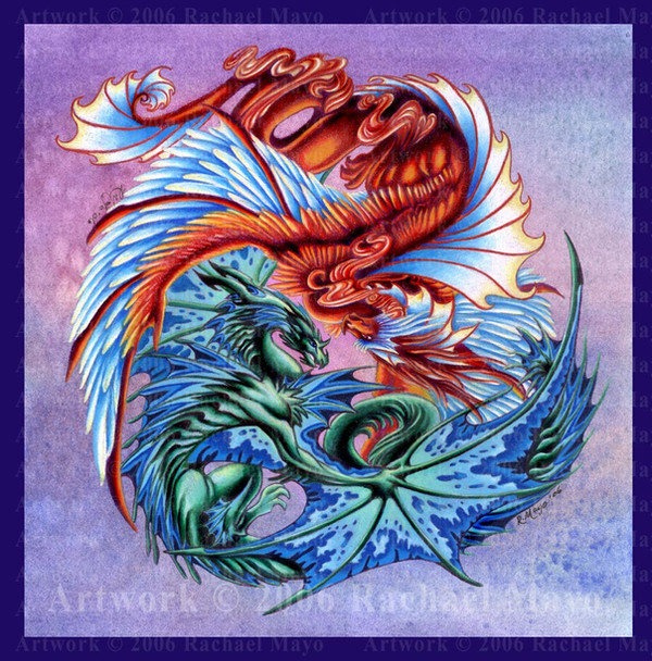
Thanks. It's definitely one of my favorites of the set that I created for contest.
")
👍: 0 ⏩: 0

They're like jewels scattered on black velvet flecked with diamond dust...Darn, you made me all descriptive!
👍: 0 ⏩: 1
LOL! Descriptive and loquatious is GOOD. I'm glad you like this one. It's one of my favorites of this contest set.
👍: 0 ⏩: 0

The dragon is the most detailed but I think the phoenix looks the best.
👍: 0 ⏩: 1
Thanks.
I wanted a little something for everyone in this one.
👍: 0 ⏩: 0

GENiUS.
you are a pure genius.
i'm sorry for such a lame-o comment, but i'm speechless.
👍: 0 ⏩: 1
I'm honored. Thank you very much!
👍: 0 ⏩: 0

Wonderful use of colors, and the jilliens of stars in the back are a very nice touch. I love how you made the curves, everything seems to work out perfectly.
I feel a sort of mystifying connection with this piece, as if I had seen it before in a dream....
👍: 0 ⏩: 1
Thank you very much! I love using my toothbrush to make very crowded starfields like this. I love the effect.
I used some fairly straightforward, well-known symbols for this piece, and the circles-and-stars motif is the kind of thing that winds up in my dreams, too. I wanted it to have that particular quality, and I'm glad to see that someone else picked it up as well.
👍: 0 ⏩: 0

This is so gorgeous!!! I love the composition and colors, and of course the creatures themselves are to die for.
👍: 0 ⏩: 1
Thank you once again. For a project I very nearly thought to death, I'm glad this one turned out as well as it did.
👍: 0 ⏩: 0

I love the starspangled heavens you created here, especially how it's not uniform.
I agree with lydario that the phoenix looks slightly off. I think maybe if the dragon was located just a little bit higher it would fix it.
Otherise, stunning piece! The details and colours are fantastic!
👍: 0 ⏩: 1
I remembered seeing the arm of the Milky Way in the night sky when I went to camp in the mountains a few years ago. I liked the way that the stars looked clustered in the arm, so I tried to use some of that kind of clustering effect here.
And alas, alas! The images are all sealed in place now with foamtape, so I can't tweak the positioning any more. I did scoot the pieces around when I was assembling it, and I thought then that the dragon looked better where it was, a little further away from the phoenix, than it did being any closer. I think it's the overall shape of the phoenix that's off, actually...
👍: 0 ⏩: 0

These would make the coolest little sculpted pendant thingies.
👍: 0 ⏩: 1
Oh, dude, you're absolutely right. I'd have to put that on my long-term project list and I'd do it when I had some significant spat of time (as sculpture is not my strong suit), or I'd need to find someone who'd be willing to try it.
👍: 0 ⏩: 1
Heh... let me see if my roommate wants to try! ^_^
👍: 0 ⏩: 0

Oh man, that's fantastic! The colors and critters and balance and everything are just awesomely done, AND it's sparkly. 8D <3<3<3
👍: 0 ⏩: 1
Thank you!
I definitely had to do something with the shiny bits for this contest. I've not abused them in so long!
👍: 0 ⏩: 0


Thanks! It's the details that I enjoy the most, though I think I have to say that I enjoy drawing and coloring them, but *not* cutting them out!
👍: 0 ⏩: 0

oh wow/ that turned out stunning! I love the composition and again your coloring!
👍: 0 ⏩: 1

That is beautiful! You put so much into it, i really hope you win
👍: 0 ⏩: 1
Thanks very much!
It really depends on whether only the public votes on them, or whether we have actual arts judges. If it's actual arts people, I may be outta luck, because "happy" and "bright" never seem to go over very well with them. But the public likes this kind of artwork, and so do I. And if I make some Ordinary People happy, then it's been worth the effort.
👍: 0 ⏩: 0

OHMYGOD this is so good! I thought you'd amaze me with this one.
👍: 0 ⏩: 1
LOL! Thank you - I'm glad you're so jazzed with it.
👍: 0 ⏩: 1

really cool.Everything seems to fit together nicely. must've taken some time to fully assemble
👍: 0 ⏩: 1
Thanks!
Truly, it was the cutting-out of the three critters that was the most tedious thing about this. The actual assembly process only took me about half an hour.  (Wink)")
👍: 0 ⏩: 0

*______* I'm still drooling over this....its so........wow. just......wow.......I used to use little jewels and things on my pictures. you know what I discovered adds a little splash of coolness? nail polish. that's right, color shanging, glittery, clear with colored iridessants.....you wouldnt believe how cool dome of them turn out. especially the color shangeing ones XD
👍: 0 ⏩: 1
LOL - Except that the smell of one of the carrier agents in nail polish makes me quite sick.
Thanks so much!
👍: 0 ⏩: 1

LOL - Oh yeah. There HAD to be shiny bits this time. I haven't used shiny bits in AGES.
👍: 0 ⏩: 0

lovely indeed... and all the more impressive that no computor aid was used in assembling it... this is magnificent
but... somehting about the placement of the phoenix bothers me... for some reason... but i love htis overall
👍: 0 ⏩: 1
Thanks very much!
You know, I think it may be that the phoenix has more straight lines than either the dragon or the koi; its overall body/feather positioning is more angular. That may be what you perceive as being a bit off. Huh! I hadn't even noticed that, but it's a valid point. Interesting!
👍: 0 ⏩: 1
yea... i think that might be it.. .but i dunno... i feel like it should be a smidge closer to the dragon... but it's fine :]
though i would expect them to be a bit closer to eachother... in like... a triangular formation... but it seriously wouldnt matter, since htis in itself is lovely :]
👍: 0 ⏩: 0

Alrighty, when I get some vacation time I'm going to have to come out and pay you a visit so I can see this piece in person. I love it, and with all of the detail for the background & the shiny bits it feels like it is a *must see in real life* instead of digitally. The balance is working well. I love the jewels, they remind me of the constallations, as I know human cultures have a huge fascination with naming star groupings (constellations)... *LOL* It's a awesome feat - your art. Totally kewll....
👍: 0 ⏩: 1
Thank you very much! I'm glad you like this piece in its finished state.
We'd probably have to make a convention meeting arrangement - that would be the kind of place where my artwork would show itself off pretty well. In my house it just sits in a flat file and gathers dust.
👍: 0 ⏩: 1
*LOL* It's better than mine, where it sits buried in my dresser drawer, hiding the dusty recesses of my closet, or shoved in with some forgotten bank statements in a Rubbermade storage container. Convetions are fun when I have the money though.
👍: 0 ⏩: 0

the dragon must've been hard to cut around  (Smile)")
But, now there is random blackness under the critters and it looks...weird... but i guess if you put stars there, too, it'd be a bit overwhelming... i think ? *isn't art smart*
Squee it looks great
👍: 0 ⏩: 1
It did take me some significant time and effort to get all three critters cut out. But it DID have to be done that way - I needed the area right behind each figure to be black so that the colors of the critters would really pop out. I also really wanted that sticky-outey effect that I got by mounting the figures onto the black circles with foam tape.
You're right - if I put the toothbrush-spatter stars onto the black circle bits, it would be overwhelming. I did it this way to give the three figures some emphasis, and to push the star field into the background. You're more art-smart than you may realize.

👍: 0 ⏩: 0

Oh my goshm this is stupendous! (")
👍: 0 ⏩: 1
Thank you very much! I adore the bright colors, and I do have a lot of kids that squee over my work when they see it.
👍: 0 ⏩: 0
| Next =>