HOME | DD
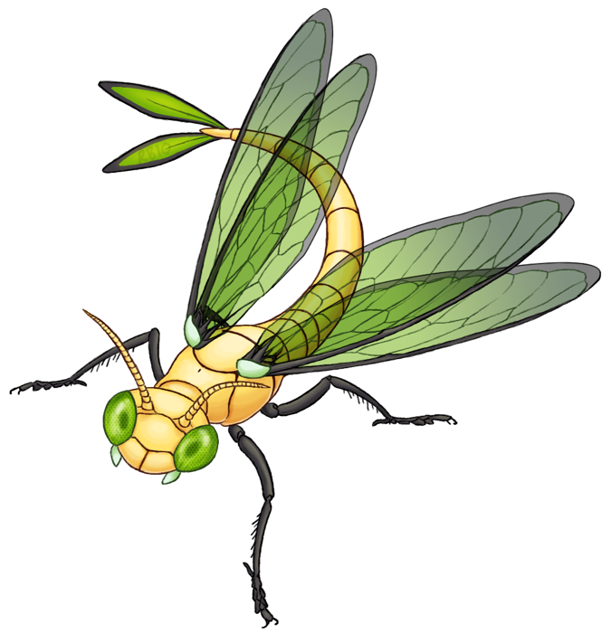
 RacieB — Vibrava
Published: 2010-04-06 07:01:40 +0000 UTC; Views: 8411; Favourites: 285; Downloads: 710
Redirect to original
Description
Those wings were a pain.Related content


Comments: 20


Looks just like a damselfly nymph! I love it.
👍: 0 ⏩: 0

My 4 favorite moves from Vibrava are
1 Dragon Breath
2 Sandstorm
3 Bulldoze
4 Earth Power
👍: 0 ⏩: 0


Oooh, one of the prettiest Vibrava realisms I've seen! I love the way you did the legs and the face.
👍: 0 ⏩: 0

Oh yes, these wings really do look like they were a pain, but they look FABULOUS. I love them. :3
👍: 0 ⏩: 0


Vibrava! Wow!
This wings were a pain? But they look so great!!
I love your picture! Great details!
I wish, someone like you, would draw my team...
I can't draw anything... but i wish, i can draw..
Great work! I love it! *fav*
👍: 0 ⏩: 0

I'd say those wings were worth the pain, they look spectacular! I love the head too, the fact that it doesn't look just like a dragonfly, but also looks a little mantis-ish as well.
It's tail looks a little flexible for an arthropod, but it's still great.
👍: 0 ⏩: 0

This is the first drawing anyone has done of him that I've actually liked.
This is way cool!
👍: 0 ⏩: 0

Well the result is stunning.  (Smile)")
👍: 0 ⏩: 0

Your designs are really really really awesome. I hope you do more.
👍: 0 ⏩: 0

I think the wings were worth your while. I like the gradients and broken lines... they make the wings quite eye-catching.
The anatomy is well-done, as always, but I like how you managed to balance the original Pokémon with all that fine anatomy, too; it's really easy to forget what you started with when you do this kind of thing.
It's a little odd that the tail isn't translucent too, though I know it's harder to show when there's nothing behind it.
👍: 0 ⏩: 1

I based the tailtip diamonds off of a feature that some dragonflies have, actually I think only females have it but whatever >>; [link]
👍: 0 ⏩: 0


")
")
👍: 0 ⏩: 0

I agree with jamew85. The pain was most definitely worth it. Those are great looking wings and the use of varying levels of alpha tranparency is a nice touch.
Excellent design, and colour choices all round. The shading for the body is very well done and really brings out each piece of the exoskeleton. The reflection effect and shading in the eyes is also done quite nicely.
On the a negative side of things the eye texture doesn't follow the curve of the eye, but that is barely noticable and fairly minor.
All in all this is one of your better works.
[/WALLOTEXT]
👍: 0 ⏩: 0

They where a pain, but they where worth it! They look WONDERFUL!
👍: 0 ⏩: 0