HOME | DD
 RadioInteractive — Zelda redesign concept

Published: 2010-05-10 17:53:43 +0000 UTC; Views: 3000; Favourites: 31; Downloads: 64
Redirect to original
Description
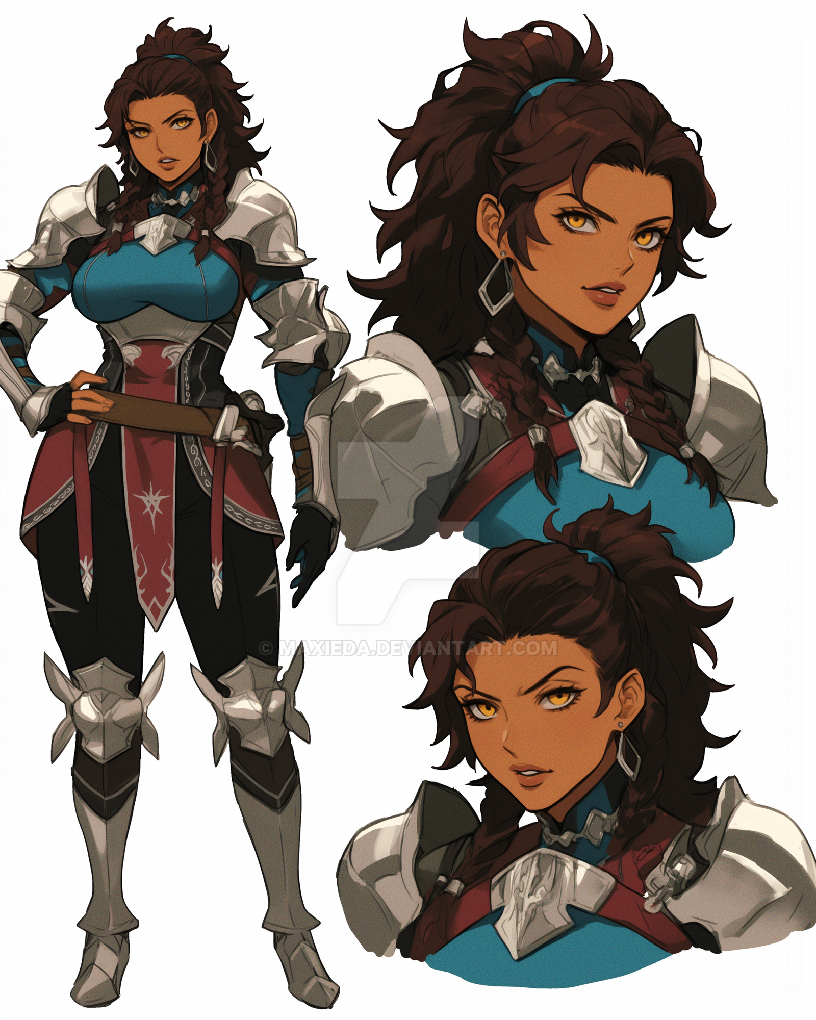
Flat colors because I'm too lazy to add value. Idea for designs was Legend of Zelda + Prince of Persia 2008. Gonna post a few more of these in a few days, I just liked Link and the other girl's designs. Was up until 6 AM working on them last night. Also their feet because feet give me problems, so it's nice to see these turn out all right.Related content


Comments: 8

I really like the flat colors here, it definitely helps enhance the details and everything. :3 These are some really hawt designs here. I can't pick any one thing I like the most, 'cause I really do love everything about these designs. <3 And your attention to proportions is friggin' amazing!
👍: 0 ⏩: 0

yum yum yum, this is really lovely. the lineart is so smooth and then really finely detailed aswell. I love her lip/cheek dots~! I find them extra cute

STOP DRAWING RAD THINGS, I'M TRYING TO HATE YOU.
Really thought-provoking, though. Though I couldn't tell you what those thoughts are. I just can't stop feeling.
👍: 0 ⏩: 0


you're getting real good with detail and proportions. i found this piece appealing.
👍: 0 ⏩: 0

Really, really HOT designs.
Seriously! I also like the flat colour - something nice and simple without taking away from all the lovely little details.

👍: 0 ⏩: 1

Honestly, I added the color because I was messing around with the concepts of color harmonies and stuff. You know, split complementary and analogous, that sort of thing. Glad it helped enhance the details.
👍: 0 ⏩: 0