HOME | DD
 RadiusZero — Final Performance Pg3

Published: 2009-12-29 05:20:35 +0000 UTC; Views: 1684; Favourites: 25; Downloads: 26
Redirect to original
Description
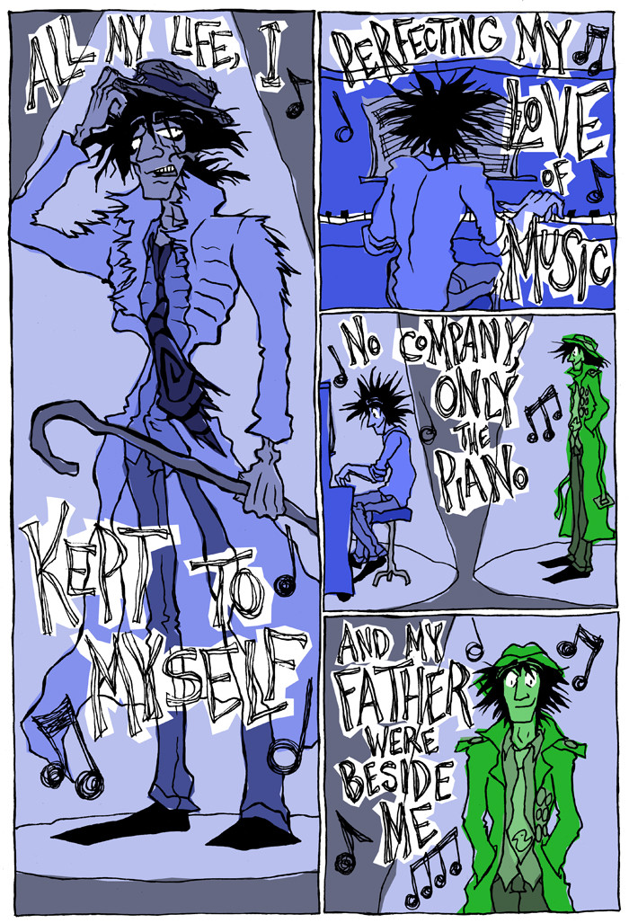
Page 1 | Page 2 | Page 3 | Page 4 | Page 5Page 3 of Final Performance. gah, my fingers hurt.
")
BTW, if anyone is wondering, I love leaving signs of my "handprint" in my work, which is why I kept the textured line work as opposed to cleaning everything up. I think it gives it that gritty look.
Related content


Comments: 3

I think this page properly illustrates good and less good use of black. (oh fuck me, I can't look and not critique. We're academics.)
Panel 2 is great black.
Panel 1 is decent black. I like where his foot becomes the stage. I wish some of the white lines on our right side of his waist were not there. Just the black form.
Panel 4 is the problem. Wish you'd done it like the first panel of page 5. Not saying go back and redo this now, rather, move on ... I figure you didn't think of doing it that way until you did it on page 5. It looks nicer than the wonky yellow outline.
👍: 0 ⏩: 2

Oh, I forgot to mention, that yellow outline was meant to carry the yellow over to that side of the page to create color balance. I tried to look at the overall page design.
👍: 0 ⏩: 0
Actually, I intentionally did that for panel 4 because I wanted people to see the yellow dots but not get a clear idea of what they were until the last page.
👍: 0 ⏩: 0