HOME | DD
 RadiusZero — Werewolf Back Cover
Published: 2009-09-24 02:56:48 +0000 UTC; Views: 954; Favourites: 48; Downloads: 11
Redirect to original
Description
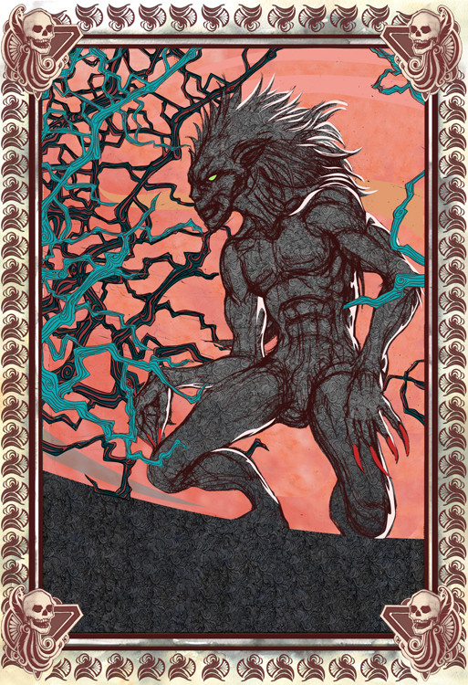
EDIT: I'm moving these covers to the scraps.I decided to upload the backcover of my werewolf book project. I didn't include that proof-of-purchase crap in it yet.
") In any account, I'm pretty happy. It's one of my few anthro-whatever creatures. Actually, this was a drawing I had done while trying to figure out Seth's werewolf form. Alas, I'm still playing around with other concepts.
In any account, I'm pretty happy. It's one of my few anthro-whatever creatures. Actually, this was a drawing I had done while trying to figure out Seth's werewolf form. Alas, I'm still playing around with other concepts.Expect a picture of the bookcover when i'm done with this. I'm kinda eager to tackle Dracula and Frankenstein now, which are the other two book covers I'll be working on for this class project.
") Pretty exciting.
Pretty exciting.On a random note, I'm posting this image while listening to horror-themed music.
Just got through listening to the theme of Tales from the Crypt, followed by the creepy melody of Poltergeist. Now listening to the Phantom of Opera. I'm such in a halloween mood right now. Oh, and in case you're wondering... border and textures were intended to give this very old fashion feel. When I upload the front cover in the future, you'll see its tuned to the art nouveau style a little clearer.
Related content


Comments: 13

I like it, but to be honest, I like the front cover better. Still cool though!!
👍: 0 ⏩: 1

Yeah, the front cover is my personal favorite of the two. More action is happening there. XD Plus, my Seth character is much prettier there than here
👍: 0 ⏩: 1
I agree, more action and smoother details I think.
👍: 0 ⏩: 1
Yeah, the lines there are smoother there too. I intentionally kept them in their messy state to imply more of that furry/chaotic mess. I may go in and add subtle highlights to make that form a little more interesting though.
👍: 0 ⏩: 1
Yes, I see what you mean. I think highlight would help. I understand your reasoning for keeping the lines messier and I like the idea, but I think you might want to consider finding a way to really send home the point that the messiness is intentional. Highlights might do just that.
Just my thoughts ^_^
👍: 0 ⏩: 1
Well, i kinda like the way it is, so I'm going to keep it that way. I'm just going to work on highlights. One thing I love doing is keeping the messy lines. It's present in all my works. I don't like to keep everything too clean, especially since digital art is always clean. Thanks for your thoughts though.
 (Wink)")
👍: 0 ⏩: 1
By all means!! I just like throwing out ideas for fellow artists to ponder!!
Have fun!!
👍: 0 ⏩: 1
Thanks. I moved these covers to the scrap section. I made a comment in the other cover that these were still being tweaked, which is why I wasn't looking for any critiques on them. But thanks for the suggestions anyway.
👍: 0 ⏩: 1
I noticed that... a little too late I suppose. Oops!! Sorry!! I get carried away sometimes...
Don't feel down about them, they are quite beautiful, even as works in progress!!
👍: 0 ⏩: 1
No problem. And I really am grateful there are folks like you helping artists like me. It really indicates you care about the work. <3
👍: 0 ⏩: 1
Aww!! I feel loved!! I really do try to help!! I say good luck to you and never stop having fun with your work!! <3
👍: 0 ⏩: 0

I need to see this bigger. O_o can't properly understand the details, particularly of the blue bits.
hehe ~ if this is the back cover, you've missed out on all the fun of writing a story summary, making up quotes from famous people, embedding satanic numbers in barcodes, etc. XD
mrf. honest, i want to say more about it, but i keep squinting at it in hopes of properly seeing it.
👍: 0 ⏩: 1
Oh, the writing is there. XD The book cover is designed with flaps, where the info, from the author's bio to the story's premise, is. That empty dark space is where the dreaded proof-of-purchase and barcode will be. Er, I think I mentioned in the post. O_o Anyway, I only wanted to upload the illustration part of this.
👍: 0 ⏩: 0