HOME | DD
 RAHeight2002-2012 — Robin Sample page 1
Published: 2007-11-21 00:09:15 +0000 UTC; Views: 3253; Favourites: 57; Downloads: 105
Redirect to original
Description
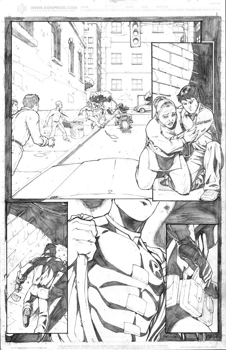
Hey Folks!!Well, I am putting together a Robin sample for an editor at DC Comics. I am having a blast doing it because I love Robin and the Batman Family.
Hope you guys ( and the editor ofcourse) dig it!
*Edit- Well, I took the suggestions I either thought were valid and/or felt even though I had another vision in mind ( like the windows in shade were smaller and higher bathroom windows like I have in my house and have had in my apartment) and adjusted them in Photoshop. Some of the things that were suggested I couldn't change because it would deviate from the script....which is why I drew them that way.
Things I changed: Made the car higher/bigger which makes it overlap the curb and gives it more depth...along with define the lines of the car more, made the windows in shade lower and longer to be the same size and level as the front windows, and widened panel 2.
Doing those things made the page tighten up another notch. Thanks for the suggestion, guys!! Much appreciated!
-Ray
Related content


Comments: 65

Well, Great mind think a like...
XD
... Just kidding.
👍: 0 ⏩: 0

Please take this with a grain of salt.
The first large panal. The car's hood looks a bit flat and low. If it was a little higher, and out further, with the roof of the car, in camera and covering up the guy on the left some, Then that panal would have more of an impact for me. Also, the windows shown in the building covered in shadow almost to the middle and left of the page, perspective wise, don't fall in line with the windows to the front of the building. Just a bit higher set than the rest.
The third panal. It appears to me as if he is falling forwards. His upper body is a tad too big, and his upper left leg could be in a little more.
I know this may seem like I'm being picky, and who am I to say whats what. Overall, this page is really tight, and has a nice style.
It would be a pleasure to ink it.
Tod
👍: 0 ⏩: 1

LOL...No problem at all, Tod! If people can't take the occasional crit then they shouldn't be posting their work on Deviantart ( or anywhere with a public forum for that matter). I appreciate the fact that folks take the time out to look at my work when there are THOUSANDS of other great artists here on DA they could be checking out.
BTW, send me a note with your info and I'll send you the hi-res.
-Ray
👍: 0 ⏩: 1
BIG_BOOTE@HOTMAIL.COM
👍: 0 ⏩: 0

Thanks a lot, Allan!
-Ray
👍: 0 ⏩: 0

Very cool. And I personally like a page with a lot of blacks and shadows. And good luck with the submission. Can't wait to see the rest of these...
👍: 0 ⏩: 0

So far so good. I am eager to see the next page, especially if there is a little revenge...
👍: 0 ⏩: 0


Nicey nice man. Make those spot blacks your bitches!
👍: 0 ⏩: 1
Thanks, Matt! I noticed that my stuff looks better with them than without them. I guess I can't fight my natural style...So I won't anymore.
")
👍: 0 ⏩: 0

")
<= Prev |